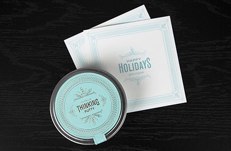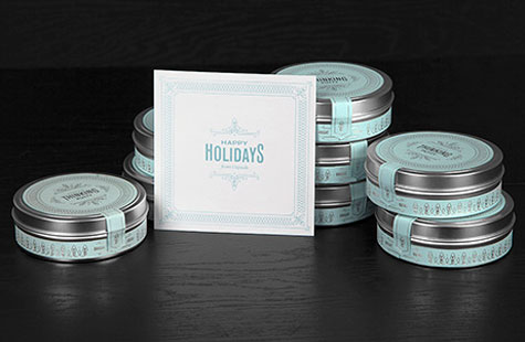
It’s always true. The designs that have the most impact take a well-formed idea and communicate it in the cleanest, simplest, most beautiful way. This self-promotional holiday gift from Capsule is one of the best examples I’ve seen.
The intention: Give recipients something that reflects the studio’s design philosophy and will allow them to use their own hands to shape, form and stretch thoughts and ideas into something tangible and inspiring for others to enjoy. The means: putty … or in their words Thinking Putty.
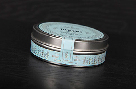
Efficient and inventive, the design team placed the putty in that all-too-familiar round silver tin. But it is adorned with elegant diecut labels on the top and circumference – silver foil stamping atop a powdery blue Fasson label. Delightfully, the putty is a shocking and complementary raspberry red. The card is smooth Crane’s Crest foil stamped in a pearl blue that matches the tin labels.
Using the notion of “bright ideas,” delicate patterns inspired by a string of holiday lights illustrate the labels and card like decorative garlands. And most fun, recipients were encouraged to share their putty creations on Twitter.