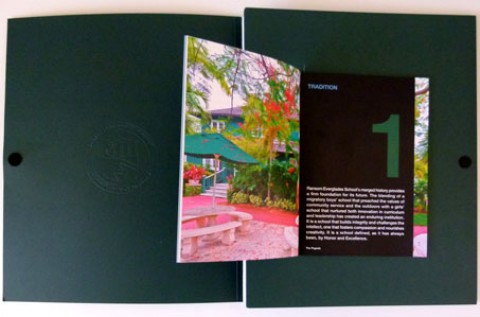
Standing out from the crowd. It’s what students have to do to be accepted by the school of their choice. It’s also what a school has to do to show that it is, well, outstanding. And it’s what this intriguing brochure for the State University of New York (SUNY) College of Agriculture and Technology at Cobleskill does quite literally, thanks to strategically placed die-cuts and an attention-getting accordion fold.
Designed by SUNY Cobleskill’s Jim Feldman and Jennifer Schorf, it was offset printed using the school’s trademark shade of orange, appropriately enough, by Fort Orange Press in Albany. (Special thanks to PaperSpecs PRO member Greg Desidoro of Fort Orange Press for sharing this piece with us!)
Starting with a 100 lb. sheet of that all-purpose workhorse, Mohawk Superfine Cover, Fort Orange Press laid down Black and PMS 021 Orange on the Ultra Smooth White paper, as well as an overall satin aqueous coating.
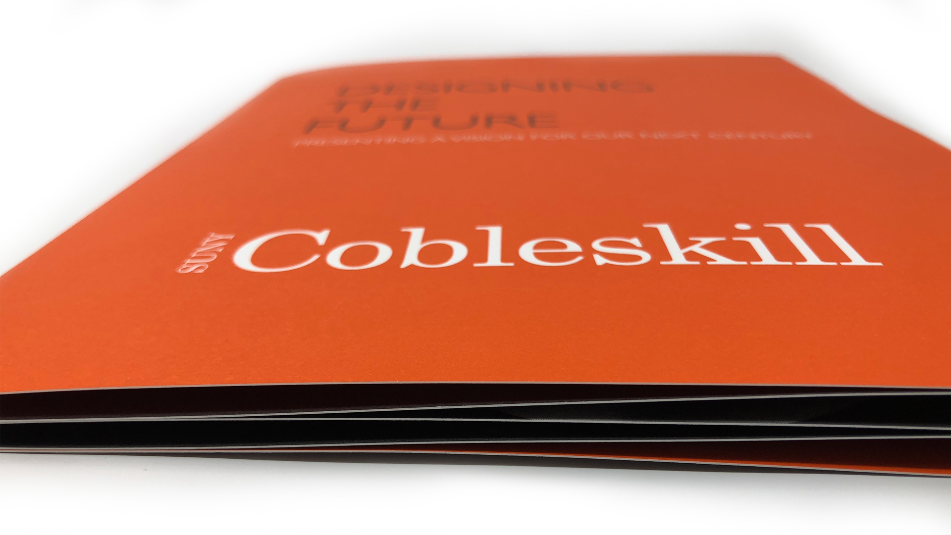
From the outset this brochure zigs where others zag, actually providing you with not one but two covers, depending on where you decide to begin. Open it one way and you are presented with the title “Designing the Future: Presenting a Vision for our Next Century” printed black on orange above the white SUNY Cobleskill logo. So far, so straightforward.
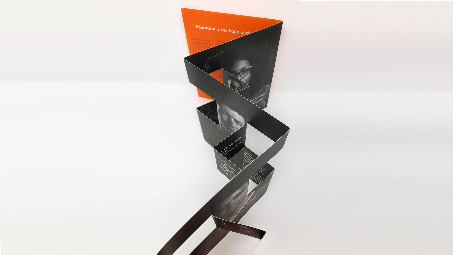
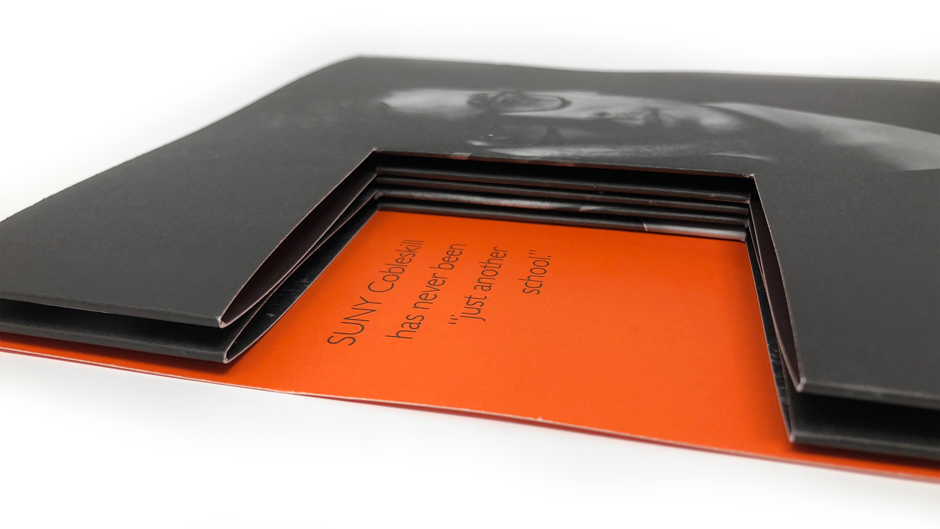
But turn the piece over and the words “SUNY Cobleskill has never been ‘just another school’ ” jump out at you through a die-cut window beside a portrait of a determined looking young student. The command “Follow us into the future” entices you to lift the cover, revealing the accordion fold.
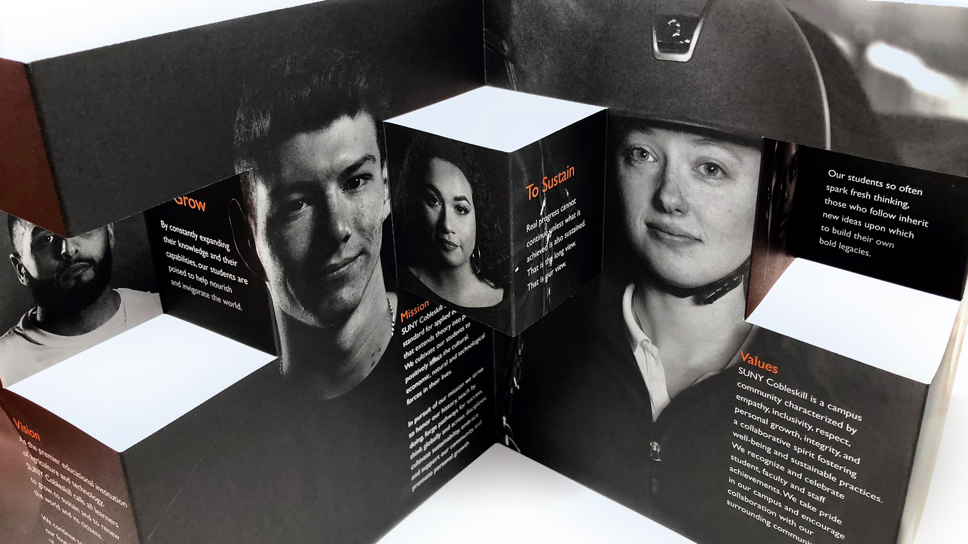
Inside, more crisp, dark images of hopeful, confident young people are intermingled with short explanations of the school’s mission, all against a moody black background. However it is only when you fold the piece slightly that it all truly comes to life. Thanks to some strategically placed die cuts you have a reverse-accordion effect with special pop-out features.
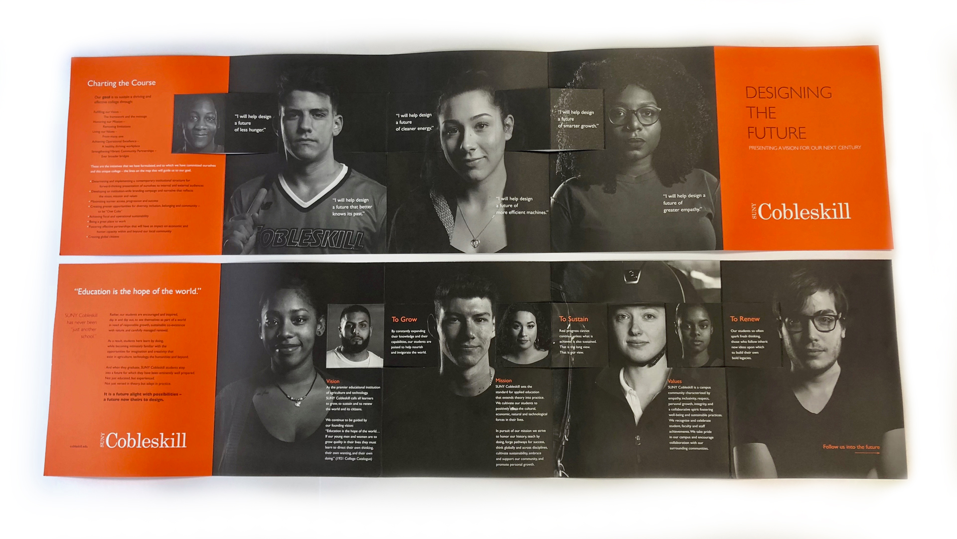
Smaller student headshots emerge three-dimensionally to face their full-page counterparts on one side, while some of the school’s core values float freely on the other. Frankly this is one of those instances where a photo – or indeed a video – is worth a thousand words.
PRO members, don’t forget to check out your:
(Not a member? Start your PRO membership today!)