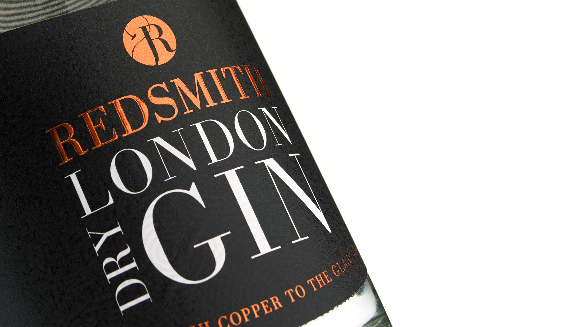
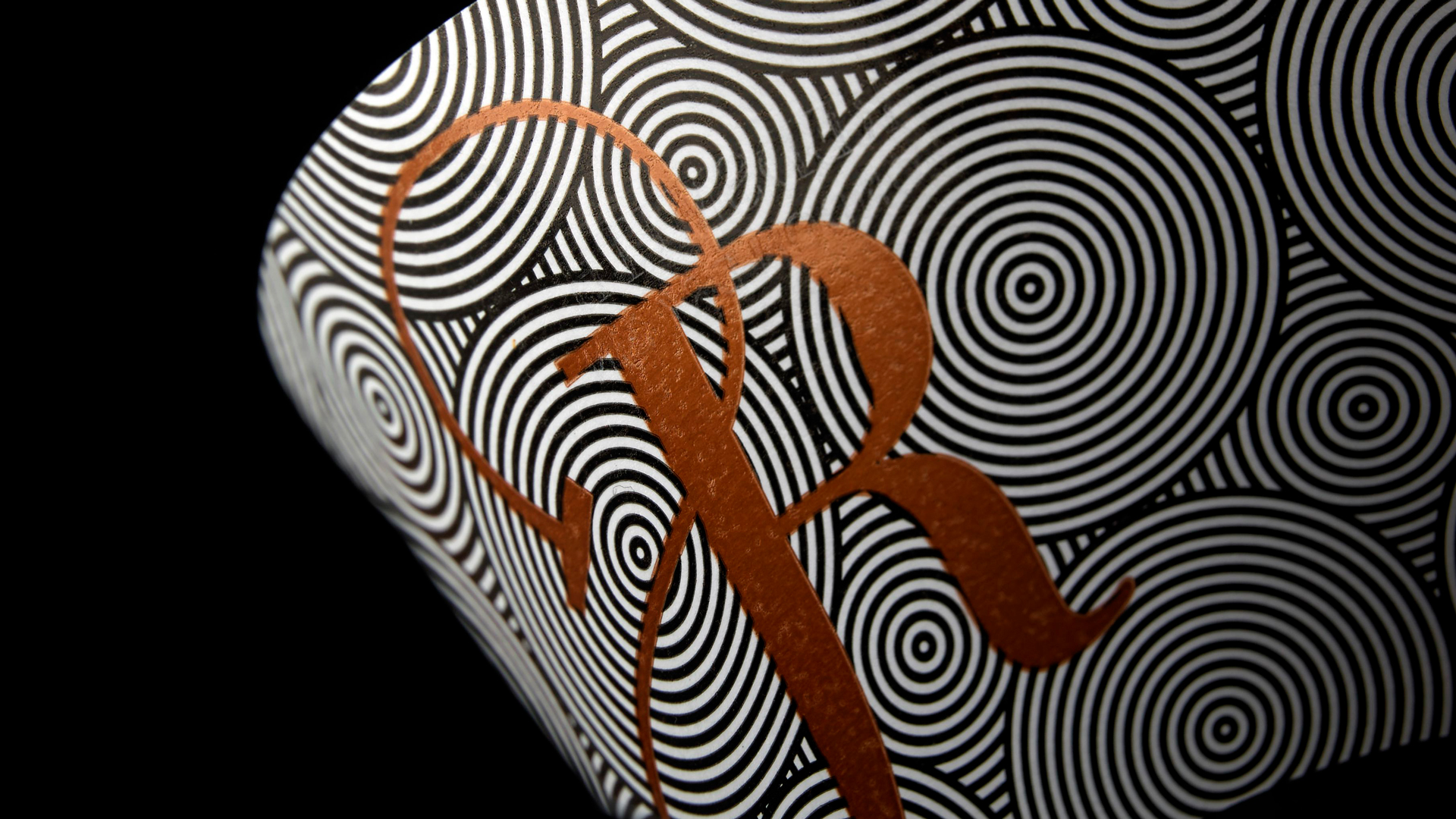
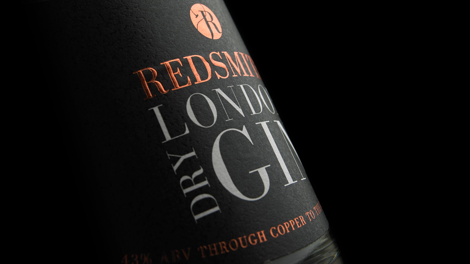
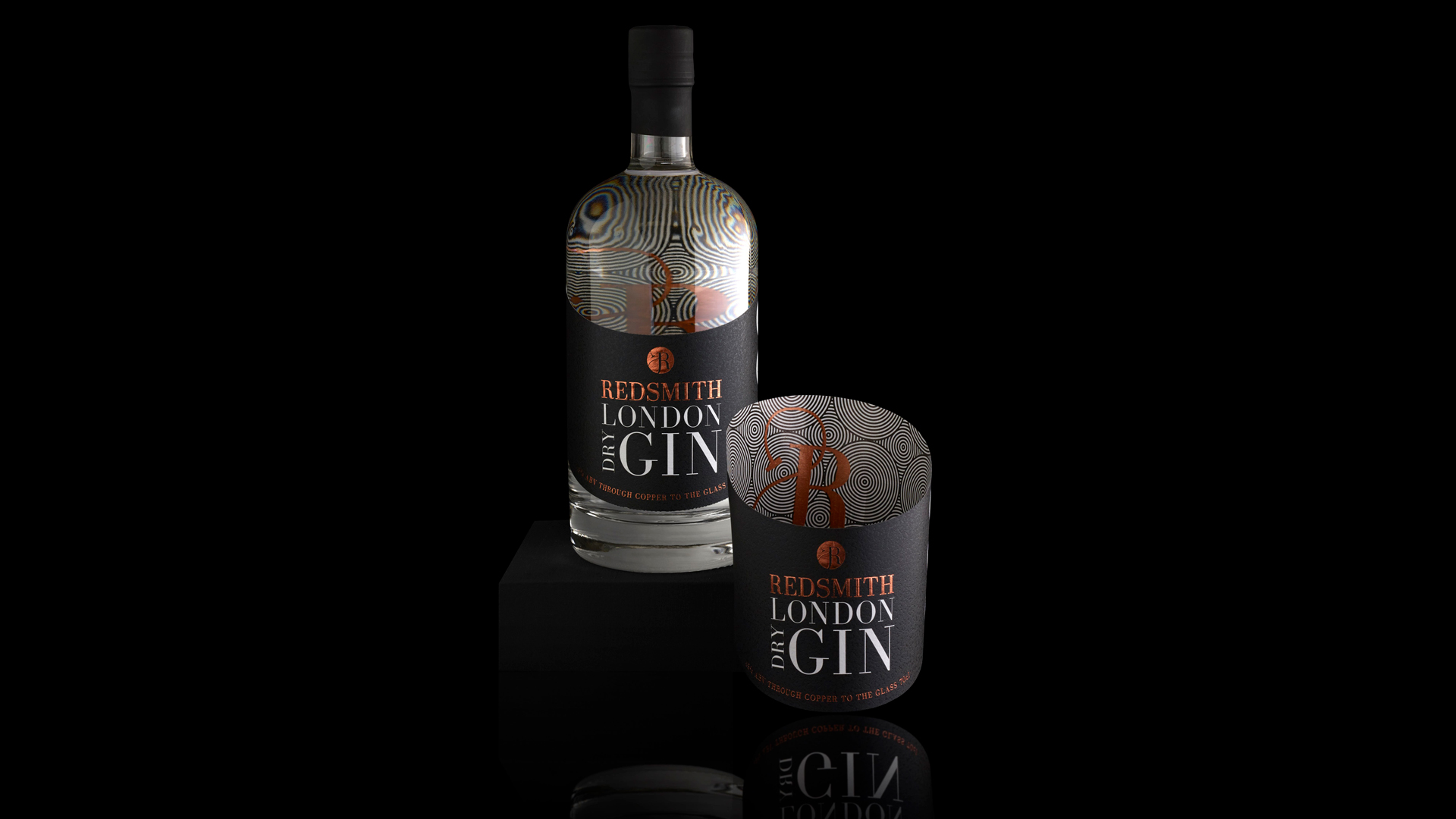
Wine and spirit labels have become increasingly more creative, featuring everything from die cuts to metallic inks and foil stamping…on the front, that is. But what about all that promising space they waste ON THE BACK of those labels? While there have been some valiant attempts in recent years to create intriguing “show through” designs on the backs of labels, few have been as bold or effective as the look crafted for Redsmith London Dry Gin. Not only does it entice with warm copper ink on the front, but it virtually hypnotizes you with a riot of black and white circles and a distinctive “RS” monogram printed on the adhesive side of the label, easily viewed through the bottle to stunning effect.
Designed by English branding agency Fifteen, this piece relies on great precision to create its attention-grabbing results. Royston Labels, which previously blew us away with a similar effect it featured for Hidden Curiosities Gin, had a couple of big challenges to surmount.
The most obvious of these was this: How do you print those black and copper inks on the back side of the label without interfering with its stickiness? Royston used a process called de-lam/re-lam in which the face material from the backing was removed so that they could print on the adhesive side.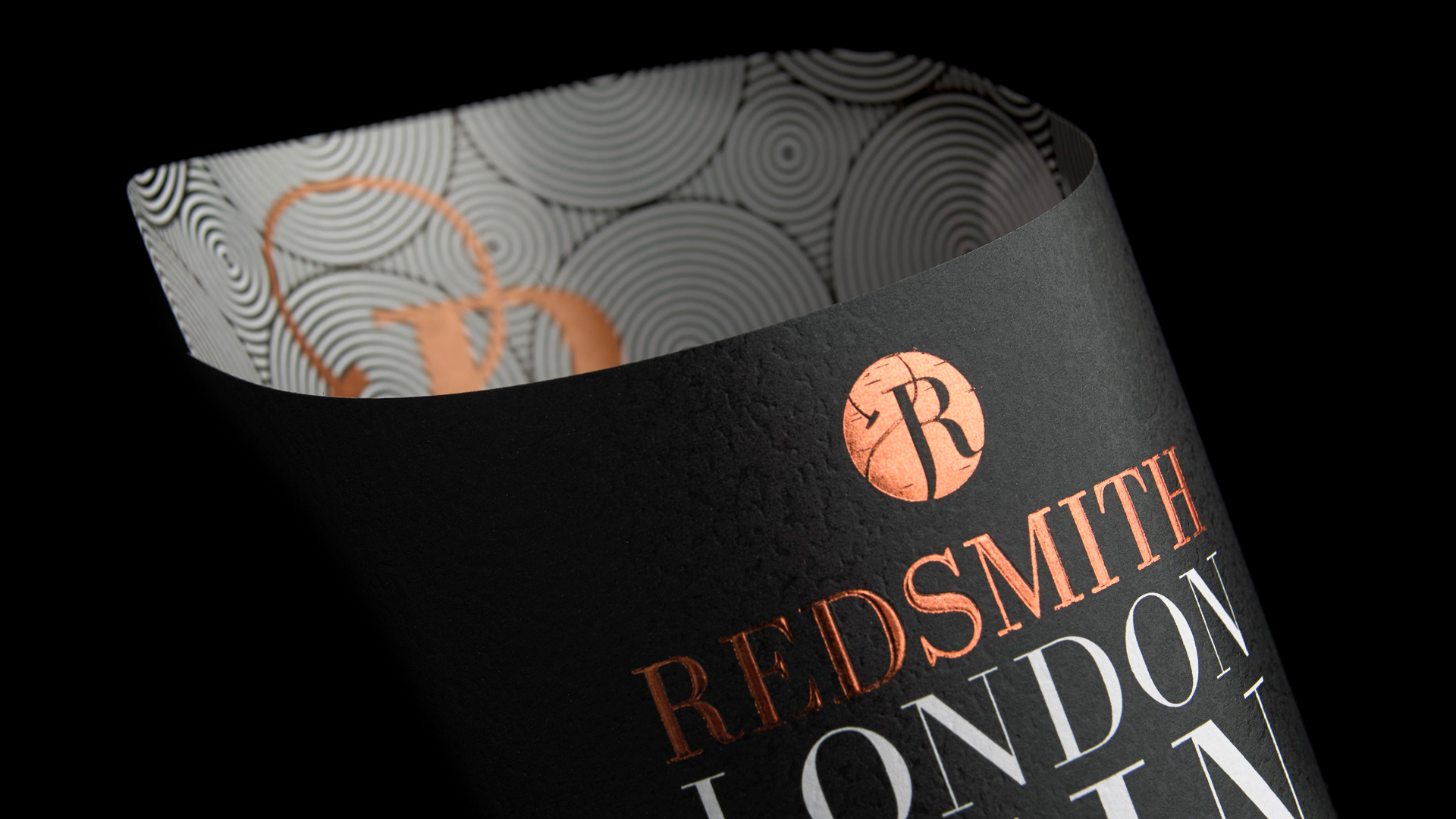
Then there was the application of hot foil to the textured stock – Avery Dennison’s Martele Extra White – done on their flexography combination press setup, which features flexo, silk screen, hot foil stamping, embossing, cold foil, laminate, die cutting and varnishing – all in-line.
Finally the shape of the label itself is an unusual one to say the least, with the back of the piece so much taller than the front to afford us an ample view of all that adhesive-side printing.

The finished product is truly something unique, with the circle pattern and RS monogram enlarged and ever-shifting depending on how you view them through the curved glass of the bottle and all that lovely, lovely gin.
Hot foil stamping brought a distinctive touch of elegance to this piece, but there are so many other ways to get the shimmer and shine of foil. Discover them, as well as the pros and cons of each, in our free Foil Cheat Sheet. Download yours now for a limited time!