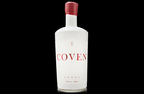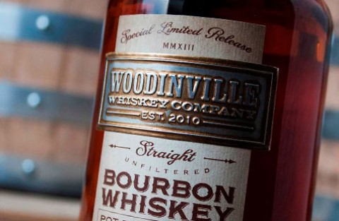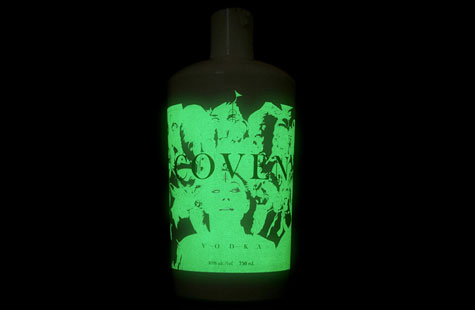
This client’s handcrafted methods for creating its distilled spirits rely on an approach rooted in history. The creative team used that inspiration for the packaging then modernized it to tell a unique brand story.
Whether from fairy tales or scary movies, witches and covens evoke imagery and concepts that consumers instantly recognize on a deep level. The label employs this technique to grab our attention and encourage us to investigate further
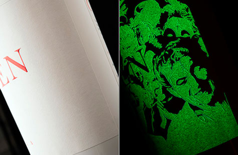
Rather than a dark palette that you might expect for a coven theme, the designer chose white … and a lot of it. The reasoning becomes clear in the dark. Phosphorescent ink, laid down in two passes, fluoresces with the details of eerie characters. I can imagine the glow in a dark bar with patrons asking to see the unusual bottle.
For daytime appeal, shiny, satiny red foil stamping and a tiara-shaped diecut perfectly complement the red wax seal on the bottle. The look is fresh and clean and inviting.