Fashion has Fashion Week. Technology has the Consumer Electronics Show. And letterpress design has “The Letterpress Calendar” produced every year by France’s MR CUP (aka Fabien Barral) [projects / website] and Studio Pression [projects / website], together with a fleet of top-notch designers.
Made available in both a “Dark” and a “Light” version, the 2024 edition is absolutely stunning. [Get yours here while supplies last.]

A Masterpiece of Design and Detail
The front cover, designed by Kevin Cantrell, showcases his signature intricate details and crisp typography. The Blue Hot Foil Stamping makes the calendar’s name and “Creative Manifesto” tagline stand out against the Copper Foil-rendered botanical details. Embossing adds a tactile experience, making the cover a treat for the fingertips and eyes.
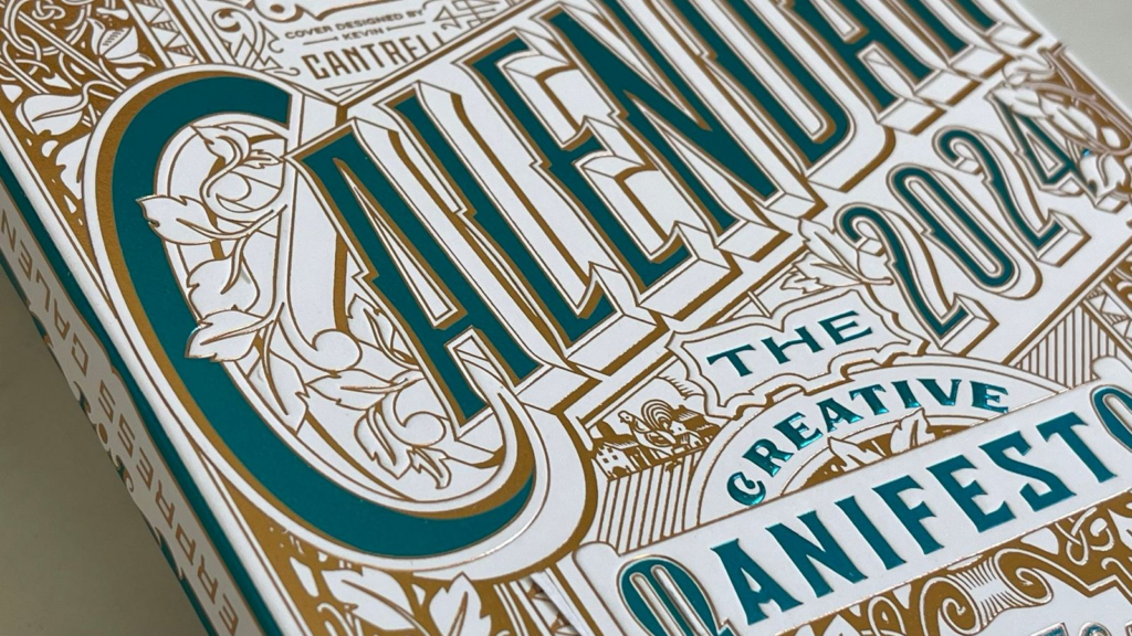
Cantrell’s design for the 2024 edition is a slight tweak of his 2017 version. Fabien decided to reprint it for this edition, eager to finally see it rendered in Foil, which wasn’t used in the earlier version.
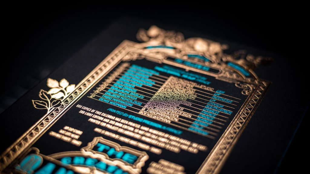
The back cover also impresses with its mix of Copper and Blue Foils. The names and social media handles of participating artists are arranged to resemble a retro video game score screen or jukebox. It’s a delightful touch, especially seeing that Denis Widmann, a close friend, designed “December.”
Elegant Design and Thoughtful Details
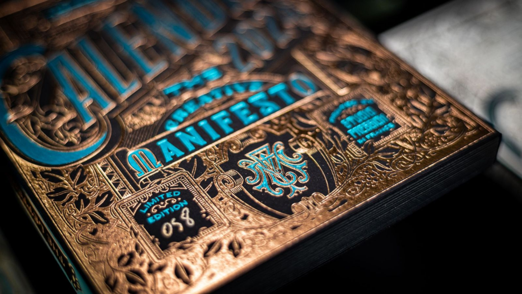
Fabien hand-numbers each cover, which doubles as a sleeve holding the 12 calendar cards securely. The Dark editions are numbered 1 to 300, and the Light editions are numbered 301 to 600. The set also includes a year-at-a-glance card and a desktop calendar holder.
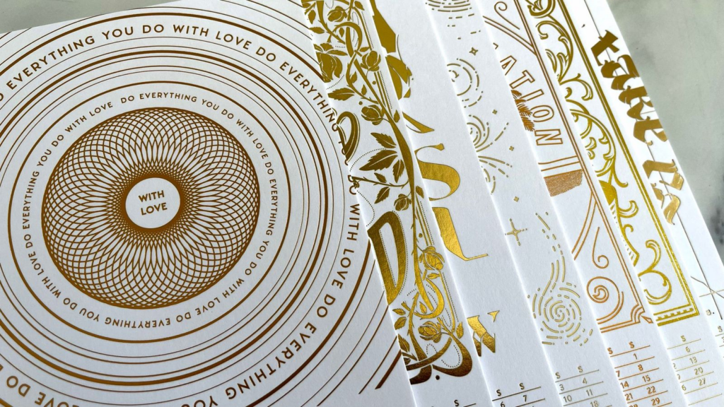
The cards inside are equally intricate and surprising. Each is crafted from 700 gsm Favini Sumo Black or White paper, depending on the edition, which prevents the bruising usually caused by Hot Foil Stamping.
Unique Designs for Each Month
Each month features an inspiring phrase, created by a different designer. The Foils vary slightly in shade and finish, with six distinct Foils used.
The bottom layout remains consistent across all cards. The month and creator’s name on the left, the days of the month on the right.
Despite the involvement of designers from 10 countries, “The Letterpress Calendar” retains its signature branded look, an impressive feat considering the calendar has run strong for 13 years.


)