When you want to attract nearly 1,000 designers to a show about paper, you really want your invitation to walk a fine line between simple and sophisticated. Get too fancy and you start inviting professional criticism from your target audience; don’t get fancy enough and you fail to entice. The piece McGuffin Creative Group crafted for 2016’s Veritiv Chicago Paper Show accomplished this beautifully, taking the event’s theme – Mix, Match & Make – very much to heart.
Said theme was “all about paper – its intrinsic beauty, tactile nature and functional purposes,” explains McGuffin Creative Group Art Director Diane Hoover. “It’s about how ‘makers’ (designers, artists and creatives) utilize paper for all types of purposes, including marketing and art.”
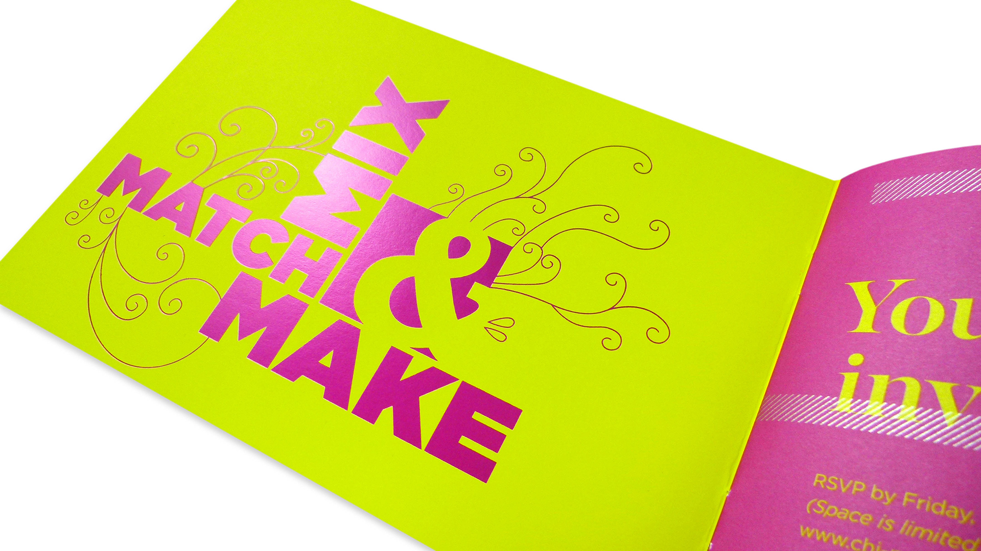
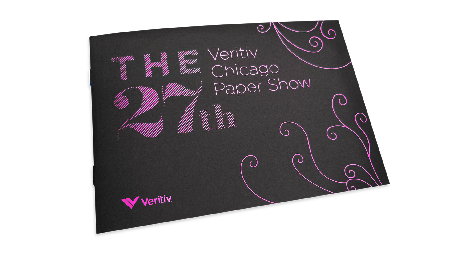
Much of the invitation’s appeal comes from the first impression it makes, and how it will soon be subverted. The name of the event, Veritiv logo and a bit of filigree are all rendered in a bright magenta foil on Mohawk Arjowiggins Curious Cosmic Mars Brown 133 lb. Cover; the effect is tasteful but tempered. But opening it up is where the fun begins.
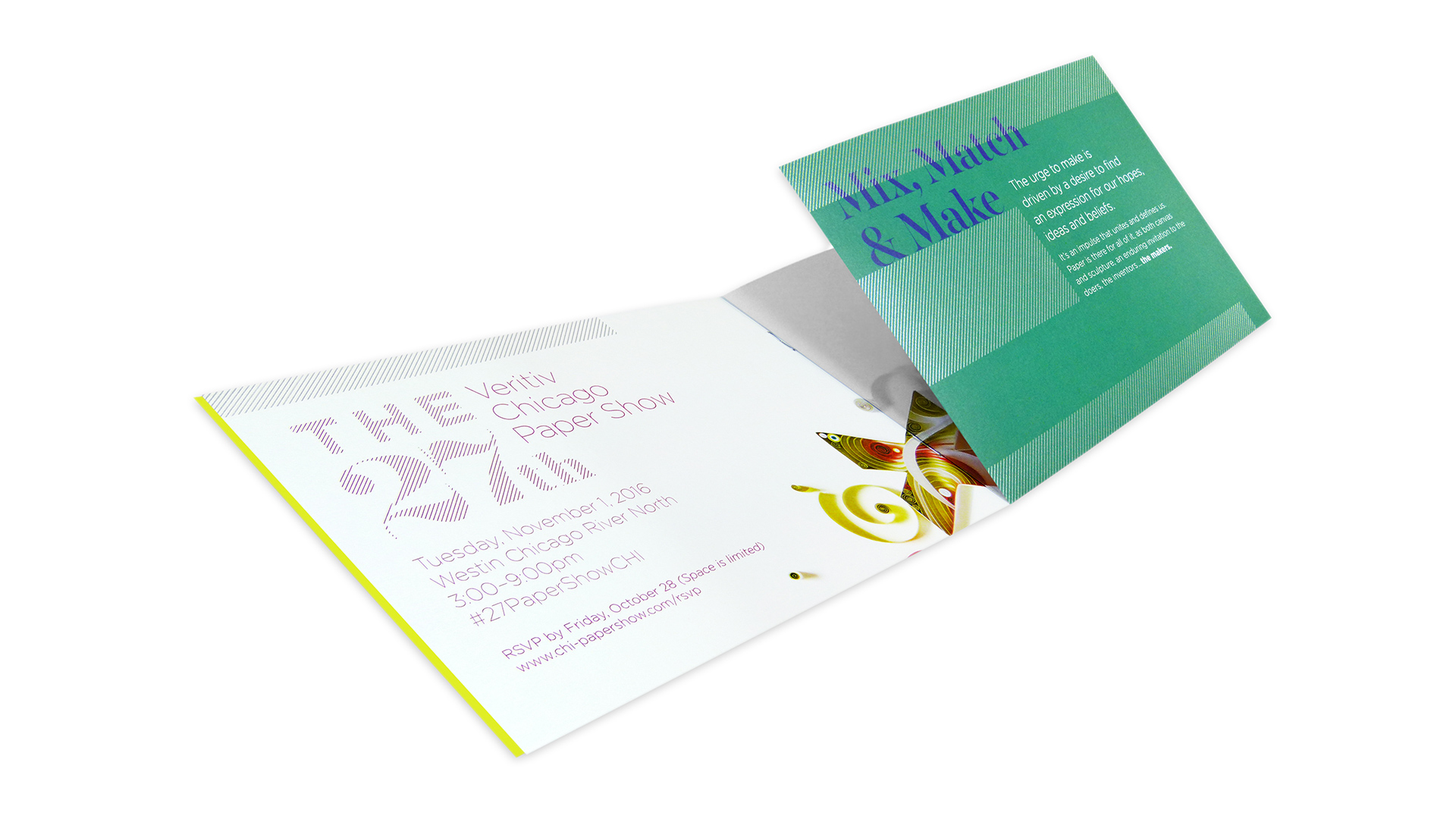
For starters, you quickly discover that the cover is duplexed to Mohawk Arjowiggins Curious Skin Absynthe 91 lb. Text that displays the theme of the event in the same magenta foil.
“Our printer, Classic Color, had to take special care to ensure that the foil [on the cover] didn’t crack under the laminating process,” says Diane.
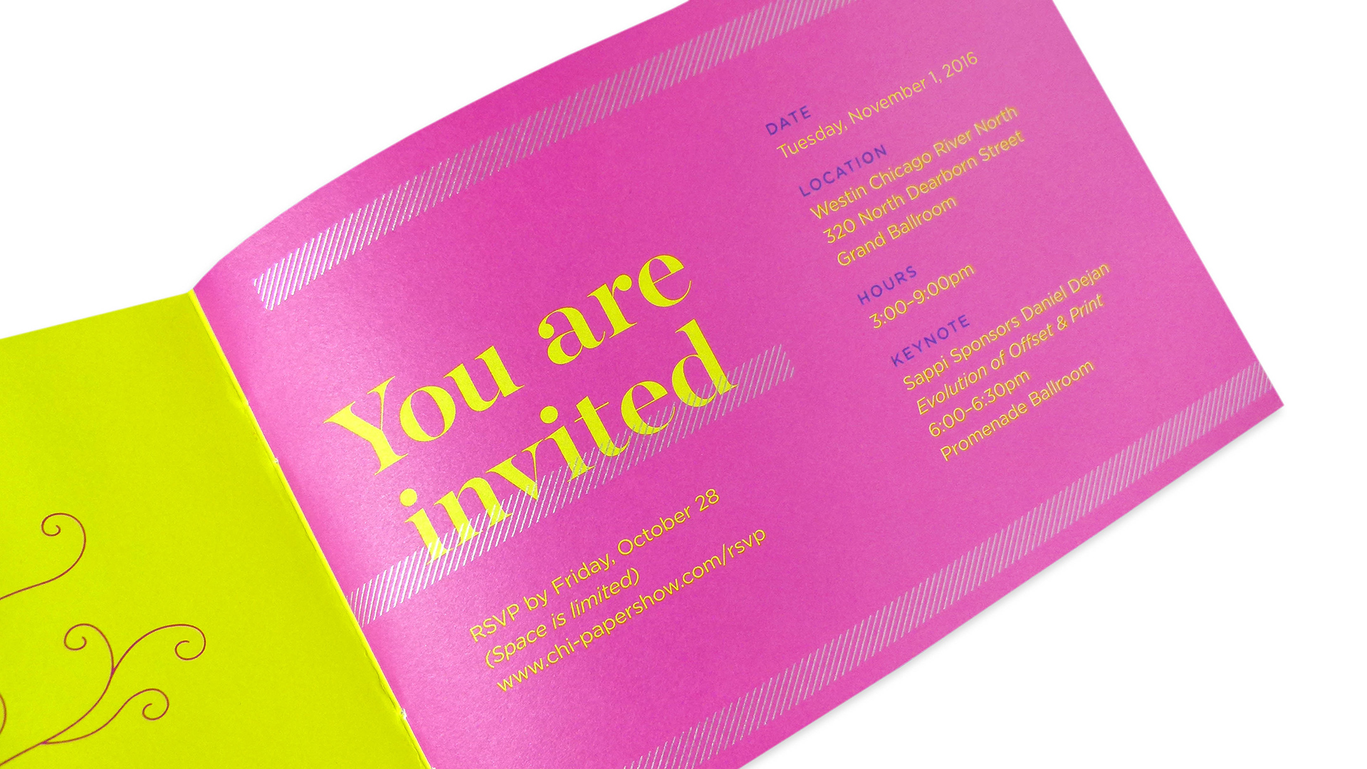
‘Wait a minute,’ you think, already feeling like you’ve been hustled. ‘This isn’t going to be a run-of-the-mill invitation, is it?’ Uh uh.
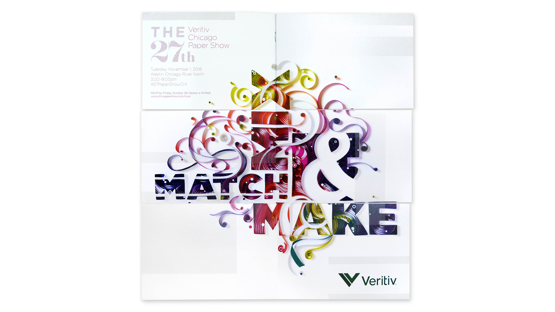
Turn the page and things start to get really interesting as the next page folds down VERTICALLY. You have just taken the first step down the path of a snake fold, with each subsequent unfolding revealing more of the poster for the paper show.
“The snake fold engages the recipient and creates curiosity,” explains Diane, though actually pulling off this fold wasn’t easy. It “required a little experimenting to ensure that the fold was smooth. We introduced slots, rather than slits, to prevent bunching.”
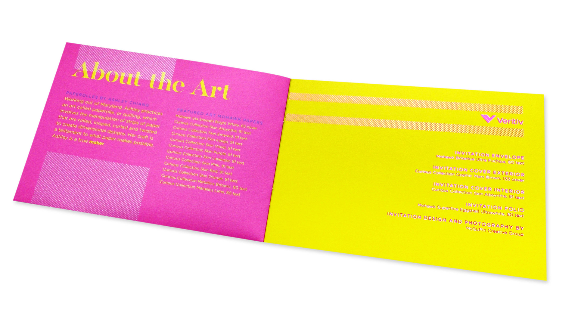
But back to that poster for a moment. Quilling – essentially rolling up little pieces of paper to form larger illustrations – is enjoying something of a renaissance these days, led in part by the social media exposure of works by Yulia Brodskaya and Sena Runa. It is used to fantastic effect here, skillfully getting the theme of the event across.
“Our artist was able to create a typographical, handcrafted sculpture utilizing papers supplied by Veritiv and Mohawk,” says Diane. “The sculpture literally reminds designers of the importance of paper in the design process.”
And THIS INVITATION reminds us that a focused message employing an unexpected fold can capture the imagination with a few quick turns of the page.