Is the client a big fish in a little pond or little fish in a big pond? As far as I can see, the design of this grand opening invitation positions this restaurant to be a big fish in any pond.
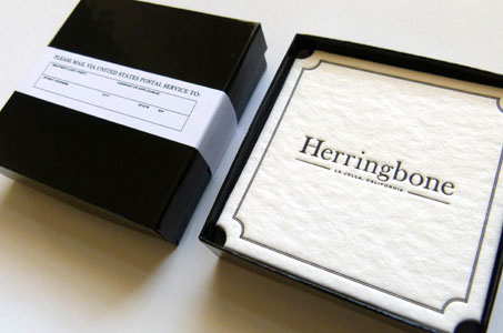
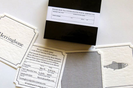
A shiny black jewelry box, with an unassuming white mailing label wrapped around it, contains four of the most beautifully letterpress printed coasters I’ve seen. The 60 pt. R-Board from Robert Wilson Paper has an amazing texture – think the ocean tide leaving rivulets as it washes across beach sand.
The four deep impressions that decorate each coaster (typographic logo, the invitation, a fish illustration, and a herringbone pattern that sets your eyes dancing) are printed in simple, elegant black. A double-line rule and diecut notches at each corner frame the coasters for a refined finish.
And while it may serve as a practical way to fill space and raise the coasters to the top, the addition of jewelry batting in the bottom of the box really shows care for the details that set any great design apart.


