 Some of the best design out there slips quietly beneath the radar; you won’t find it winning awards or toasted at social events for creatives. That’s because some of the best design is done by people fueled by their passion for the product. Graphic design student Matthew Lew looked past all the slightly dodgy bits of design in our shared environment to target something most people probably never really think too much about: TicketMaster tickets. Lew, though, clocks 20 concerts a year and even ushers at some events to gain entry, so he’s seen a lot.
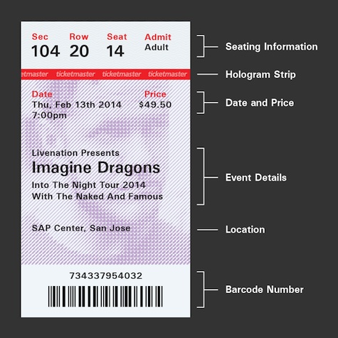
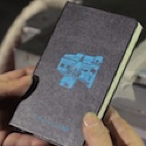
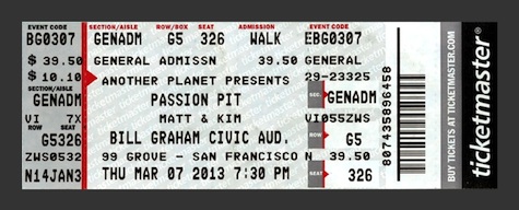
And he’s right: these pieces of paper that often sell for hundreds of bucks haven’t changed in 30-plus years (see below). As Lew puts it, “If TicketMaster is supposed to be the best service to buy tickets, maybe its design should live up to their name.”
With that in mind, Lew designed an alternative ticket that he thinks TicketMaster should use.
The problems
Though he lists a number of problems with the current tickets, the five biggest are:
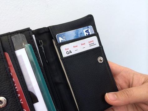
1) They’re too long to fit comfortably in billfolds or pants pockets.
2) They’re too hard to read in the dark, which is where they’re usually read.
3) They have no anti-counterfeiting measures. As Lew observes: “If tickets cost $50+, shouldn’t it have the same anti-counterfeiting tactics as a $20 dollar bill?”
4) There’s too much info crammed on there, most of which is unnecessary, since scanning the barcode will tell venue staff right away everything they need to know.
5) They’re butt ugly. Unlike nearly every other piece of paper we receive in our daily transactions, concert tickets are saved and treasured by a great many people. Shouldn’t they have more to look at than a hodge-podge of all-caps letters?
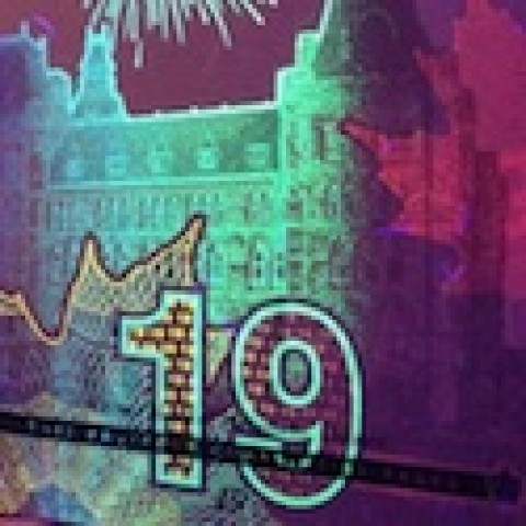
The solution
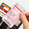
And here’s what Lew came up with. Beautiful.