 by Sabine Lenz
Editor’s note: Next week, PaperSpecs will introduce “Inside the Design Studio,” a new video feature for our PRO members that explores the creative process behind some of the most exciting projects we’ve seen. The first episode, posting Sept. 18th, will go behind the scenes with Rosslyn Kasman, the creative force behind the gorgeous Peacock Parfumerie packaging featured in our last Weekly Paper Inspiration.
To give members and nonmembers alike a taste of what’s to come, we present a preview in the form of this Paper Tip, which explores a tiny part of what’s covered in next week’s premiere episode of “Inside the Design Studio.” Enjoy 🙂
How do you translate the sublime pleasures of scent into packaging designed to make perfume bottles fly off store shelves? As we learned, it begins with color.
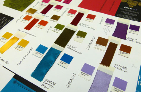
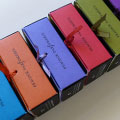
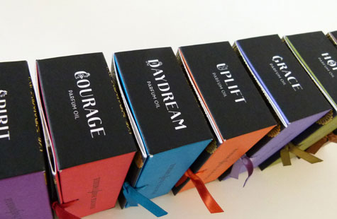
To differentiate between the nine scents in the Peacock Parfumerie collection of mid-market fragrances, San Francisco designer Rosslyn Kasman came up with “a color story based off that scent name and what color it would evoke,” she explains. For example, “we used a deep gorgeous rich magenta for Allure, cyan turquoise for Daydream, and a bold red for Courage.”
[PRO members: For more on what a “color story” is and why it’s so important to your design, check out this recording of the PaperSpecs webinar “Composing Your Color Story.” ]
[youtube=https://www.youtube.com/watch?v=http://youtu.be/CQ2TXD36tcA]
So far, so good. But Kasman had also hit upon the idea of closing the box by tying the front panel to the side of the package with a colored ribbon – different ribbons that had to be matched to each box’s color. This detail made the project all the more challenging.
“There’s greater flexibility in terms of printing and not as much when it comes to sourcing colored ribbons,” she admits.
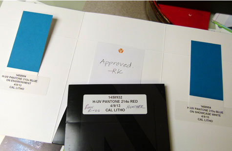
“We had a lot of challenges on the PMS colors because they were 9 special,” adds Heather Hitchcock, account executive at Calitho, which produced the boxes. “We were basically matching the colors on press to a PMS color, yes, but also to the ribbon. [Kasman] spent hours and hours taking these ribbons and finding just the right PMS color… .We took that PMS color, we did draw-downs, and we tried to get as close as we could. You’re not usually mixing UV inks on press, but we did little tweaks here and there because they were close but not right until ink hit the paper.”
After all the worries over color and the endless press checks, Kasman is sanguine about the whole experience. “I think the color really sells the product, and really tells a story about scent.”
PaperSpecs PRO members, don’t forget, the first episode of “Inside the Design Studio” posts on Sept. 18th. Not a member, but curious to see what “Inside the Studio” is all about? Why not sign-up for a PRO membership today? Hope to see you there 🙂
—————
 Seeing designers worldwide struggle to stay current with new papers and paper trends inspired Sabine Lenz to create PaperSpecs, an independent and comprehensive Web-based paper selection tool and weekly e-newsletter. Growing up in Germany, she started her design career in Frankfurt, before moving on to Australia and the United States. Lenz worked on design projects ranging from corporate identities to major road shows and product launches. From start-ups to Fortune 500 companies, her list of clients included Oracle, Sun Microsystems, Deutsche Bank, IBM, and KPMG. Lenz is a noted speaker and author on paper issues and educational topics related to the paper industry.