 We’ve grown so used to coming across a fascinating piece of design on the Web and instantly being able to read about (or see a video of) how that project was actually made. Yet sometimes we find something featuring ample photographs, but only the vaguest hint of how it was created, leaving us to work it out for ourselves. (Behance is a good source of this phenomenon.) Hiro Noguchi’s Spirit of Japan brochure is an excellent example of this.
Here’s the brief:
“To create a visual identity of Japan; The focus is on the appreciation of a nature in colour and its stimulation of mood/emotion. Each colour was created by taking away the form of nature until it becomes just the abstract colour that compose them, which represents the passage of time in Japan. My attempt was to create an identity of Japan through environmental experience of nature in colour to convey unique attribute of Japan to seduce the audience.”
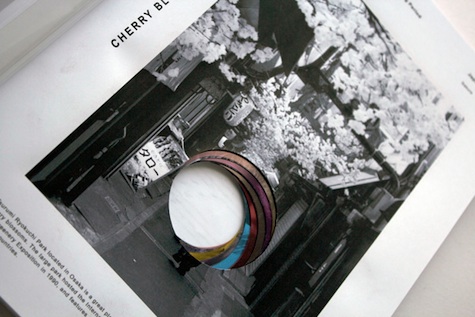
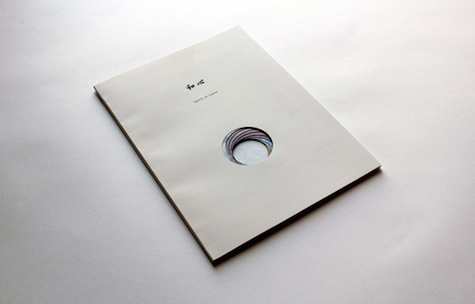
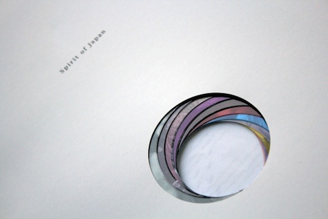
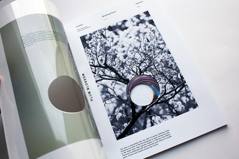
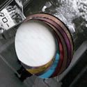
It features several pages, each with a circular die cut that is purposefully misaligned from the one before and after. The end result evokes a colorful camera aperture, with that swirl of different colors gently guiding you on a monochrome journey through various parts of Japan. For a brochure that begins with a near-blank, plain white cover, it’s an astoundingly impactful piece of work.