 After 34 years of focusing on brisk runs and feel-the-burn ab crunches, Self magazine is rebranding itself as a more traditional lifestyle magazine for women (read: more beauty and health content), with an impressive redesign.
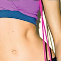
“We think there’s a shift in how women think of their bodies and beauty,” Vice-President/Publisher Laura McEwen told The New York Times. “Being fit and fashionable are really one.”
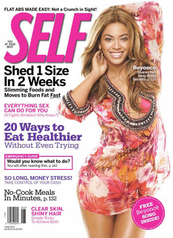
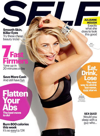
Um, no they’re really not. But leaving aside the magazine’s new philosophy for a moment (we’ll come back to that later), the new design is a refreshingly clean one. Its daring use of white space, large central images, and a reliance on bold-yet-slightly-edgy typography is a welcome change from the busy opulence that’s dominated the women’s magazine market for so long. Somehow it even makes the tacky cover callouts this genre’s known for (“7 Fast Firmers”) seem fun, thanks in part to the use of funky spot-color type backgrounds.
Editorial content gets a similar whimsical tone with sections such as “You Look Awesome in That” (fashion rears its perfectly coifed head), “It’s a Thing” (trends) and “Just Shoot Me Now” (advice for embarrassing reader experiences).
With its playful new design, it may well appeal to its 18-to-30-year-old target market, though McEwen’s description of these social-media-loving young women sets our teeth on edge. “The magazine is being edited for the women who think in 140 characters.”
Seriously? Just Shoot Me Now.