From the initial spark of an idea to stunning finished product, paper is there to hold our hand every step of the way. This week, we take a peek at three design projects of varying levels of print sophistication: the idea scrapbook of a children’s book author, an extraordinary handmade pop-up book, and an award-winning holographic print. (Previous Cool Designs of the Week can be found right here.)
Children’s Author Scrapbook Design
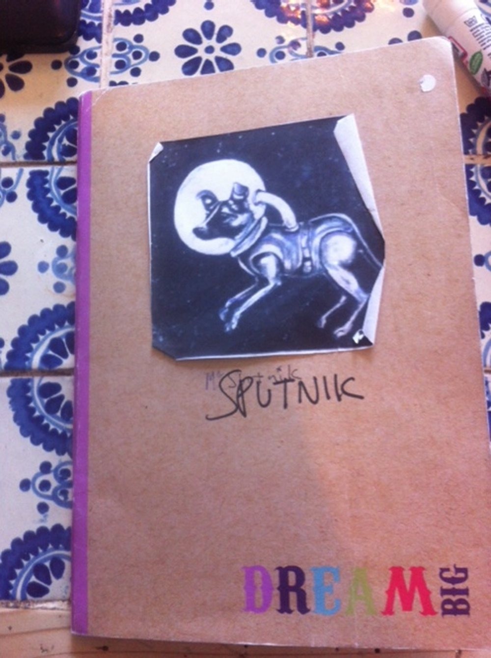
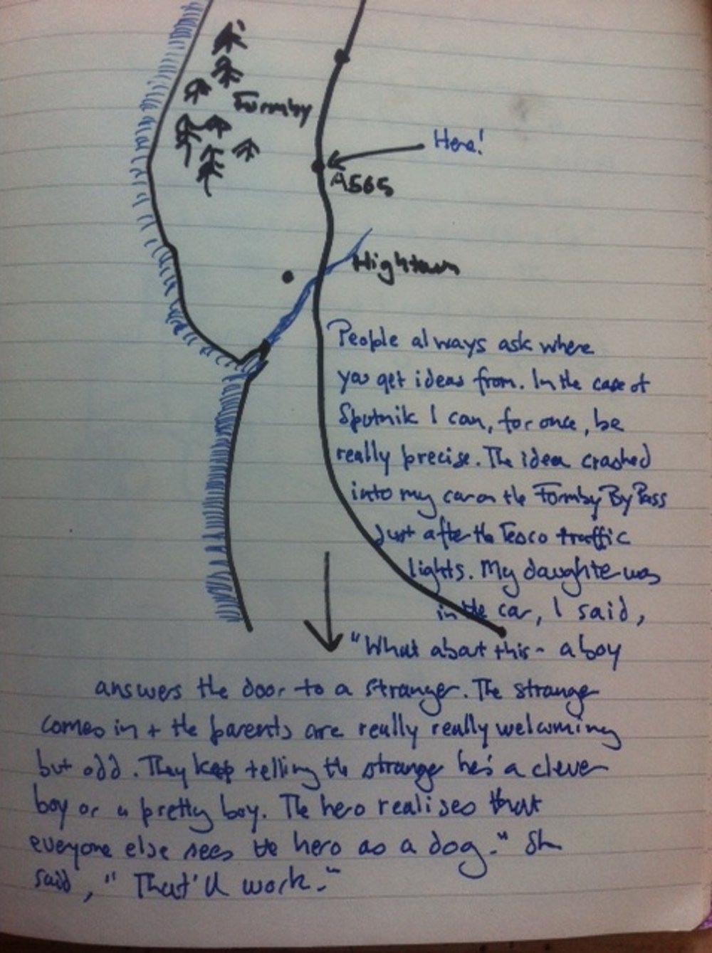
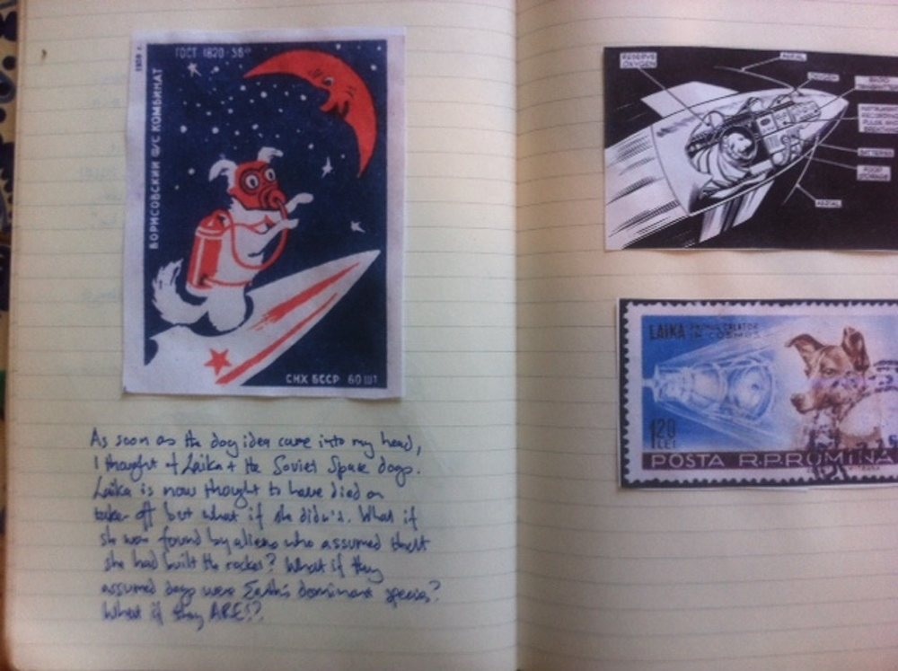
Few things thrill us more than taking a peek inside the notebooks of artists and designers, so you can imagine our delight when we saw the images below. Author Frank Cottrell Boyce begins each children’s book project by creating a scrapbook for it. The following pages are taken from the one he put together for his latest book, “Sputnik’s Guide to Life on Earth.” Says the author, “Whenever I think I’ve got an idea I make up a scrapbook and send it to my editor, Sarah Dudman. She will always tell me straight what is exciting in there – and what isn’t.”
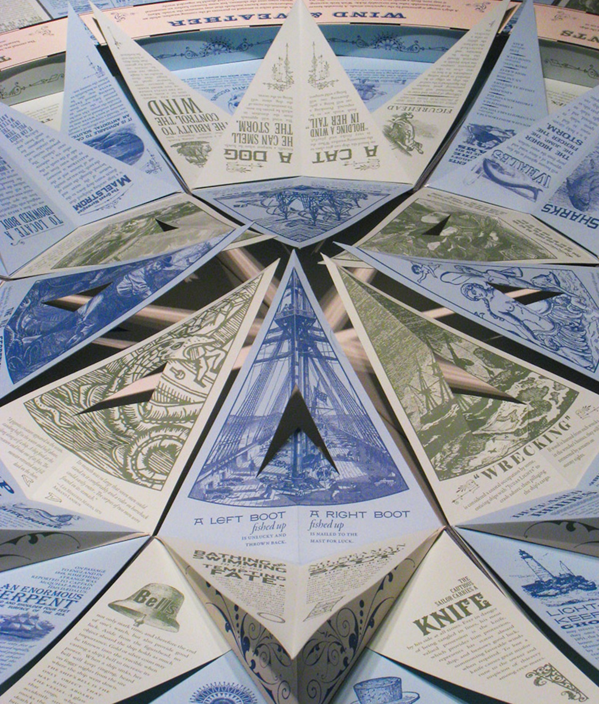
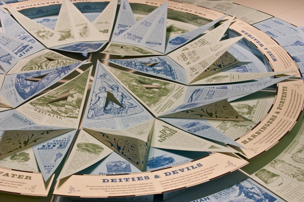
‘The Deep’ Pop-up Design
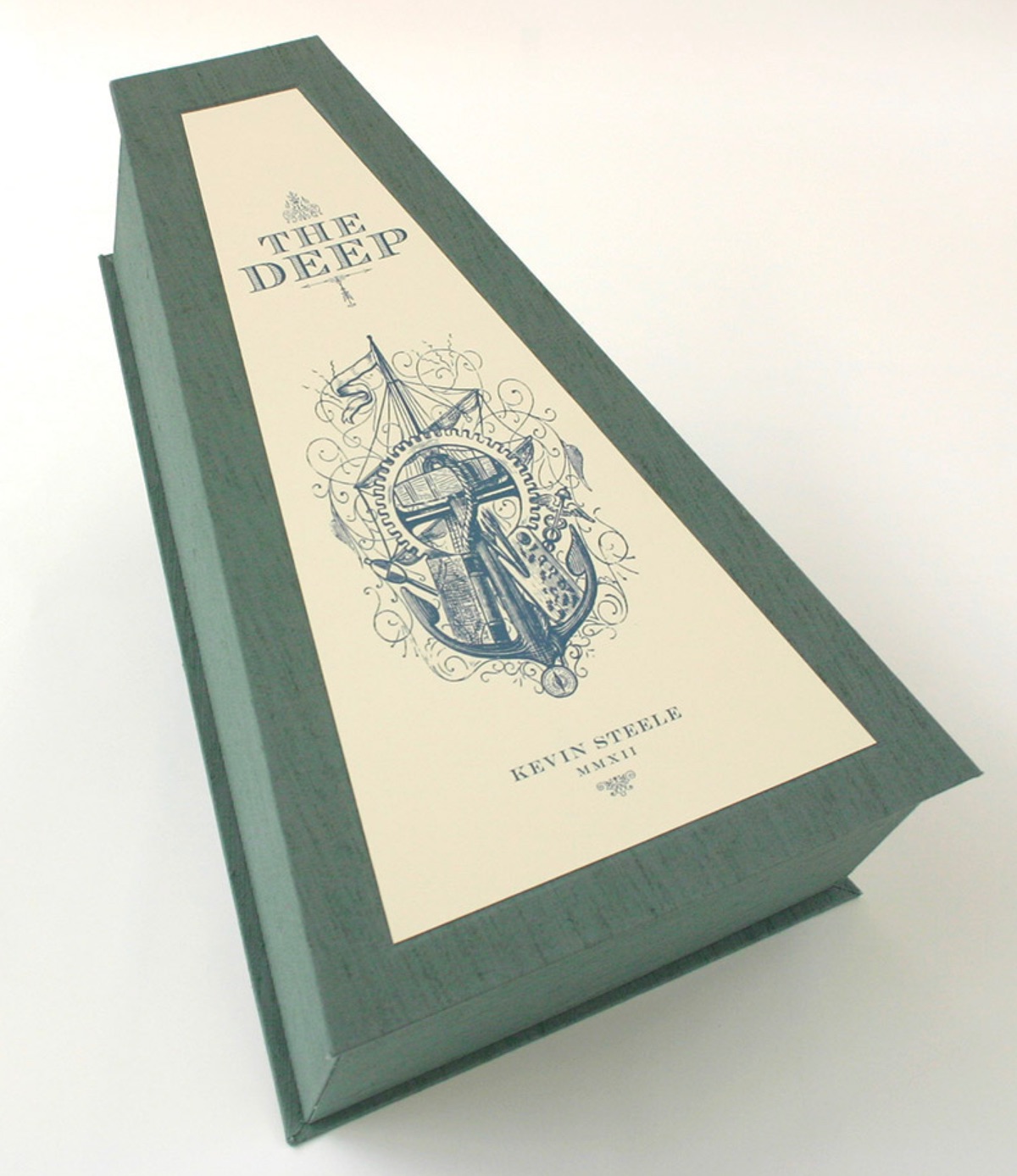
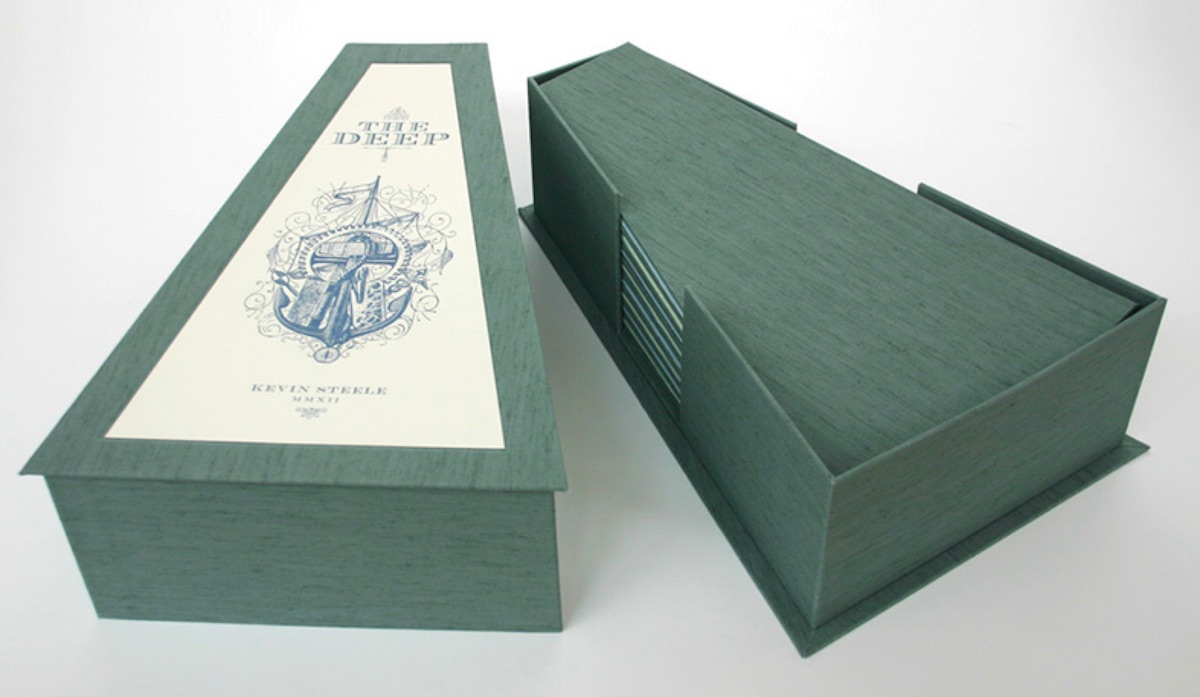
Artist/designer Kevin Steele seems to have discovered the secret to keeping your work fresh – always have a passion project going. And if it can serve as your MFA thesis, so much the better. His handmade work “The Deep” is a circular accordion pop-up book that resembles an enormous 8-point compass rose when unfurled, in the process paying tribute to mariners of long ago. Inkjet printed on Beckett Expression papers the piece is completely hand cut and assembled, and tucks neatly away in a wedge-shaped storage box when not being oohed and ahhhed over.
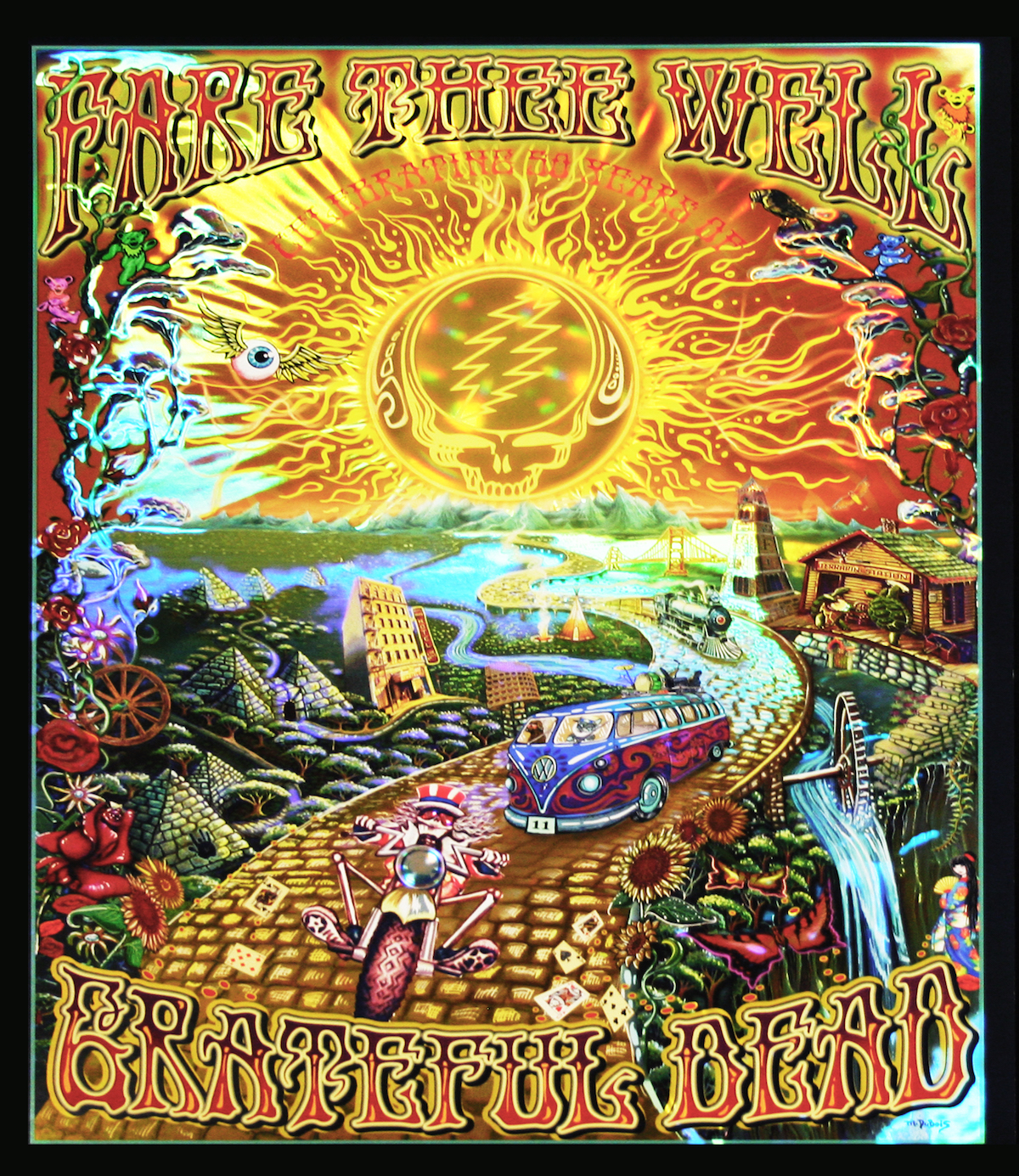
50th Anniversary Grateful Dead Poster Design
After more than half a century, it takes a lot to make psychedelic Grateful Dead art seem anything but “more of the same.” Yet Hazen Paper Co. injected a whole new dimension into this 50th anniversary print by Woodstock’s own Mike DuBois by using the transfer-metallized custom holography for which it’s known. Here’s what they did, according to the company:
“Multiple holographic techniques accented individual elements of the complex artwork, which features the skeleton of Uncle Sam riding a motorcycle down a golden road, a vintage Volkswagen bus, pyramids and other symbols suggested by song lyrics. Hazen-Lens delivered greater three-dimensional Fresnel-lens-like effects on the sun, the skull and the motorcycle. This technique was combined with rainbow holography, 2-channel holography, white-motion holography and micro-text holography in a single-write master design without recombination or shim lines. The .10-inch, coated-2-side solid bleached sulfate (SBS) substrate was transfer-metallized with Hazen Envirofoil, which features Ultracure coating for enhanced printability and provides essential lay-flat stay-flat properties. A.M. Lithography, of Chicopee, Mass., printed the posters using UV-cure inks.”
Last month, the print won an award at the 2016 annual management meeting of the Association of International Metallizers, Coaters and Laminators (AIMCAL), which surely must know their way around the Dead discography…