Wherever you travel in this vast world of ours, great design can be found everywhere, and wherever found, inspire. This week we take a look at a Swedish book about communication that boasts a cover that’s cool in any language, a postcard series that celebrates the fading fortunes of Soviet-era interior design, and a luxurious brochure for a South African hotel chain. (Previous Cool Designs of the Week can be found here.)
Swedish Book Cover Design
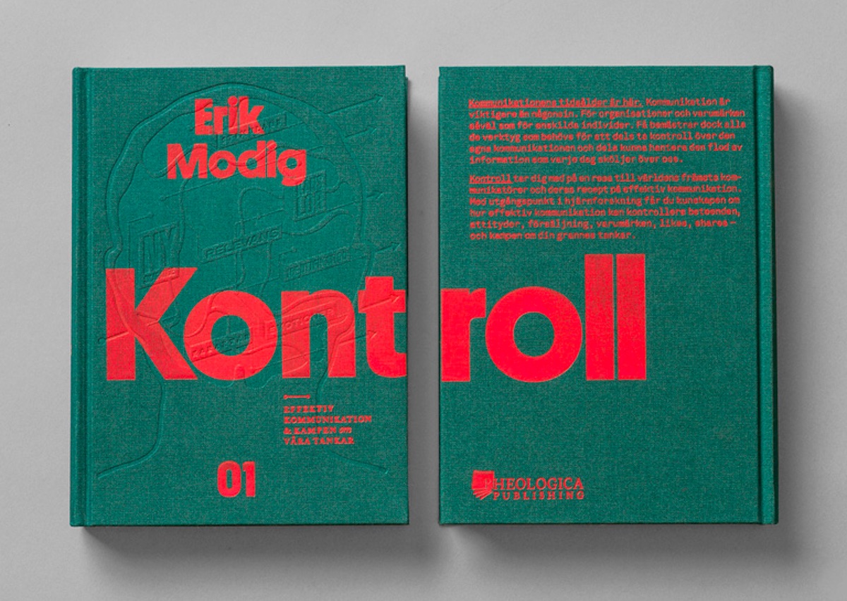
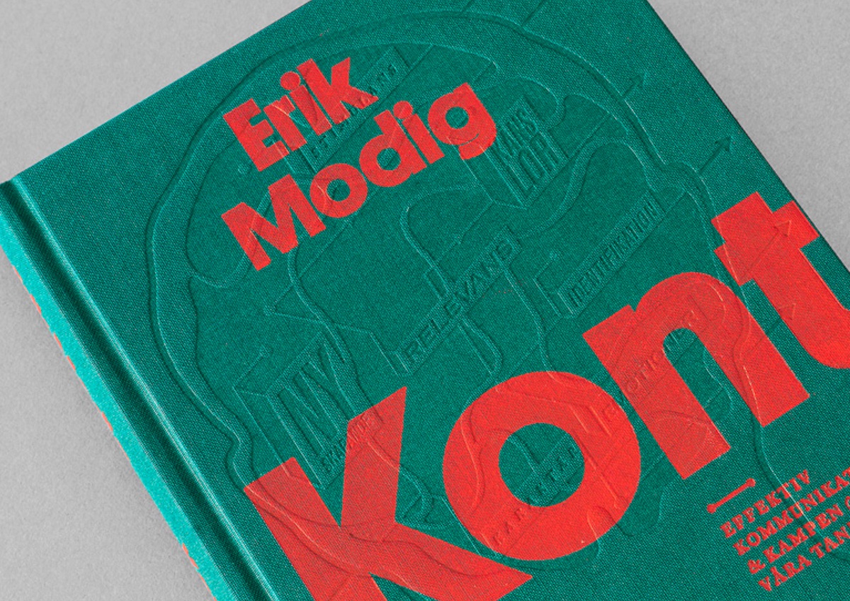
At a time when most book covers seem sooooo cookie cutter, the one Snask designed for Swedish artist/researcher Erik Modig’s book “Kontroll” is refreshingly bold in an understated kind of way (hey, we’re living in a time of paradoxes here). While the debossed mix of words, signs and connections in someone’s head is what grabs your attention, the red silk-screened lettering – particularly its interplay with some of that aforementioned debossing – is what keeps it.
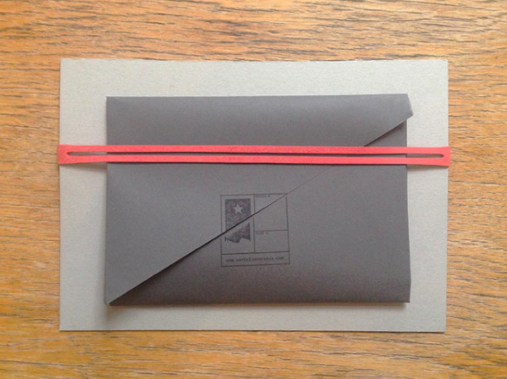
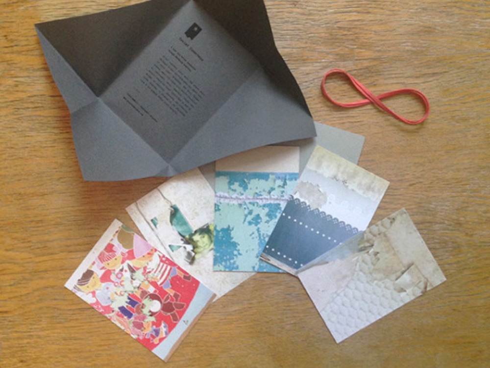
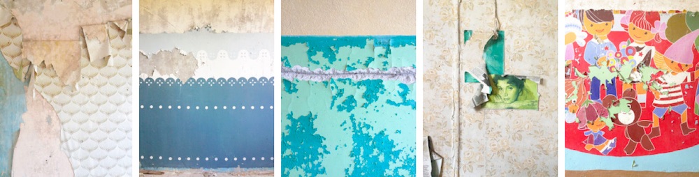
‘Soviet Innerness’ Postcard Design
Photographers Alessandro Calvaresi and Elena Amabili g0 around former Eastern Bloc countries snapping pictures of the insides of homes and buildings. For roughly $11, you can get a set of five postcards from this project depicting the crumbling wallpaper and whimsical illustrations to be found in these former dwellings. These are a sobering example of people’s perseverance under an oppressive regime, and proof that inspiration is everywhere – you simply need to look for it. Even the hand-folded/rubber-stamp packaging the cards come in evoke the gray, utilitarian impression Westerners have of the Soviet era.
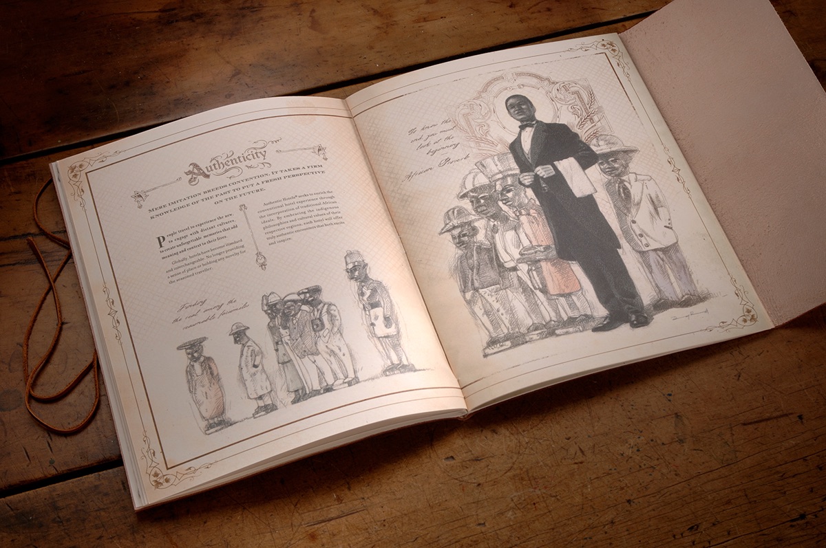
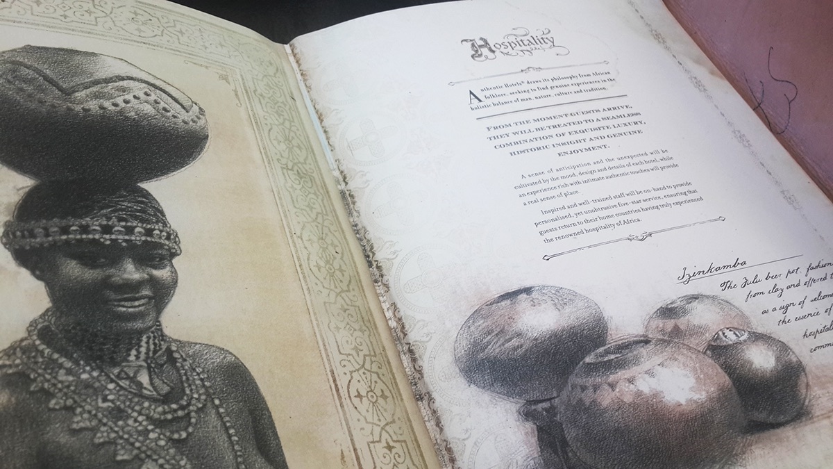
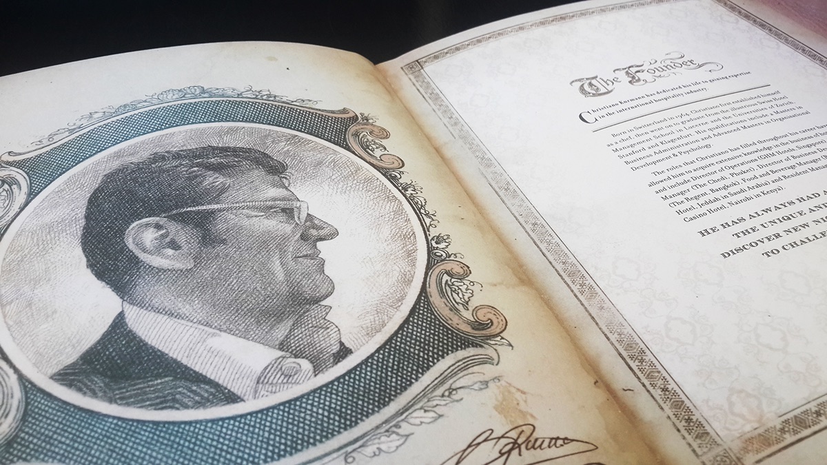
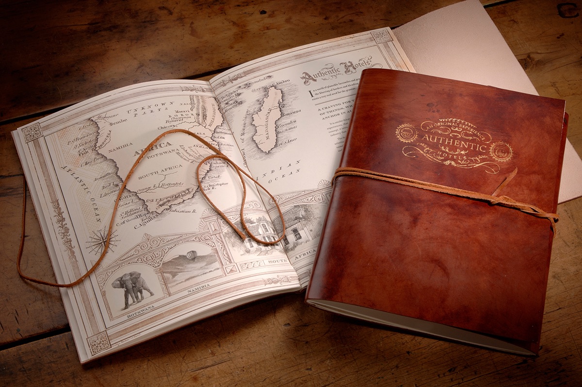
Authentic Hotel Brochure Design
One of the occupational hazards of traveling the world through design is that occasionally you brush up against hints of a nation’s turbulent past. In the case of this gorgeous brochure for the South African 5-star Authentic Hotels chain crafted by the Bitter Suite Communications Agency, it is the sense that there is more than a whiff of Apartheid-era colonialism lurking at the edges of its illustrations. That said, this is a marvelous piece of work that beautifully blends traditional motifs and photo-realistic illustration to maximum effect. The leather cover and closure combined with the plains-brown color scheme instantly put one in mind of Ernest Hemingway-esque safaris. Perhaps just as with any trip, it’s always a good idea to limit the baggage you bring with you here.