DVice One (1), a capabilities brochure/serial publication for Digital Color Concepts designed by WITH Creative, won PaperSpecs Gallery’s Take Note Award.
Earl Gee, partner and creative director at Gee + Chung Design in San Francisco and judge for Quarter Three awards, was immediately drawn to the over-sized publication with questions on how the piece was cut and assembled in such an unusual way.
“Everyone who sees this wonderful project for the first time instinctively wants to straighten what appears to be askew edges,” says Sabine Lenz, founder of PaperSpecs.
Why? A serendipitous event became the inspiration for this project.
“I happened to be walking around the studio one day, dropped a manila folder and then tried to shuffle it back together,” said WITH Creative Director Jonathan Gouthier. “I said, ‘Wow, what a brilliant concept of something falling apart and not being able to get it back together.’”
Gouthier used the visual inspiration of disparate edges as a jumping off point to create a high-end publication that showcased Digital Color Concepts’ retouching and printing capabilities.
 Achieving the Look
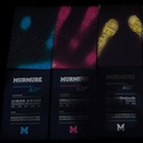
To get the look of papers no longer in perfect alignment, the 4-page forms of the 24-page brochure were diecut to produce angles reminiscent of a Stealth fighter jet. The spreads were then gathered together and secured with a clear rubber band.
Since the client also wanted to produce an ongoing series, it meant a name for the publication would need to be chosen.
The name “DVice” sprung from a commonality that the key players possessed – each uses a “device” to do their jobs. The printer (Digital Color Concepts) has a press, the photographer (Peter Hapak) has a camera, and the designer (WITH Creative) has a computer.
Going even deeper, the notion that a person can do something seemingly innocuous (like collecting beautiful material possessions), only to become corrupted or distorted by the act, informed the selection of copy and photographs, and ultimately the theme of the first issue – White.
“It was important that when the person received this thing that it was all white and not just a white square. There has to be some sort of context where the text and the imagery relate to each other. That’s where these jutting out pieces of paper happen. When you open it up, you’re slam bam with a full-bleed image of someone’s skin. All the photography is with dancers, whether that’s a close-up of their skin or of their facial expression or them actually dancing. That’s pretty powerful because people don’t realize what they’re actually looking at when they open the piece,” explains Gouthier.
While the brochure was laid out efficiently on only three sheets of paper, production on the piece was complex – a different diecut pattern for each form, alignment of photographs that crossed over spreads, achieving a squareness that would allow the spreads to be taken apart and used as posters, running press tests on the uncoated stock to see how the images would look.
 Keeping It Together
Finishing was also challenging – hand collating and assembling the forms, using a large rubber band as the binding method. No detail was missed, and each was fully used as an opportunity to showcase intelligent design and excellent production skills – a debossed dialogue box on the front cover is topped with a business card-sized pocket that houses an introduction card. The pocket includes a thumb-notch to help you remove the intro card, but it was placed off center and in the shape of a “1” for the first edition.
“The other thing I love is removing the binding. We chose a clear rubber band so that it wouldn’t obstruct the full bleed image that’s shown on the inside spread. When you take that rubber band off, you can select the imagery that appeals most to you and use it as art on your wall. I think that’s its staying power. It’s a lasting piece when people are able to take it apart and do something else with it.”
The project definitely took guts to produce – from the concept to the subject matter, from the design to the copy, from the images to the execution – and that’s the result of what WITH terms “intelligent design” where strategic insight fuses with creative intuition, where the collaborative process goes deep, igniting a dialogue with customers about their businesses and the future of their brands.
“I always heard of stories where studios would sit down with their printer and their production team and go through the piece step-by-step discussing exactly what it’s meant to do. I really think it’s important when you’re producing a complex piece both design-wise and production-wise that you get everybody involved because they may have ideas – which they did here – of how to actually produce the piece so that in the end, it’s beautiful looking. That’s the point of print – something beautiful, something tangible that will always be there,” says Gouthier.
———-
The PaperSpecs Gallery was created to inspire and expose great achievement in the graphic arts industry by showing how paper plays an integral part in carrying our most imaginative creative impulses out to the world – and how wonderful design and skillful printing transform paper into an unparalleled vehicle for communicating marketing messages or conveying individual thoughts and feelings.
The Take Note Award winner is garnered from the top ten entries selected by popular vote of online visitors to the Gallery. Based on design, print quality and paper choice, a notable industry designer then selects the winning piece.
PaperSpecs Gallery Take Note Award winners receive an iPod nano and special recognition in the PaperSpecs e-newsletter as well as a video highlighting the winning piece.
Please visit PaperSpecs Gallery for details on how to submit your own designs for inclusion.