 Thankfully, it’s not often that news of a redesign prompts the question, “Gosh, is that magazine still around?” Yet that was our reaction on learning that the 119-year-old Billboard music industry magazine has just received a complete facelift courtesy of Pentagram’s Michael Bierut – arguably a rock star of design in his own right.
Starting with the Jan. 26 issue, Billboard is leaving behind remnants of its trade-newspaper-design roots to push beyond the boundaries – literally, with pull quotes, graphs and other data shoved off to the margins being a key change.
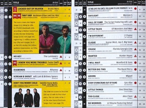
Perhaps most liberating of all, the tax-form-like matrix of chart positions for which Billboard is known now appear in a larger format (above), spreading across a greater number of pages, allowing the information to “breathe.” Textbook-highlighter-like bars that used to pick out key chart details have been replaced with larger colored boxes that also act as a better foil for slightly larger photos.
![]() Other changes include:
Other changes include:
- Renamed table-of-contents page featuring the best quotes from the week’s stories
- Headers paired with graphic bars inspired by the charts
- Design employing “a carefully coordinated suite of typefaces,” including LL Brown, Lyon Display and Atlas Grotesk for headers, Lyon Text for body copy, and Ziggurat for special features and advertorials.
The only quibble we have is with the use of color in the new logo: it appears on the website and in marketing materials, while a black or white version of the logo is used on the cover of the print copy. “This makes the print version look immediately more grown-up and serious, and a lot easier to design with full-bleed color photographs.”