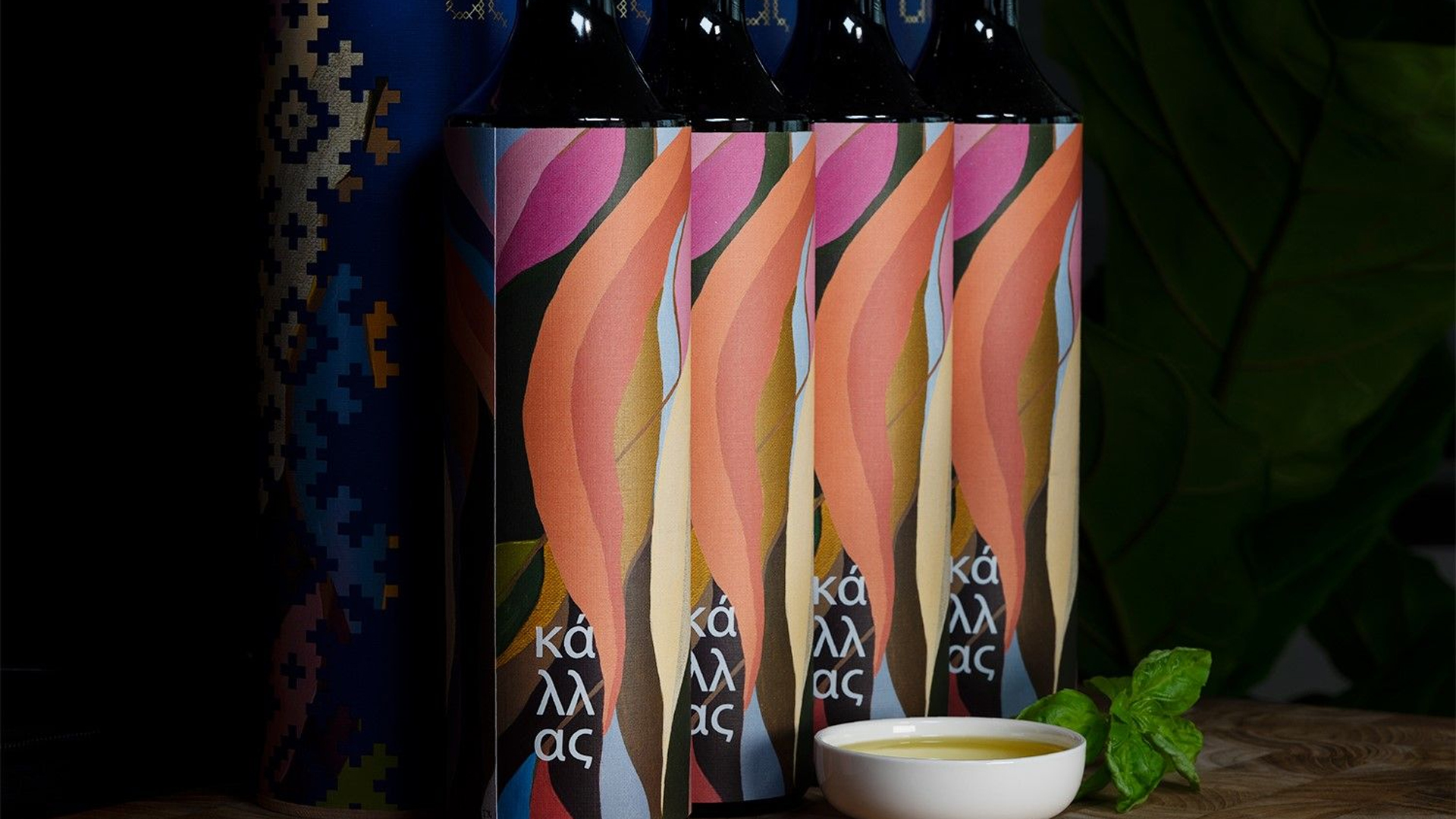
Since 2011, MET Fine Printers has skillfully crafted the creative packaging for the First Press olive oil that the Kallas family shares with that company’s friends and clients each year. Derived from the Greek orchards that have been in the family of MET President Nikos Kallas for more than 100 years, the oil turns out to be the perfect blank canvas for some truly exceptional packaging design.
This year MET, working closely with Letterbox Design, took a turn for the colorful with an intriguing tube/label combination that shows off the printing company’s capabilities and keen attention to detail, even as it hints at the exciting potential of the product within.
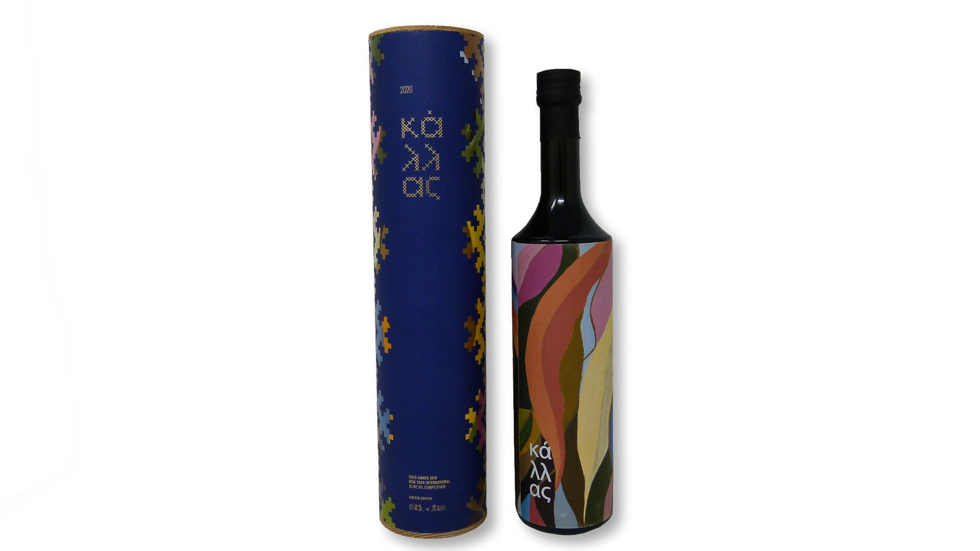
Olive oil, of course, comes in a range of different packaging nearly as wide and imaginative as that of wine and spirits. Yet more often than not it relies on the color of the oil itself to set the color palette as it shows through the glass bottle; seldom would you call olive oil labeling colorful.
Letterbox Design merrily threw this tradition out the window with the creative packaging for Kallas First Press by turning to modern Greek art and sewn linens for inspiration.
The Label: A Wave of Color and Texture
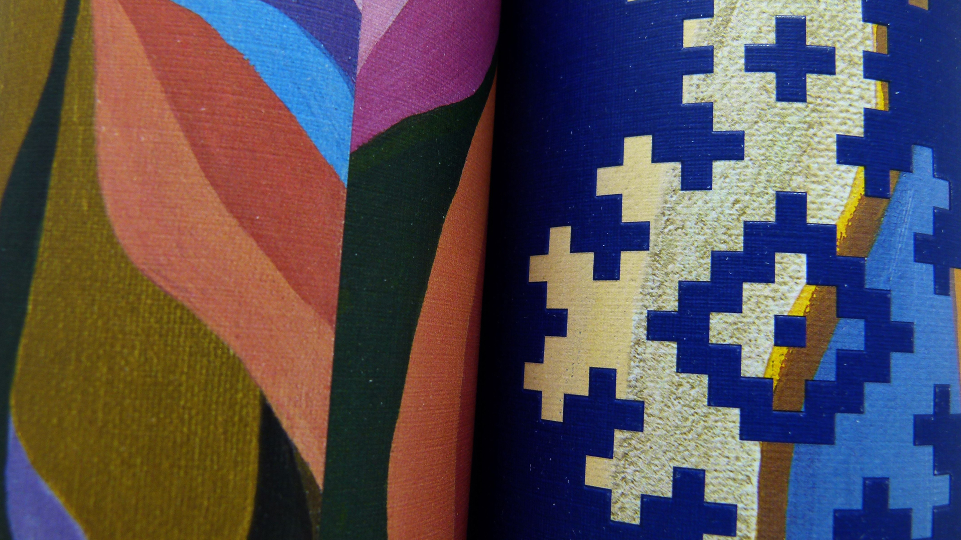
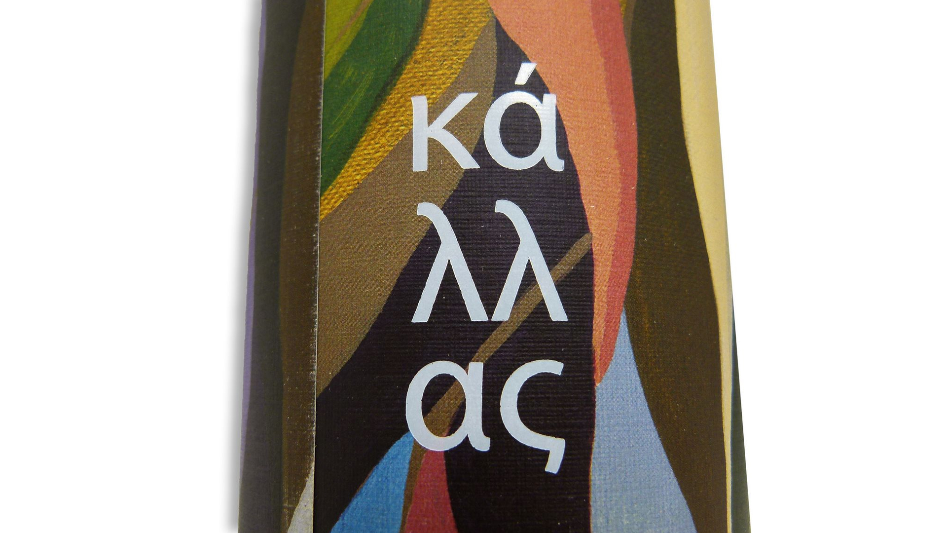
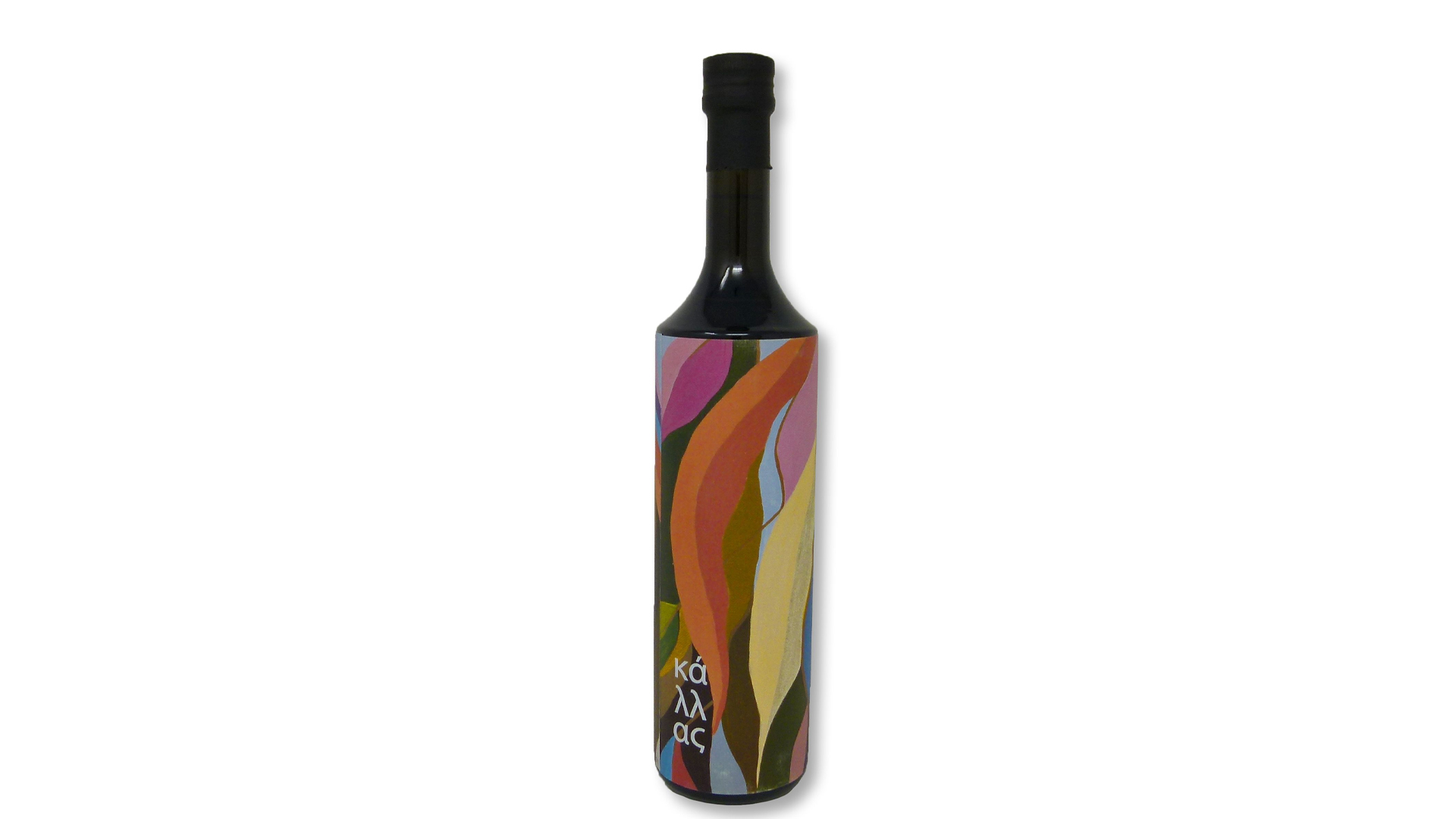
First they went with an opaque bottle, completely eliminating the oil’s hue as a design factor, leaving them free to explore a wide range of color possibilities. This they did in the form of a scrumptious-to-the-touch Neenah Classic Linen label [Get Swatchbook] LED UV offset printed with swirling waves of color, the Kallas name unobtrusively printed using the Greek alphabet on its surface.
Previous editions have muted the colors of its packaging to keep the texture of the labels front and center to emphasize the handmade quality of the product. This time they’ve found an intriguing balance between the visible texture of the sheet and the vibrancy of the colors printed on it.
An Equally Colorful Carton
Not content to stop there, MET crafted an equally colorful, and I think even more gorgeous, tube in which to package the bottle.
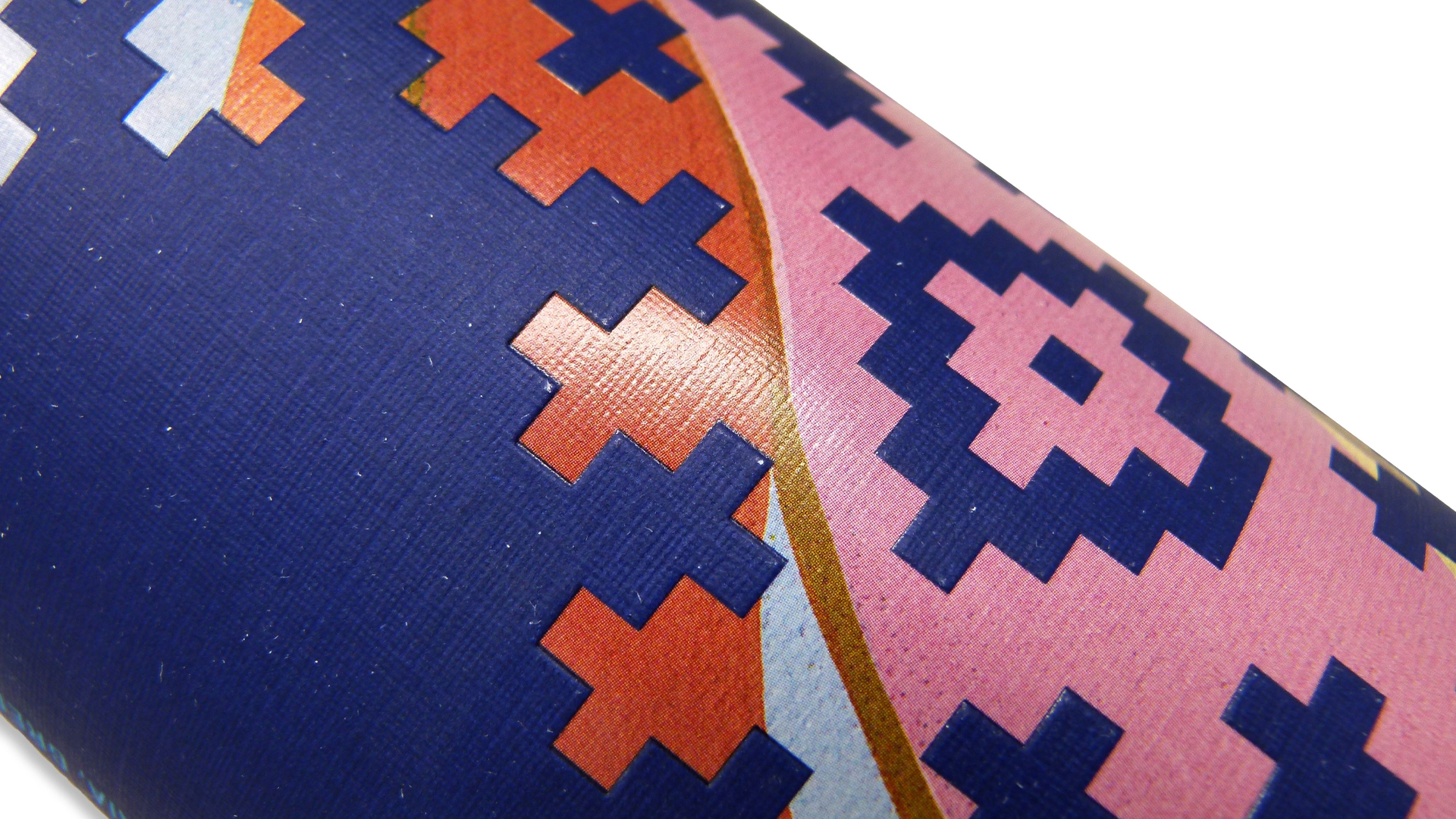
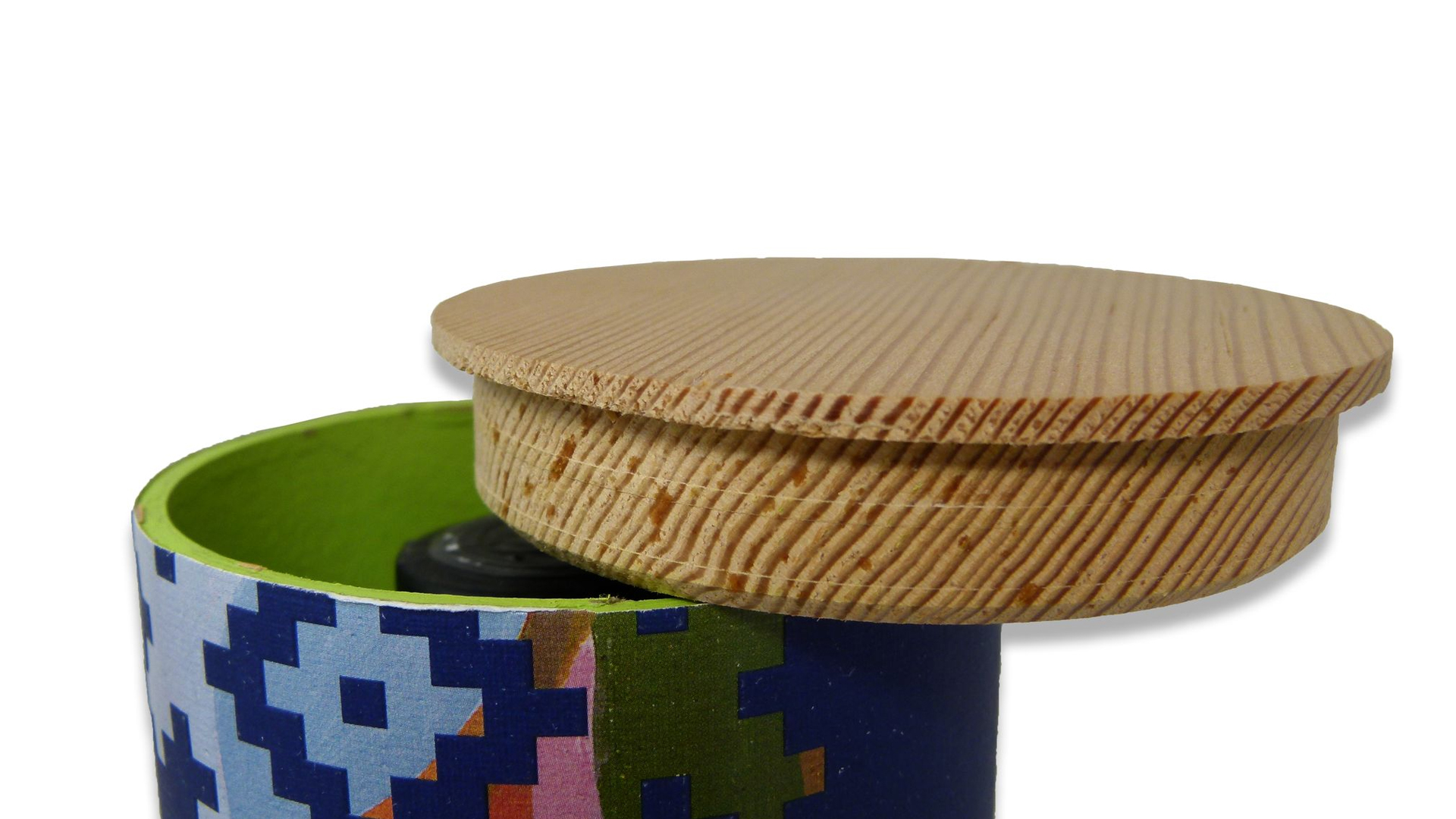
Sheets were printed CMYK with an extra touch of gloss varnish to enhance the debossed pattern, as well as Gold foil stamping for the company name and year, before being laminated to the tube, the insides and edges of which were painted a lively green.
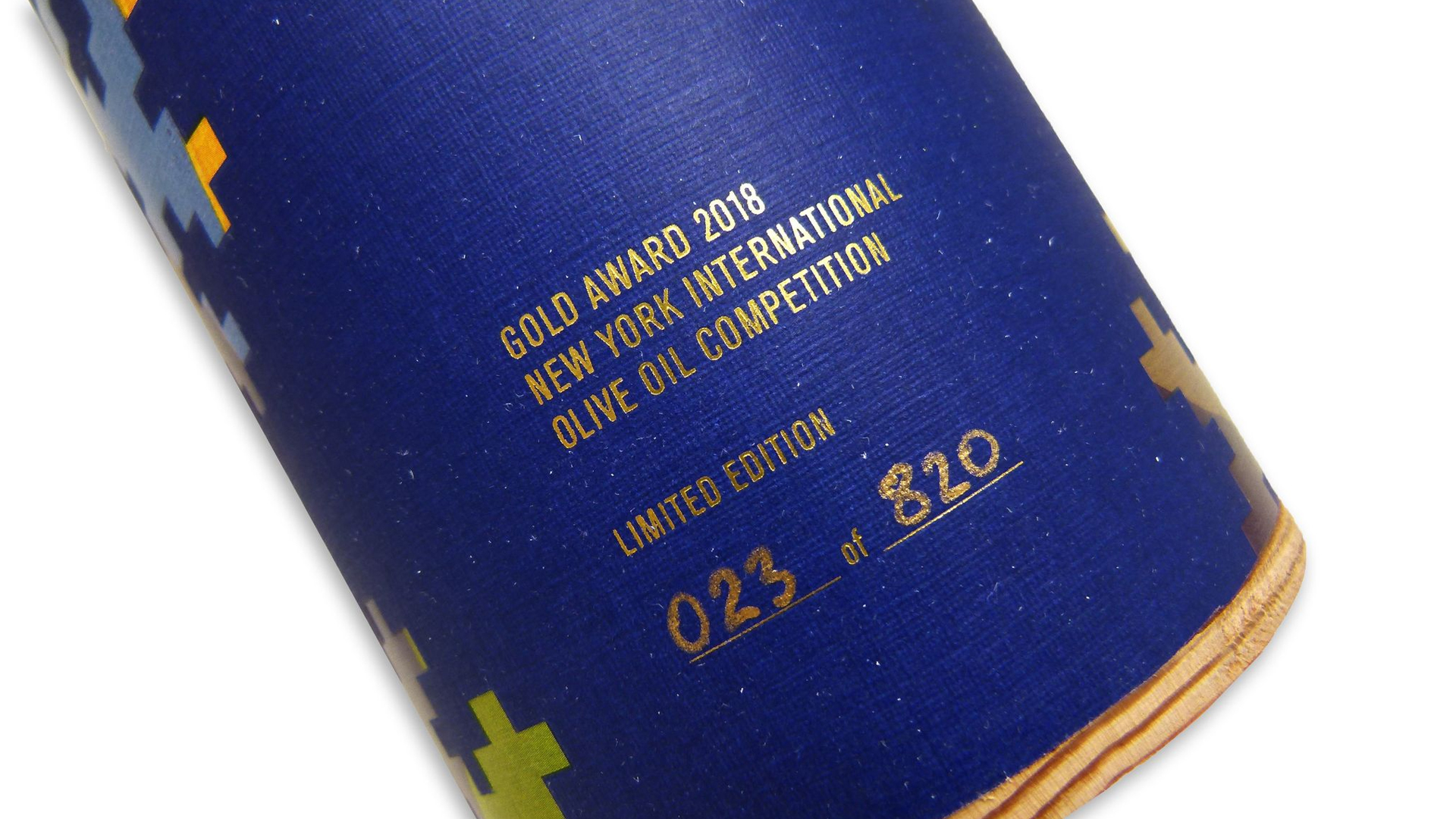
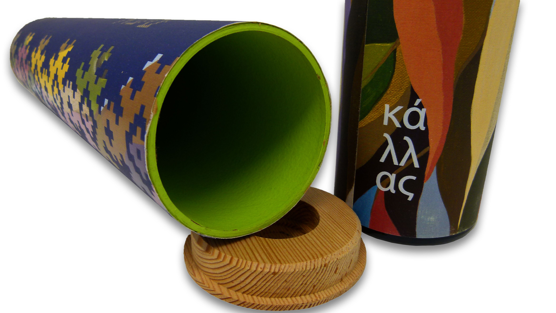
A top made from wood reclaimed from MET’s new printing plant renovations proved to be, quite literally, the crowning achievement to a truly inspiring creative package.


