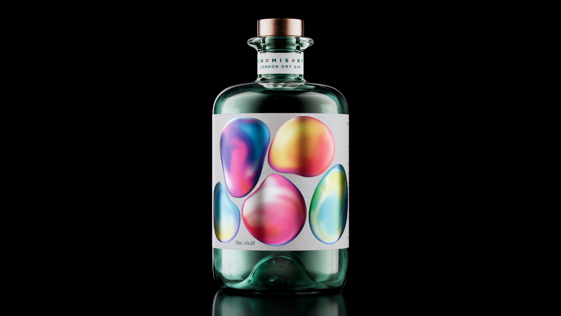
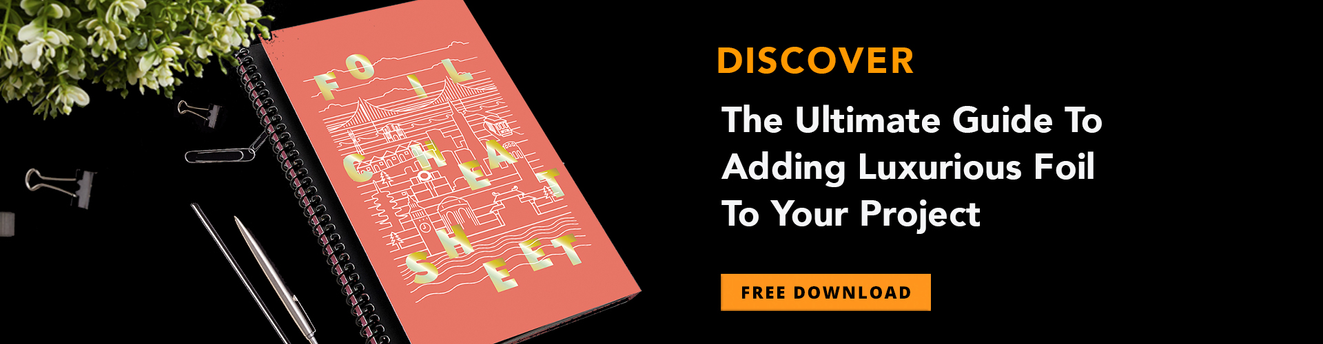
Gin labeling today rarely stands out on the wine and spirits shelf, often relying on a single-hue bottle and subtle design to attract attention. The trippy, psychedelic label for New Zealand’s Chemistry Gin, however, catches the eye and quickens the pulse using a surprising foiling technique and Clear Gloss varnish.
Crafting the Perfect Blend
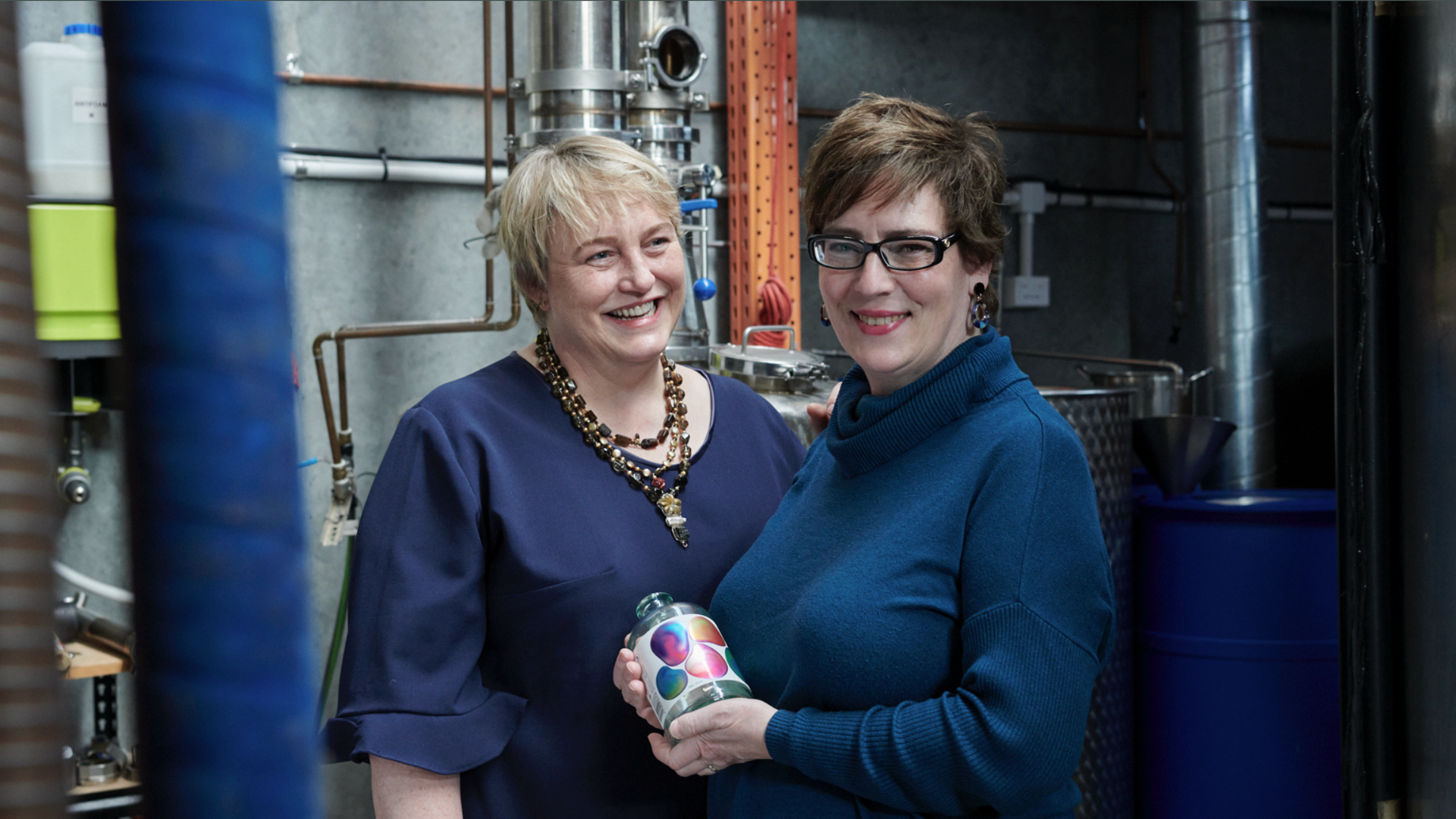
Karori Drinks Company Co-Founder Dr. Marie van Drimmelen, a biochemist, and her wife, Laura Bruce, crafted a gin using scientifically refined flavor combinations, hence the name Chemistry Gin. They designed the label to communicate the gin’s perfect molecular balance and to emphasize how relationships between people are a type of chemistry, too.
Captivating Design and Techniques
Design firm SingleDouble brought this idea to life, emphasizing the wonder of science and chemical interactions. Illustrator Igor Morski created colorful, abstract orbs that seem to interact with one another.
CGI renders: Tricycle Studio
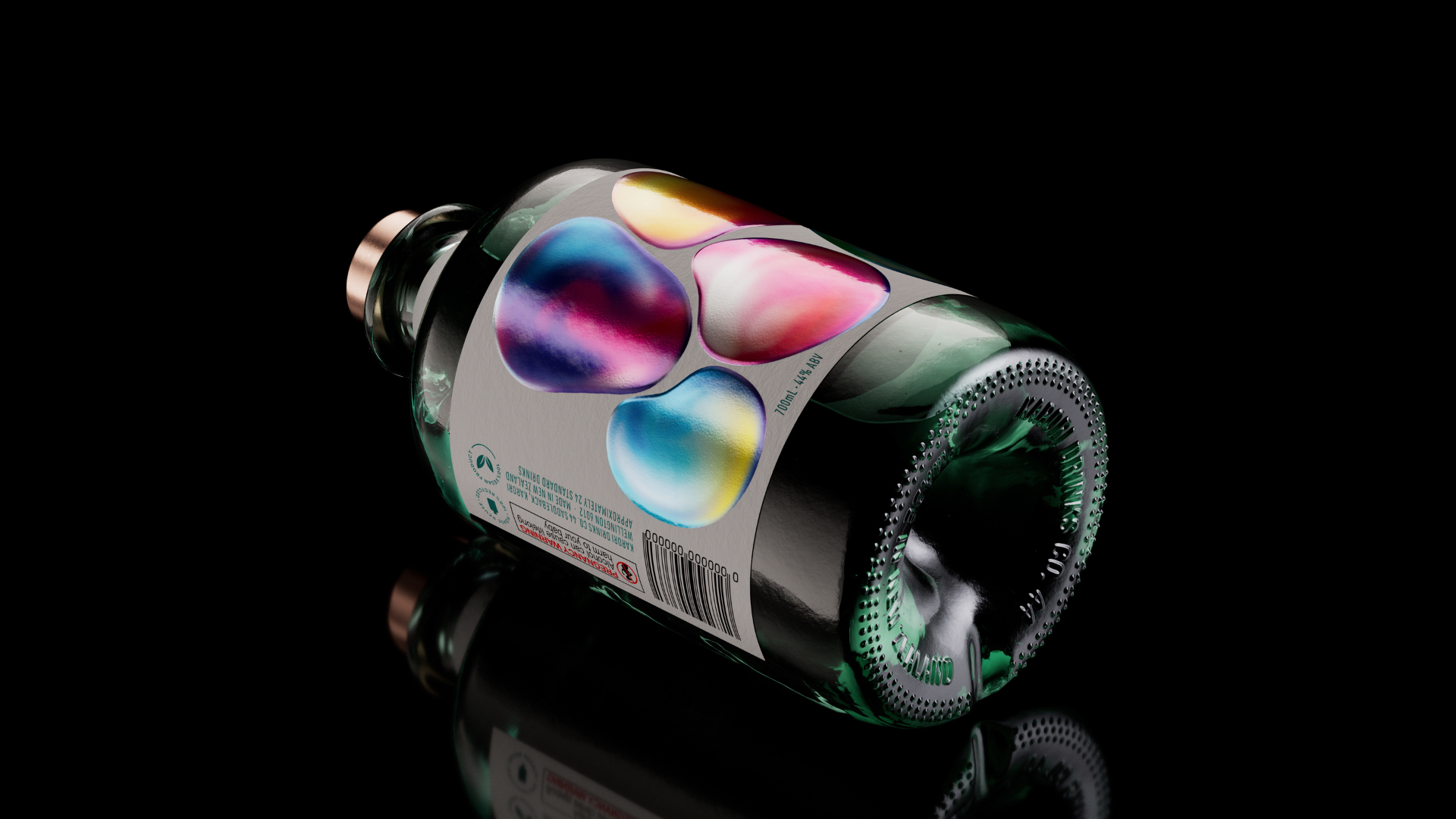
MCC Label applied Silver Cold Foil to uncoated Fedrigoni Manter Cotone Bianco, then overprinted it with CMYK to create shimmering, super-colorful designs. They topped off the designs with Clear Gloss varnish to give them an eye-catching, 3-dimensional quality.
CGI renders: Tricycle Studio
Commitment to Sustainability and Empowerment
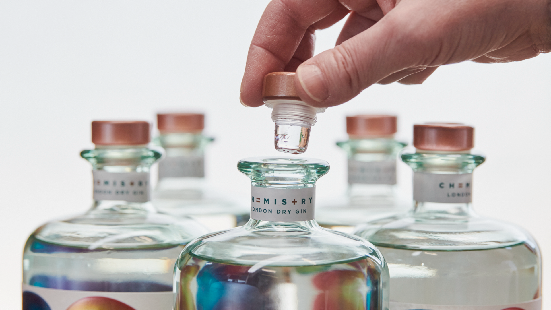
In line with Karori Drinks Company’s commitment to “treading lightly on the planet,” they make the gin from sustainably sourced botanicals and bottle it in 100% post-consumer glass, which requires up to 35% less energy to produce. The unique imperfections in each bottle’s glass add to its handcrafted look and feel.
The company has pledged to donate $2 to women early in their careers in Science, Technology, Engineering, and Mathematics for every bottle of Chemistry Gin sold.
Most people will buy Chemistry Gin for its super-colorful label, a multi-colored representation of how we are attracted to other people and nature, especially over a gin cocktail or two.
In fact, if you look at the label long enough you might almost swear the orbs are moving closer together, like bubbles in a lava lamp. You don’t have to drink the gin to experience this effect, but it can’t hurt 😉


