No matter how high-definition the video or how sharp the online images, nothing captures the essence of a place quite like a smartly-designed book of photographs. In his latest work, photographer Tadd Myers [projects/website] takes us on a lobster fishing expedition so convincing, you can practically feel the wind rushing through your hair…and that’s just on the cover.
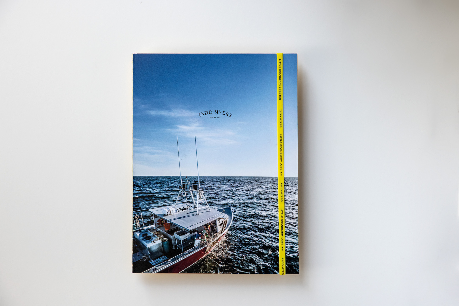
Offset printed CMYK by Villanti Printers on 80 lb. Monadnock Paper Mills Astrolite PC 100 Cover, “The Lobstermen of Little Cranberry Island,” in a mere 40 pages, brings the titular Maine community to life by emphasizing color and texture in the book’s design, photography and paper choice. And like the life it depicts, this piece offers a heady mix of the rough with the smooth.
The Rough: Textured Design Elements
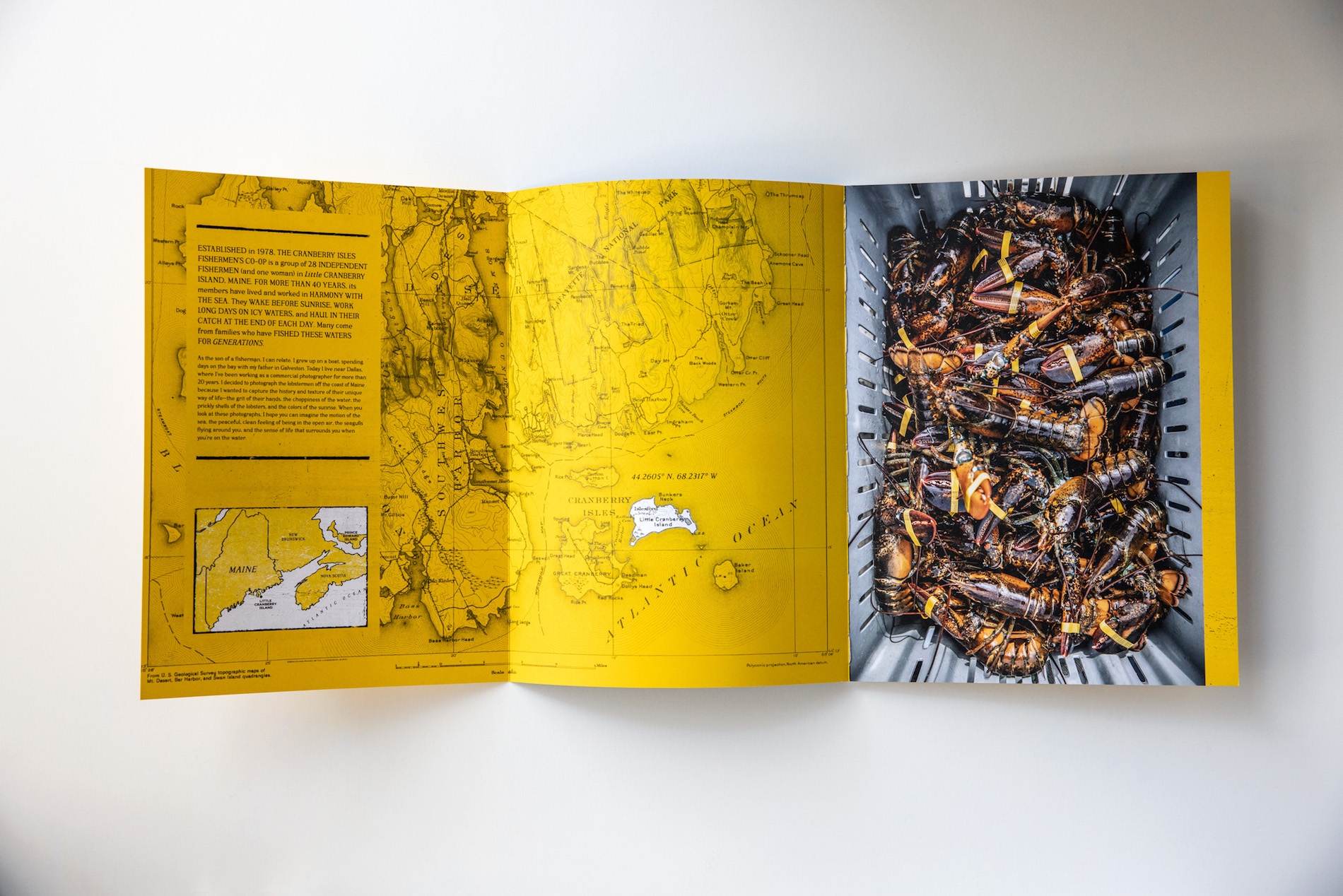
As Tadd reveals in the book’s introduction, growing up the son of a Galveston, Texas fisherman, he felt compelled to “capture the history and texture” of the Maine lobstermen’s “unique way of life – the grit of their hands, the choppiness of the water, the prickly shells of the lobsters, and the colors of the sunrise.”
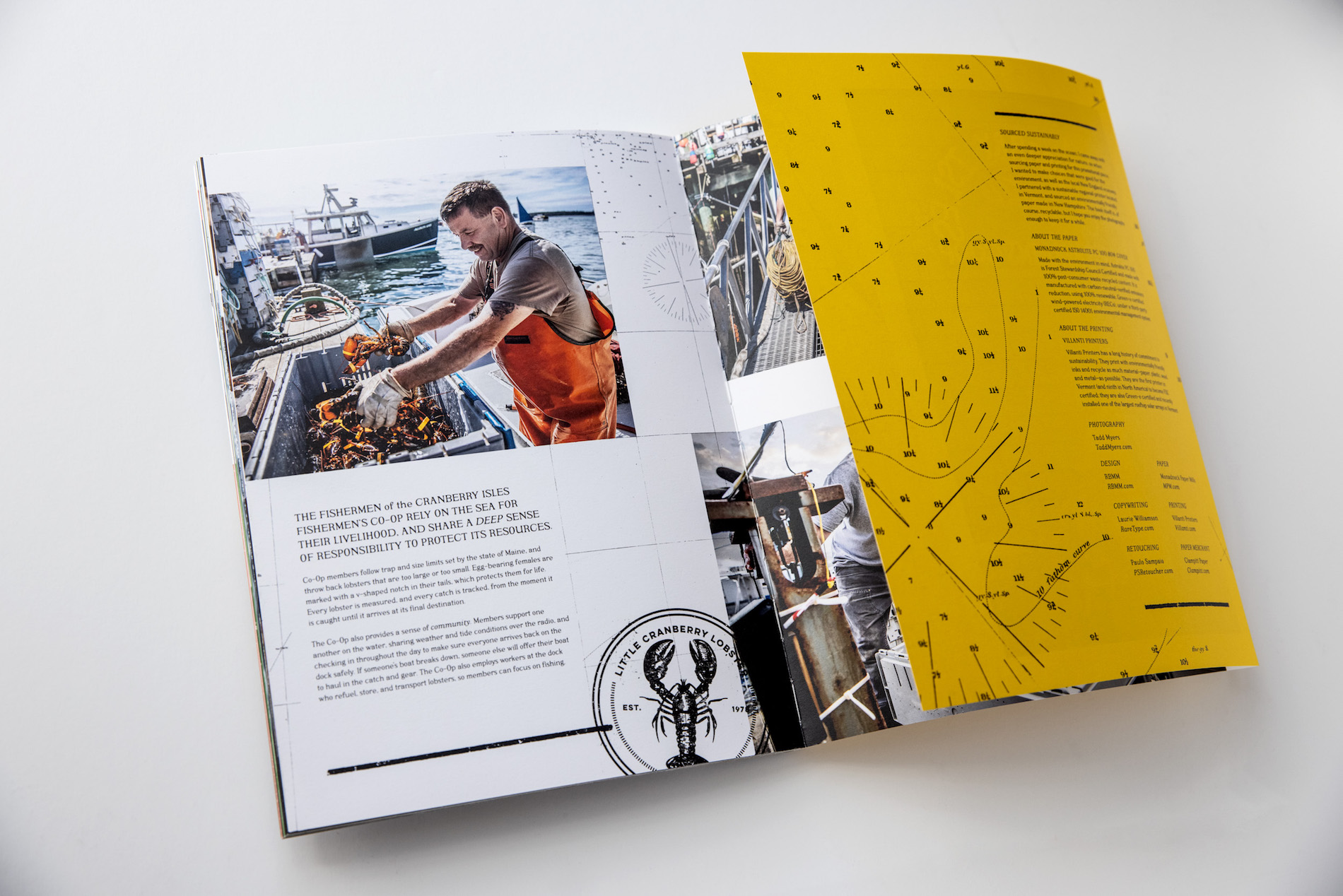
All of this grit and texture is expressed through RBMM’s design using elements sourced from vintage maps and charts of the Maine coast. Much of the typography also mimics hand-painted boat house signs and is set against colorful, weather-beaten looking backgrounds. Those colors come directly from the buoys used by the three fishing boats Tadd photographed for the piece.
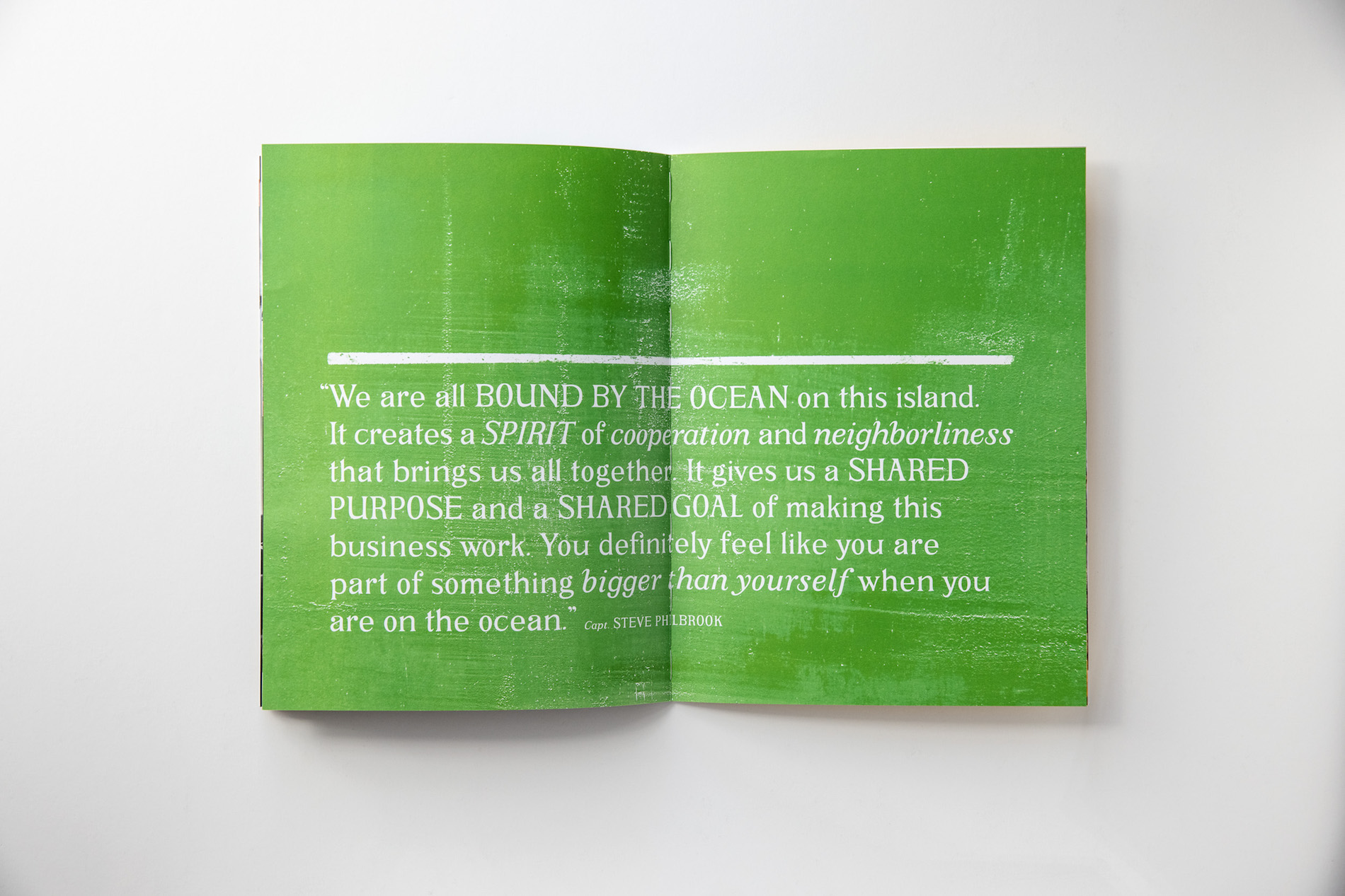
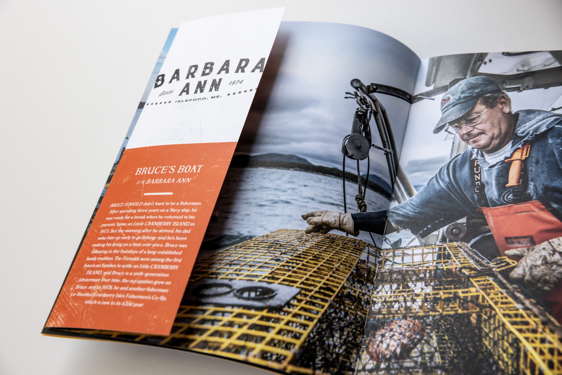
Each boat has a unique color and each gets special treatment here with an 8-page photo spread – the opening one featuring its captain – overlapped by a matching-color hinged flap featuring biographical info, all printed against a distressed looking background.
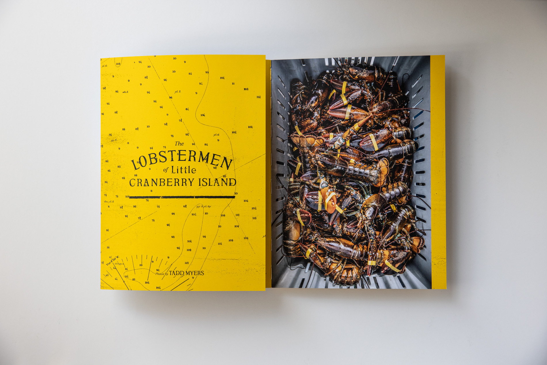
The piece’s front and back cover panels also open to reveal more maps of the coastal area, the book’s introduction, as well as print and paper details.
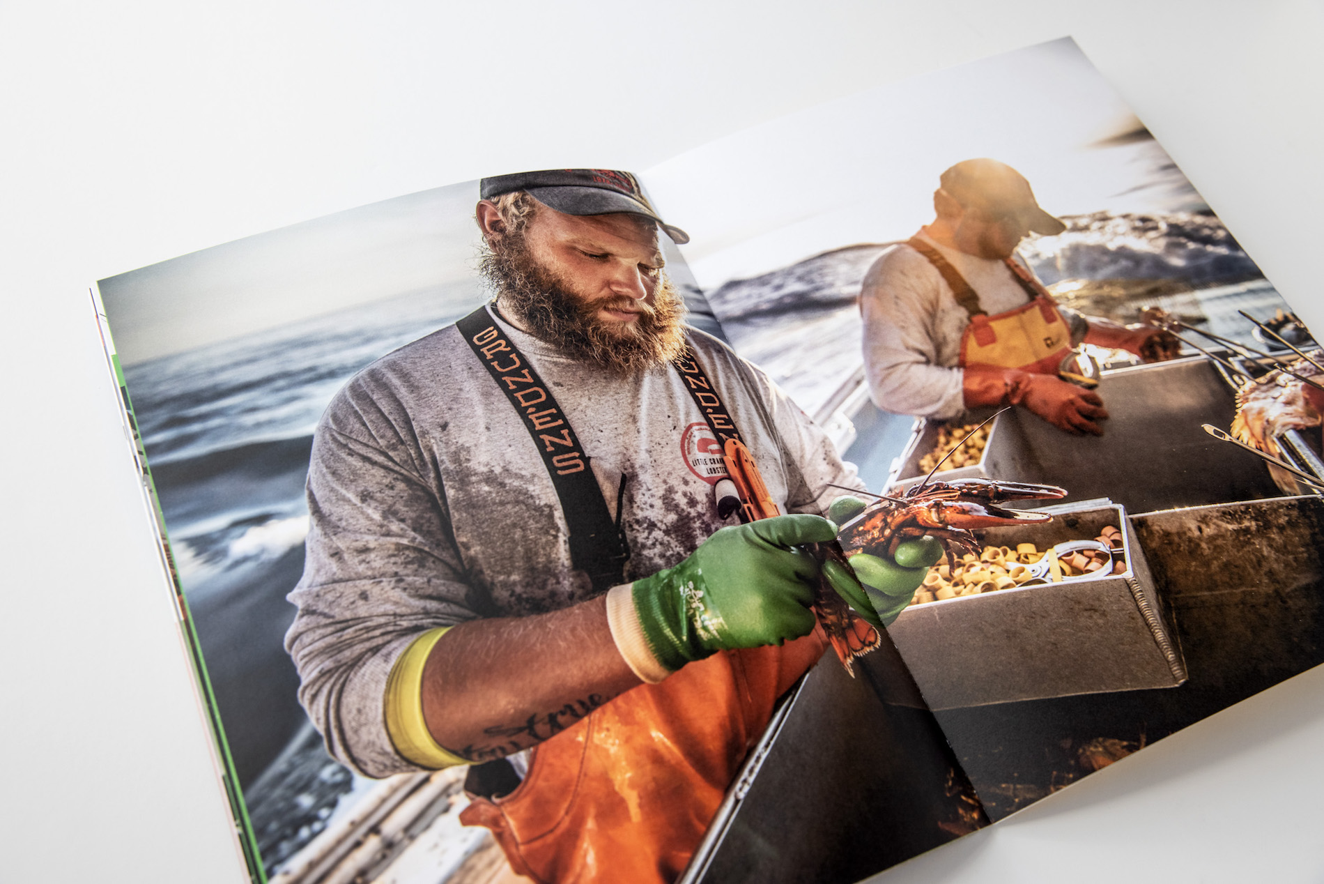
The Smooth: Beautiful Photography
The sea-beaten roughness of the design is complemented by the gorgeous, moody photographs taken both on the island and at sea on each of the three boats.
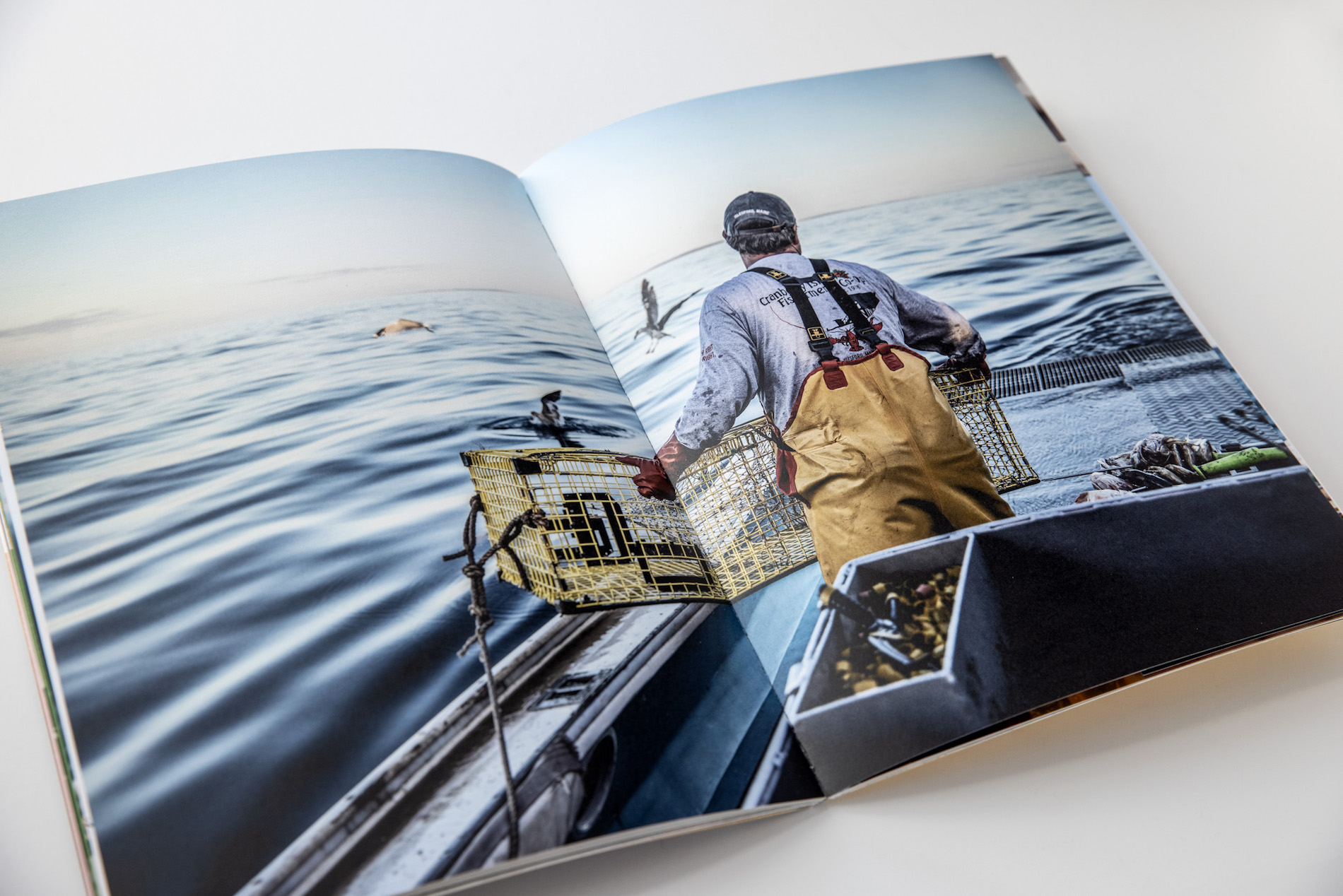
The lobstermen’s lives are shown to be much more vibrant and colorful than you might expect, from the searing Yellow of the lobster bands and the lobstermen’s own Orange waders and Green work gloves, to the deep Blue sea upon which they all depend.
The exquisite photographs are also given ample room to breathe, including some deeply contemplative 2-page spreads.
The choice of Monadnock Astrolite PC 100 – a 100% recycled paper that also happens to be a premium uncoated sheet – seems appropriate for this mix of rough and smooth, and makes the colors pop wonderfully.
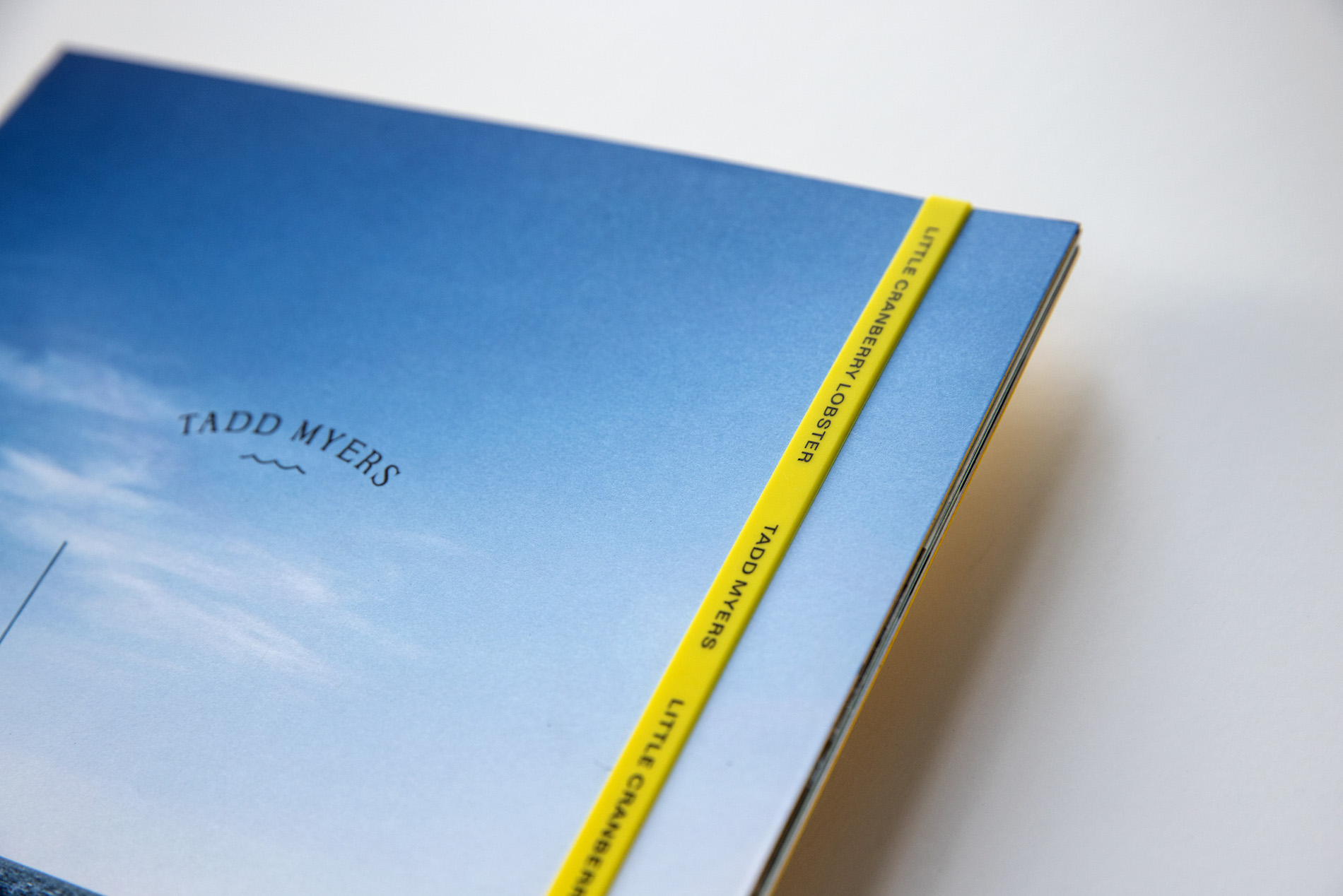
Rough and smooth also come together nicely in the exposed Smyth-sewn binding [PRO Guide to Smyth-sewn binding] executed by Superior Packaging and Finishing, giving the impression of something handmade and unfinished while also allowing the book to lay flat, perfect for those breathtaking spreads that seem as boundless as the seas. Ready for the finishing touch? A Yellow rubber band featuring the book’s title and Tadd’s name, inspired by the bands used to keep lobster claws closed.
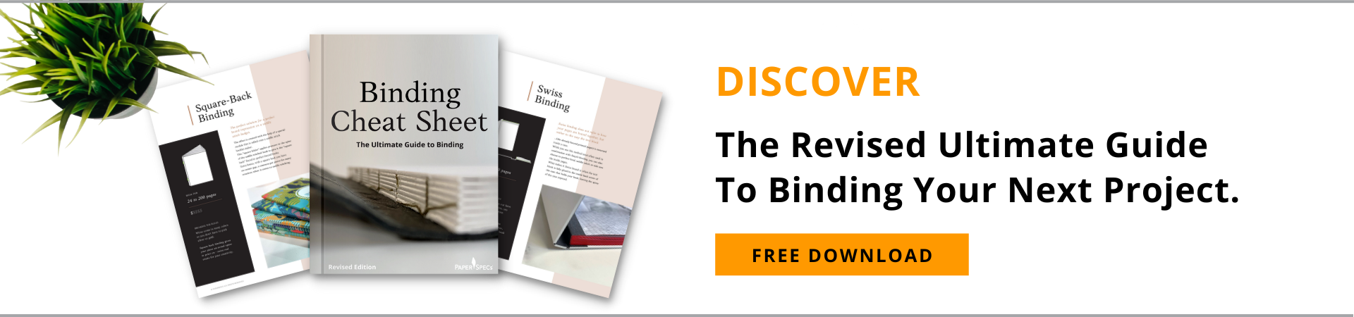
Smyth-sewing turned out to be the perfect binding for this piece, but there are a wide variety to choose from. Discover 12 of the most popular – including specs and pricing information – in our free Binding Cheat Sheet. Download yours right now!


dont forget to mention the paper merchant on the back page. 🙂
Do you mean the amazing, always helpful, couldn’t-live-without-them people at Clampitt Paper ( https://www.clampitt.com/ )? We wouldn’t DREAM of mentioning them 😉