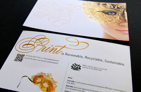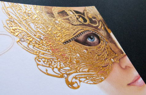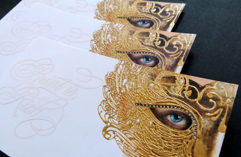
To showcase how a number of print processes could be combined to produce a product rich in tactile sensation, the Printing Industry Association of Southern California created this amazing handout for ChoosePrint.org at HOW Design Live.
So how many process were actually used? Attendees at the event were invited to the booth to guess. Those who posited offset lithography, digital printing, engraving, and foil stamping were correct!
In addition to using the design to showcase all the different processes the printer is able to produce, a QR code was also incorporated onto the back, linking to a video about print as a renewable resource.
Our favorite elements? The lacy mask with its eyebrow of diamonds looks positively three-dimensional. The decision to incorporate a pastel orange adds richness of color and detail. Mounting together two beautiful pieces of paper (Solar White Neenah Classic Crest on the front and Pearlized White Neenah Esse on the back) gives this postcard an extra thick (and yes, RICH) look and feel.
Print Is Rich Postcard was featured as a Paper Inspiration.
[youtube=http://youtu.be/T9mGxiFfylM]

