It’s so fun to compare projects for the same type of client (in this case real estate) by the same design team (And Partners, New York), especially when both are equally successful! (Check out the 845 West End Avenue pieces.)
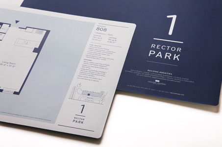
The font used on 1 Rector Park reminds me of a well-trained athlete – perfectly proportioned, muscular and lithe – a no-nonsense style that conveys confidence and a fitness for its potential residents.
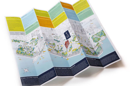
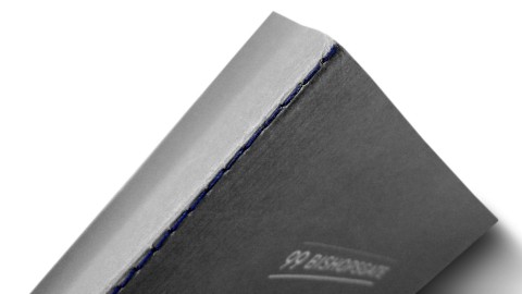
That accordion-folded map was essential given the many parks and amenities in this particular neighborhood. We LOVE the THICK business cards (110 lb. cover, duplexed!) – a real standout in times when the temptation is to cut corners.
This color palette reminds me of all the facets of any busy urban dweller: the navy blue (financial-capital-of-the-world business suits) combined with the light blue (views of New York Harbor and that famed statuesque lady). The more contemporary orange and green say, “Yep, we like to kick back with a well deserved glass of wine and a good book.”