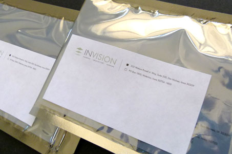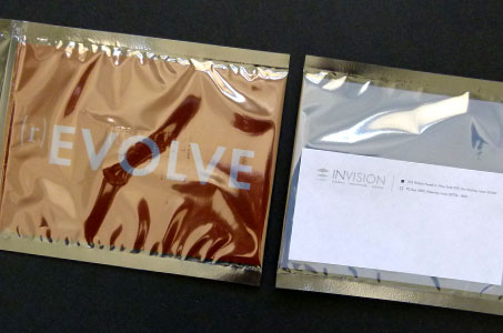
An unusual mailing envelope (hint: inspired by computer packaging), carefully considered paper, bold typography, clever copy, and bright color made for a direct mail piece that got past the gatekeeper at the front desk and garnered the attention of clients and contacts. And all to announce a website redesign!
The anti-magnetic hard drive envelope is not commonly used for mail pieces, but it made a big impact here. The shiny metallic look combined with its translucence grab the eye immediately.
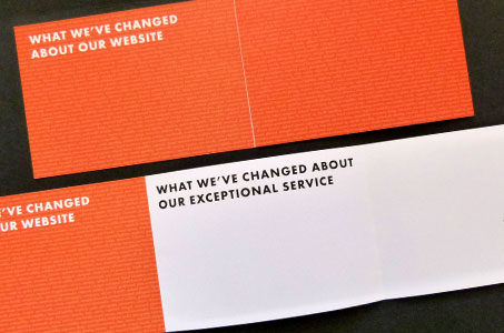
As for the tri-fold announcement insert, a bold cover and typography (printed orange on white Endurance Silk Cover) was designed to create immediate interest without revealing the whole story, driving recipients to open and read further. It also created a conceptual tie to the technical nature of this revamped website.
Copy was also cleverly crafted to get attention and imply the creative nature of the studio. It also skillfully links the “evolution” of the site with the philosophy of a business whose attention “revolves” around the client.