 By Nani Paape
How do you determine whether four-color process printing will work for your design or project? Here are some tips to help you decide between spot vs process color.
In four-color process printing, all colors are printed in dots, in the four process-color inks. The four process colors are cyan (C), yellow (Y), magenta (M), and black (K). (Why K? Because if it was B, some people might think B stood for blue?) In traditional offset printing, those dots of color form rosettes, like the ones here. Each color of dots is printed at a different screen angle.
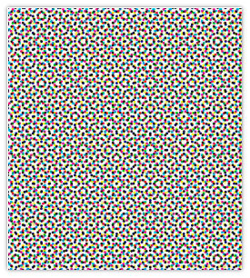 C, M, Y & K dots form rosettes in standard screening *
The easiest way to understand four-color process is by looking at the cartoons in the Sunday paper. The dot pattern is printed so coarsely on the newsprint that you can see all the dots.
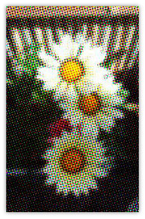 Squint at this image to see how your eyes translate the dots into smooth colors.
Printed dots are usually finer than these.
Notice how your eye interprets the dots as continuous colors. It’s like magic. If you have a magnifier or loupe, you can look at any printed page to see whether it’s printed in dots or solid inks.
Digital printing does not always create a rosette pattern. Some digital presses create a dithered (scattered or sprayed dot) pattern that looks more random, similar to inkjet printing.
- Four-color process printing is necessary if your design includes full-color photographs.
- Areas of color that look like a solid, single color can be created from CMYK dots. These are called four-color builds. Some greens, browns, oranges, and pastels are hard to reproduce as builds.
- On a digital or offset press, big solids can turn out uneven, but some digital presses are more likely to produce pronounced stripes called banding.
- Fine lines, especially curved ones, can look jagged in four-color process printing, since each line must be comprised entirely of four colors of dots. A line weight of 1 point or greater will usually be OK. No, a 0.5-point line will not be OK. (My favorite designers love 0.5-point lines!)
Spot vs Process Color
Spot or solid colors are individual colors pre-mixed to a set recipe or formula. The Pantone Matching System (PMS) is the dominant standard for spot-color formulas in the United States.
A solid color is identified by name, such as “Pantone 485.” The standard mixing colors used in the spot color formulas are shown below.
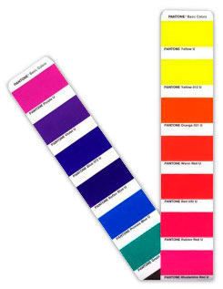 The “recipe ingredients” colors for mixing spot colors
If consistent color matching is important for the success of your design, spot colors may be the way to go. If you need to use fewer than four ink colors on press, you might also be happy to discover that it will be cheaper than digital printing!
- Solid colors are an especially good choice for brand standard colors in a logo.
- Spot or solid colors are also best for tiny type, tiny reverse type, and those precious 0.5-point lines.
- Spot colors often look cleaner and brighter than four-color builds.
- If your design includes large areas of tints or percentages of a color that must match from one spread to the next, using spot colors will make that easier to accomplish.
Depending on the press used, a full-page solid or flood may require two passes or layers of a spot color to achieve rich, even coverage. This technique is called a double-bump or double-hit.
Doing Tower Math
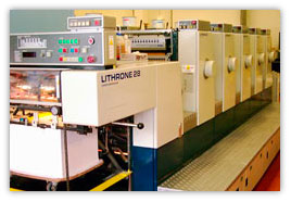 5-tower (5-color) 28-inch offset press
Each ink color used on an offset press requires a separate ink unit or tower. Mid-size presses often have five to six towers, and small ones can have as few as one or two.
Digital presses work a little differently, but most of them print only in the four process colors, in ink or toner. (The newest HP Indigo presses can also print a limited selection of spot colors.)
Each pass for a double-bump requires a separate tower.
OK, so here’s where Tower Math comes in. For this example, pretend we have access to this five-tower press. Let’s say your design includes full-color photos. You’ll need four towers for them – C, M, Y, and K.
What if you want to add a spot green? That’s one more tower. Then you want a spot varnish over the photos. Oops! 4 + 1 + 1 = 6! Too bad, you already used all available towers at five! The spot green would need to be a process build instead, or you’d need a press with more units/towers.
Not to make things more confusing, but it’s important to know that many presses are equipped with a coater, which is not the same thing as a tower. Coaters are used to apply flood coatings, such as varnish or aqueous coatings. Printers often describe their press as, “five-color plus coater.” If a coater is part of the equation, it changes the tower math, usually for the better!
Disaster Avoidance Tips
You’d be surprised how many people don’t consider the design’s end use from the beginning.
For example, if you plan to print a quick, small run on a digital press, design with its limitations in mind, avoiding big solids or adding noise or pattern to them to de-emphasize banding, and fattening up rules to lessen jaggies.
Or if you know that your design will be reproduced in magazines – nearly always printed in four-color process – be sure to select colors that will reproduce well as builds.
So how do you do that? On the Pantone Formula Guide fan, pick colors with four little dots at the bottom, just below the Pantone number. That’s your clue that Pantone thinks the color can be successfully reproduced as a build.
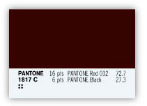 Note the four-dot secret code! **
Then check a Pantone Bridge, the fan that shows the solid color side-by-side with its build equivalent. You’ll be amazed at how poorly some solids can be interpreted as four-color builds.
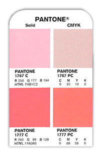 Warning: Some builds suck. **
If you don’t own a set of these guides, your printer may let you look at his. But it is worth having a kit of the basic Pantone fans in your studio. Think of the expense as a $300 disaster avoidance insurance policy.
Do not go by how colors look on your monitor! Printed color and RGB color are not the same, and most monitors are not calibrated anyway. You’ll need to look at proofs (for CMYK) and drawdowns (for spot color) to see how the ink colors will really look on paper.
Before deciding whether to print with CMYK or spot color inks, it’s wise to review samples produced with the method and the press you are considering. Did designs with elements similar to yours print well?
Examine the samples for variations in hue, even saturation and coverage on solids, smoothness of fine lines. And of course, talk with your print reps and discuss your design with them.
When it comes to color reproduction, there are myriad factors to consider. I’ve been able to cover just some of them here, but I hope you will find this post helpful.
———-
Copyright 2009 Nani Paape. This article reprinted with permission of the author.
Nani is a marketing communications specialist at GeoEngineers, an earth sciences and technology consulting firm, where she continues her mission of writing about complex processes in ways that make them more accessible to everyday people. To read more of her printing stories, see her website.
* Rosette image created by Astute Graphics and used in accordance with their copyright provisions. ** Pantone Bridge and PMS 1817 images used by permission of Pantone.


