Penguin, whose orange-spined paperback editions have kept many classics alive on both sides of the Atlantic for decades, is about to release a line tailored to the typographically obsessed.
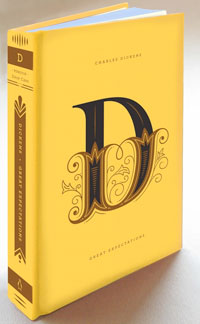
The Penguin Drop Cap series goes on sale Nov. 27 and will feature 26 literary classics in smart hardcover editions, each with an enormous drop cap on the cover corresponding to the author’s surname – a literal A to Z. (A for Jane Austen’s “Pride and Prejudice,” E for George Eliot’s “Middlemarch,” etc.)
We’d dismiss this as yet another shameless rifling of dead authors’ pockets if not for the involvement of letterer/illustrator Jessica Hische, whose dedication to typography is beyond dispute. (And yes, she is the creator of the “Daily Drop Cap” blog, so there’s that.)


