 Once is unusual, twice is interesting, and three times is a trend, or so an old newspaper boss once told us, pointing out just how subjective the word “trend” can be. Yet we always pay attention to print trends because they tell us something about our profession, and frankly, what the rest of the world expects from us when it comes to design. Recently, CreativeBloq.com pulled together five trends to watch for during 2013.
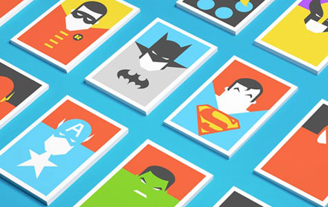
1. Flat Design. A type of minimalism that comes to us via the Web in response to years of textures, drop shadows and bevels. These flat-illustration postcards, “Re-Vision,” from studio Forma & Co. in Barcelona, illustrate the point nicely.
2. Typographic Contrast. Whereas flat design aims to simplify visual elements, this trend goes in the opposite direction. Up till now, using only a few clean, similar fonts has been stressed to maintain a timeless look. However, we’re now seeing pieces that include widely contrasting typefaces. Think large brushstroke fonts paired with tiny san serifs – for wild juxtapositions that, when done right, call attention to the design without overwhelming the eyes.
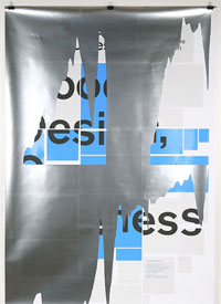
3. Experimental Distortion. Basically we’re talking about drastically changing pre-existing artwork to grab attention – museums and festivals have become particularly enamored of this lately. This work by studio Helmo is an excellent example.
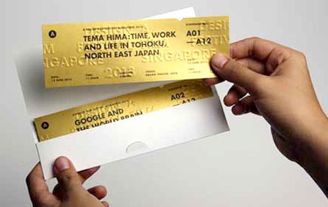
4. Unusual Paper Stock. Now we’re talking! Though I’m sure we all have our favorite combinations, this “golden ticket” for a Singapore “Design Film Festival” is unforgettable for legions of Willy Wonka fans. These were created by Singapore studio Anonymous.
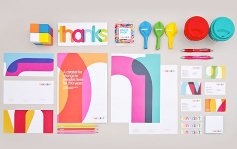
5. Being Playful. One would hope this is always in fashion, though being playful on somebody else’s dime has always been tricky. (Don’t forget to check out the PaperSpecs Gallery for an ever-growing number of examples of playful print design.) This complete identity collection for the charity Benevolent Society demonstrates how much fun can be had with a variety of print materials without ever losing that feel of one cohesive message.