Love this PRO Tip? Become a member for access to more!

Finally! I’ve been sitting on my hands so as to not write about this before its official release last week. But now those hands are lovingly cradling samples of a brand new digital printing option: Xerox’s metallic gold and silver inks – yes, the only silver on the market! (For another digital gold option, check out here and here.)
Digital’s Chance to Shine
There are ample applications in which a touch of gold or silver could add that special touch. Let it be full-on type or graphics or used as a touch plate – a bump plate – to enhance a certain aspect of an image. With the release of Xerox’s Color 800i/100i, this will become a great option even for mid-to-small runs (as in one off, 10, 40, up to 3,000+).
Set up for full color, the 5th housing station of the press can print clear toner (which has been around for a bit) and, as of last week, gold and silver metallic inks, too.
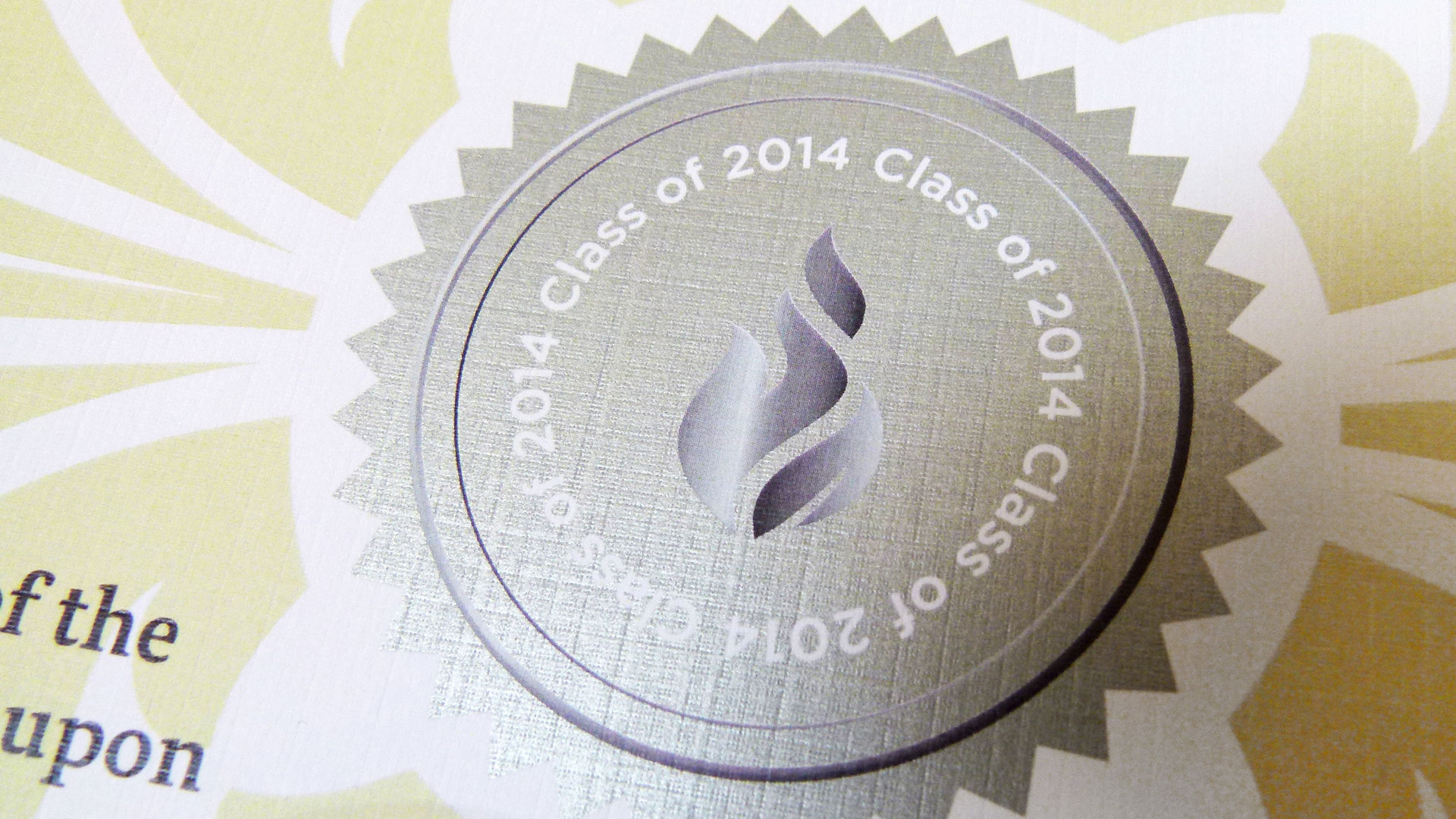
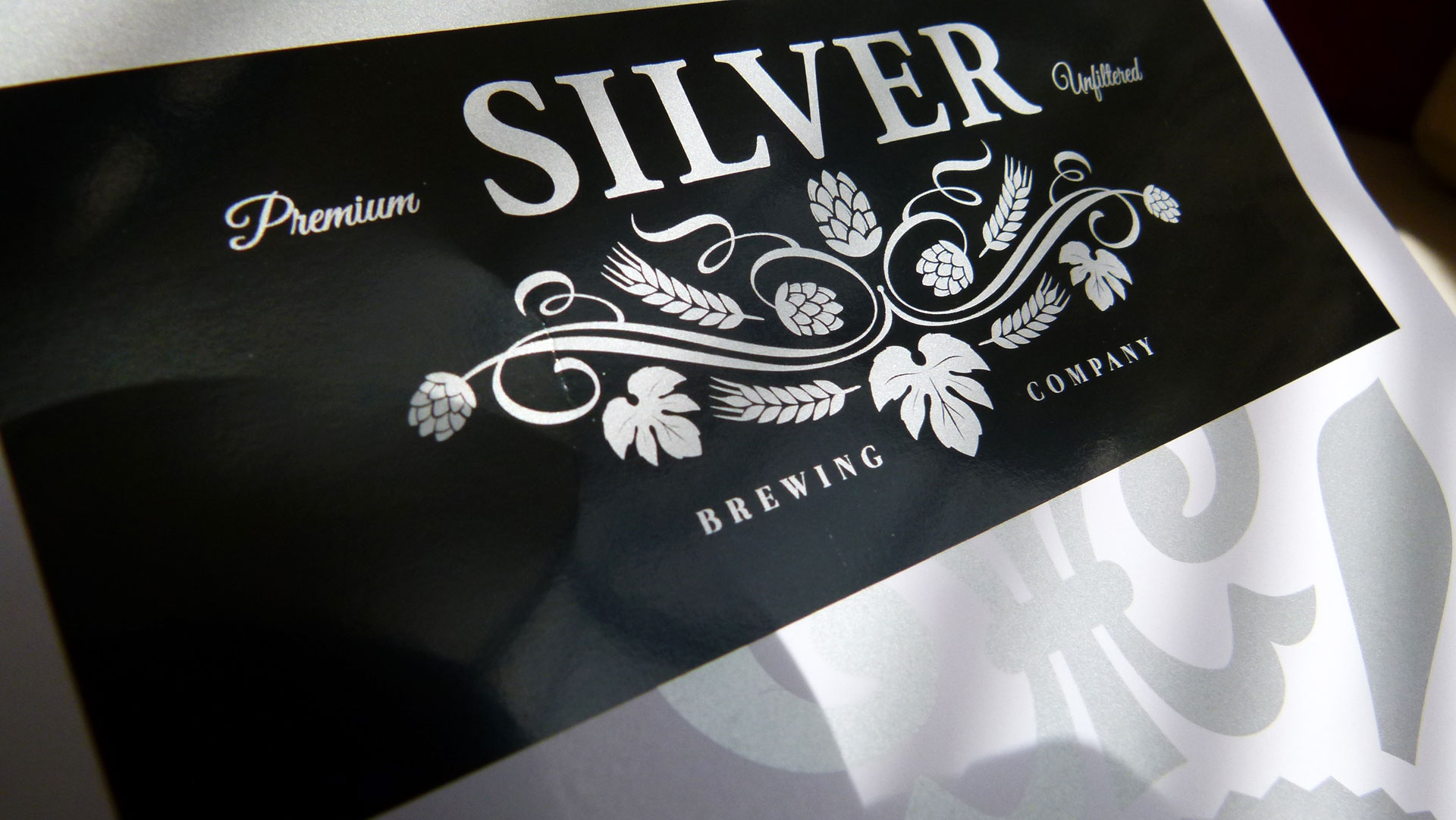
“Both silver and gold have some of the highest Flop Indexes in the industry,” explains Mary Roddy, worldwide product marketing manager at Xerox. “That’s the degree of reflectancy that you see as you hold that sheet in various angles with a light. These are true metallic inks, by the way, with metallic flecks embedded in the toner.”
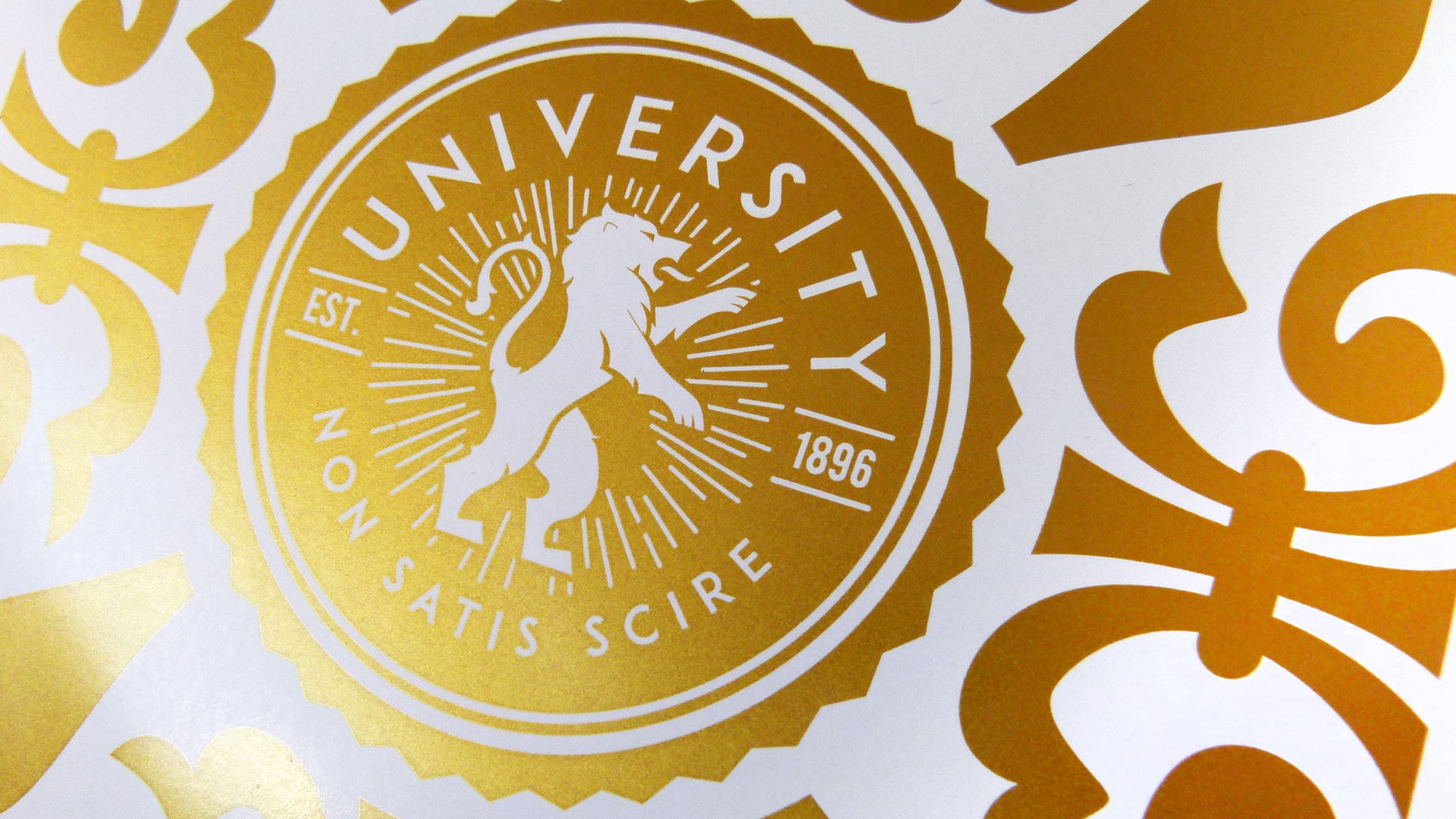
Which makes my designer heart beat faster as this allows these inks to carry Pantone designations: 871C for gold and 877C for silver. Oh so important because that makes it easy for you and me to visualize and design with the right hues in mind.
The inks are also very opaque, which helps achieve a high reflectancy with only one pass. “It is possible, certainly, to do more than one pass,” Roddy admits. “However, we’re really not recommending more than two.”
Paper and Other Substrates
As with every digital press, your sheet size is limited; in this case to a maximum of 13″ x 19.2″ (330 mm x 488 mm). No way around this.
But when it comes to the weight of the substrate there is some wiggle room. The official specs for the press recommend sheets up to 130 lb. Cover – or 350 gsm, but…
“Actually, it depends on the stock,” cautions Greg Wallace, president of Harvard Pinnacle Group, and one of the beta testers. “Because we can run a 16 or 18pt Carolina paper, a very stiff stock. And then there are other stocks that have a higher thickness or GSM but they’re more flexible and they’ll run just as well.”
And not just paper, mind you. You can apply the metallic inks to durable pieces that require synthetics, never-tear and specialty media—which includes vinyl, polyester, plastics, magnetics and textiles. Just think of the possibilities!
Coated vs. Uncoated
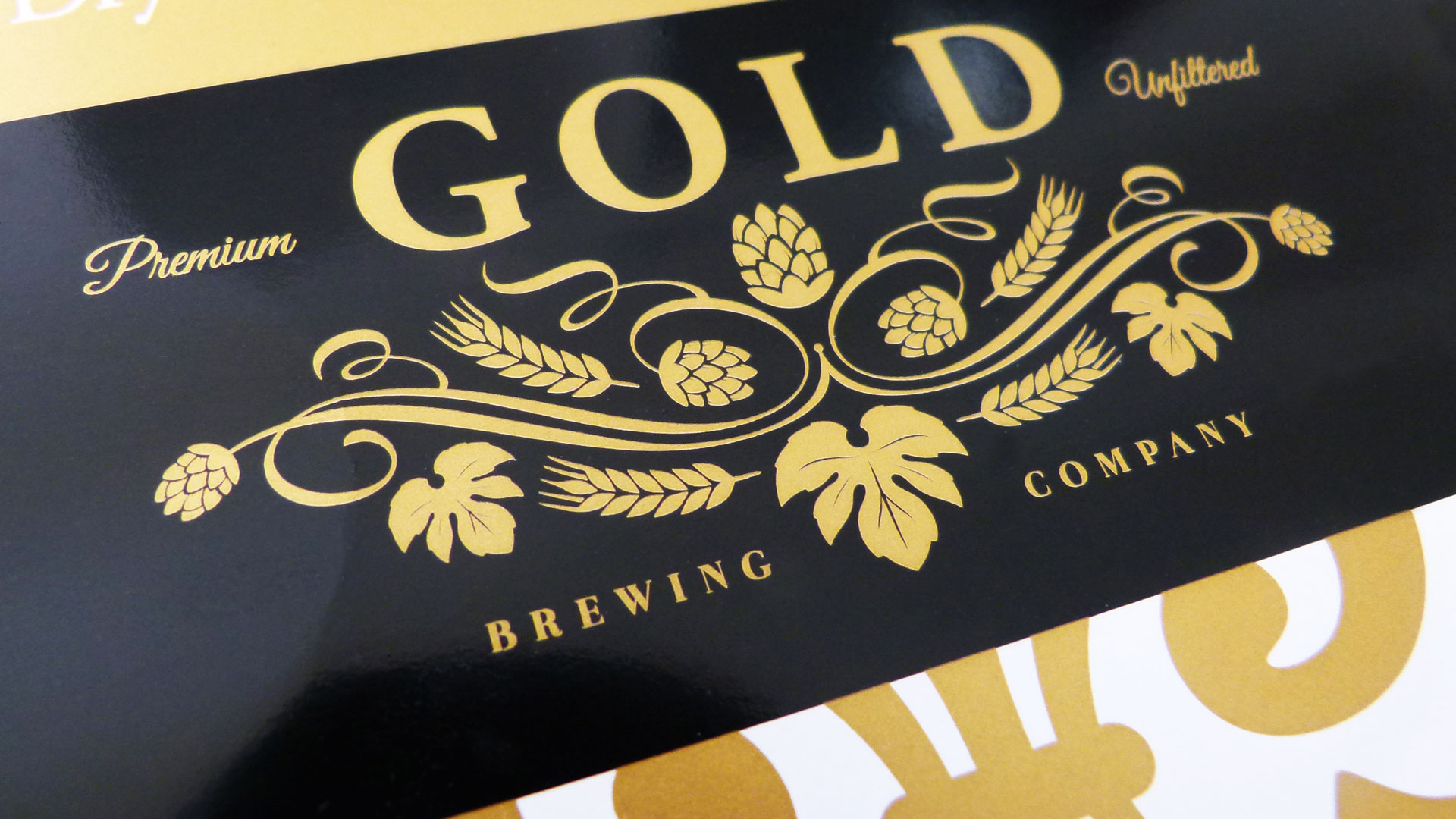
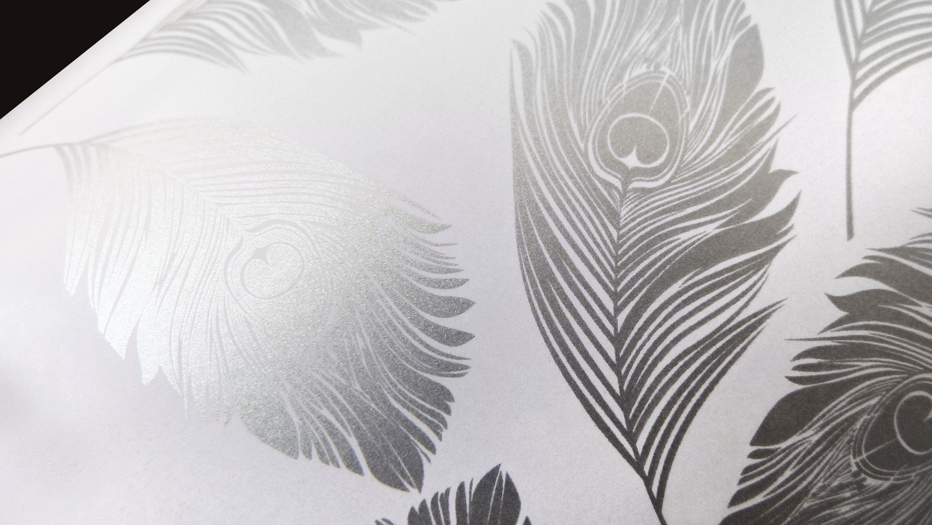
On a coated sheet the ink has a super high, foil-like sheen, which enhances any high-end look and feel – think silver on a black background for example, or just a simple white background with a tasteful gold metallic pattern. Or adding a silver/gold touch plate to enhance the shine of jewelry in a catalog.
As expected though, when printing on an uncoated sheet some of the tremendous sheen gets lost. Some, but there is still ample sparkle left.
“The three favorite cover colors for financial reports are crimson red, forest green and navy blue,” Wallace explains. “So in our tests we printed on navy blue linen stock, which is probably the worst case because the linen has this heavy texture to it. But the linen pattern was actually enhanced by the silver ink. And it held beautifully, even down to the 6 pt. type we used on the bottom of our test sheet.”
Special Effects
The Color Press is set up to print C,M,Y and K – like every digital press – and then applies the metallic ink of your choice.
You get the cleanest Pantone reproduction if you knock out your desired type or graphic, but Greg and I encourage you to play with the inks and let your creativity run free. In other words test, test, test.
A little bit of black or cyan under your gold or silver can actually enhance the metallic effect – a little bit mind you.
Underprinting the silver or gold is a different matter. You will lose a lot of the reflectancy as you are printing the less-shiny CMYK on top of your metallics. But that again can create a special effect.
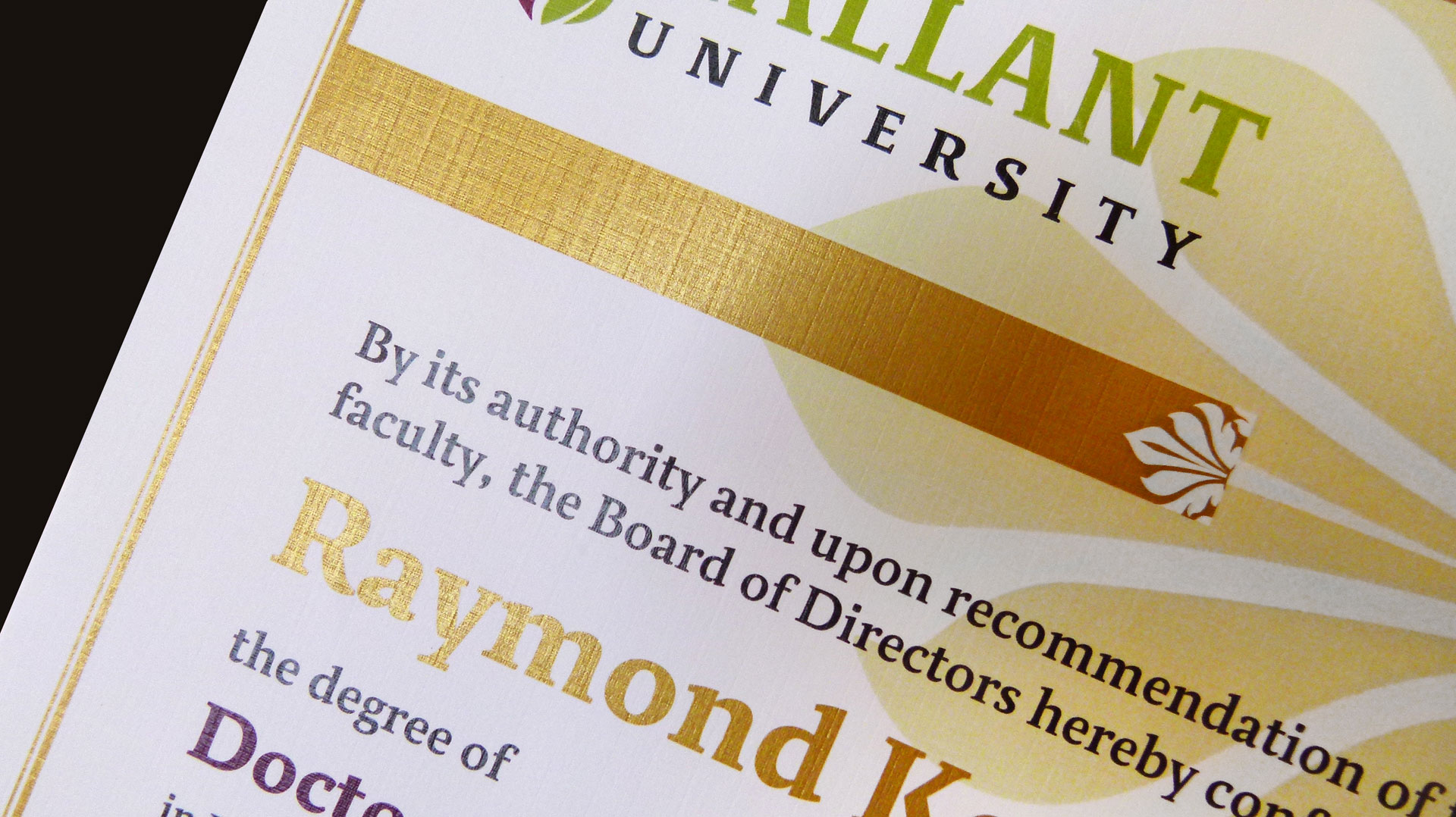
“It was a lucky accident,” Wallace admits. “We were doing a number of samples for our clients and in one case accidentally printed the whole artwork in silver. So we ran the sheet through the press again to add CMY and K. If you look at the accidental and the original certificates, the density of the inks are the same, but as you hold the piece in your hand and tilt it just so, you can see the silver shining through. This mistake turned out good after all, I guess.”
So let your imagination run wild!
The Cost
I know you want to know but, as usual, there is no set rule for this. It all depends on your ink coverage and thus how much of this precious metallic ink your design needs.
The end uses of course are endless, from business identity systems, invitations, greeting cards, posters, even photo publishing products … everything that can benefit from that extra shine. And as always when it comes to digital, you have the option of personalized communications.
P.S. Please note that Xerox has just started making these presses available in North America, so this technology is still in the early stages and not easily found. This will change…and we will keep you posted.
Love this PRO Tip? Become a member for access to more!