Every week I’m inspired by the projects I get to share with you here. But once in a great while I come across a piece that’s so intricately planned, so well-executed, and such an utter celebration of what print does so well, that it takes my breath away. That’s certainly the case with this endlessly inventive packaging for Eberl Print’s [projects / website] self-promotion, designed by Clormann Design [projects / website].
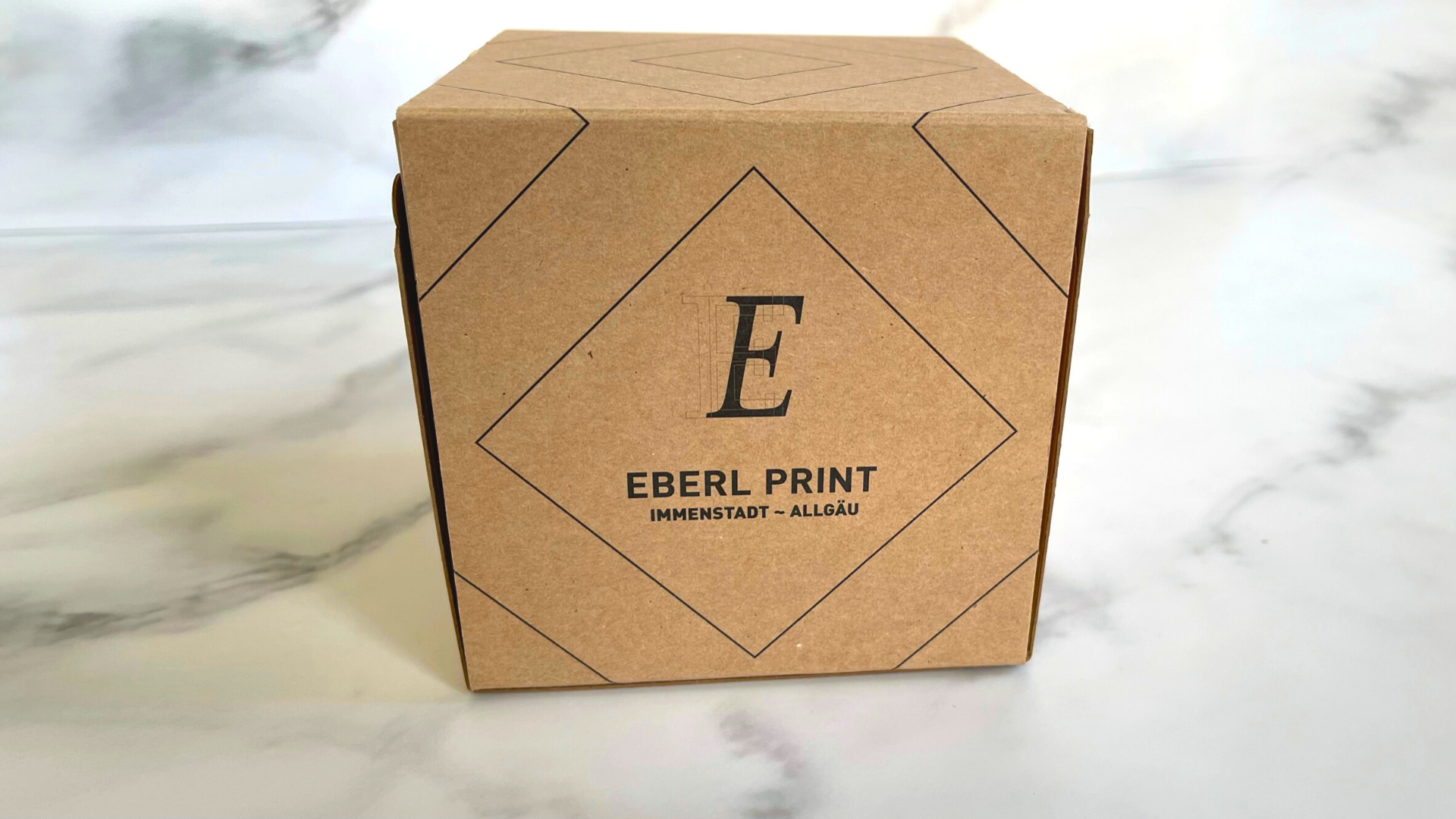
It arrives in a more-or-less plain brown shipping box, with only the printer’s name and a square pattern printed in one color on its surface. It opens with the tug of a handy zip strip, a tantalizing hint at what is to come. [PRO members, be sure to check out our exclusive PRO Tip all about zip strips here!]
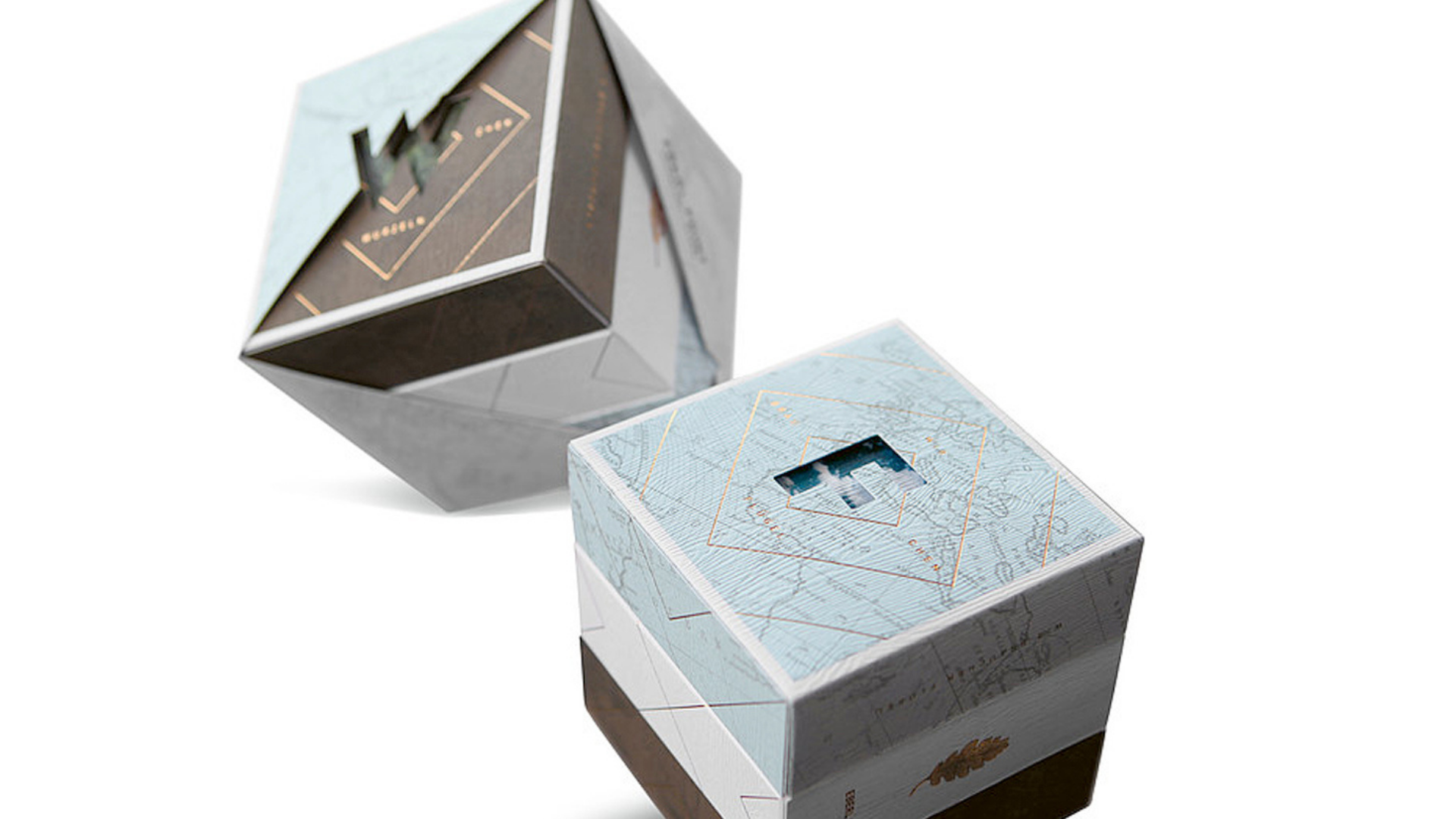
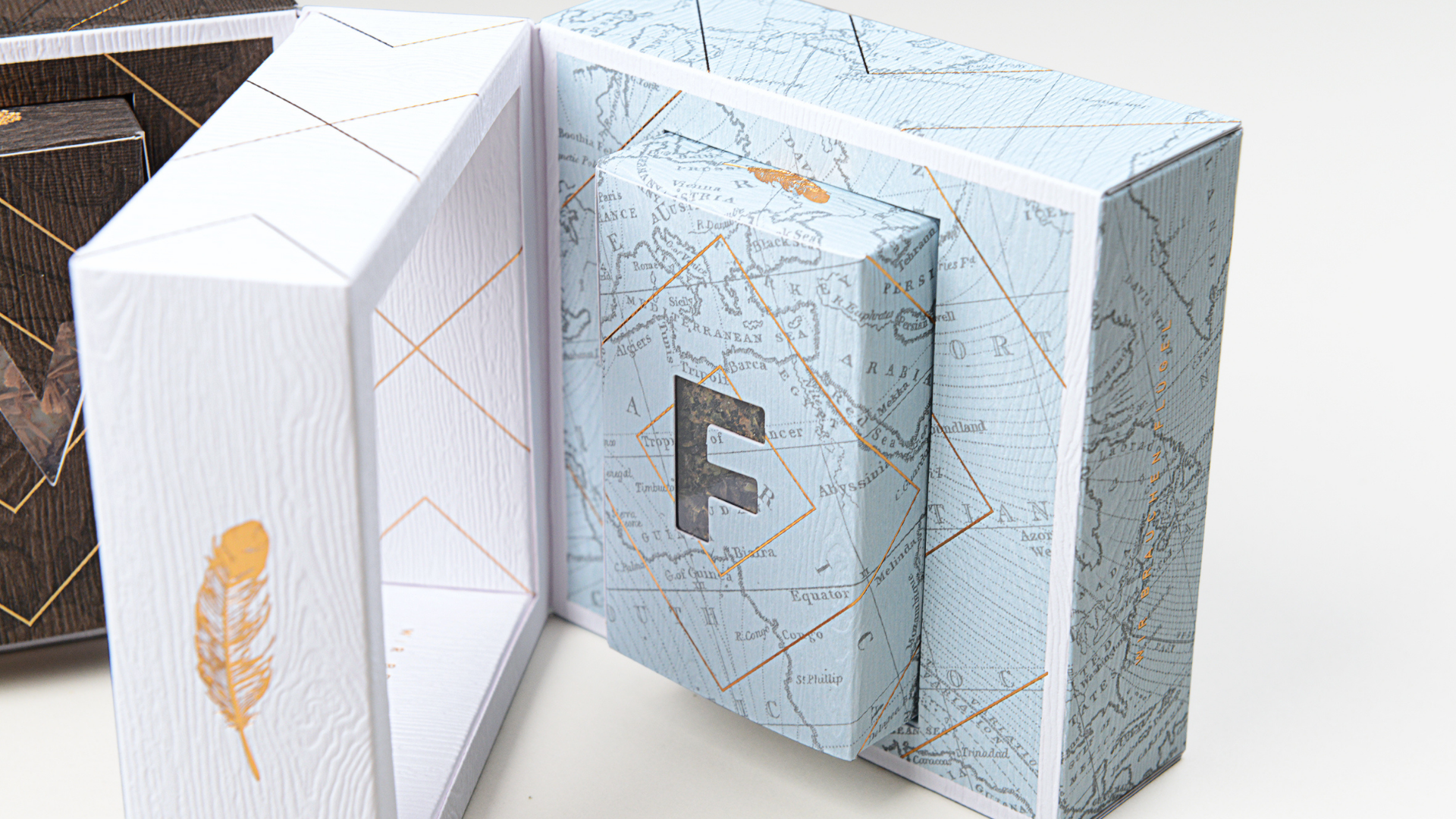
Upon opening the shipping carton you’re presented with the main attraction: a gorgeous printed cube so intricate, it takes a moment to figure out just what it is. Even then, it’s impossible to tell how it’s all put together – a paper puzzle box, if you will.
Closer examination reveals that the entire piece is actually diagonally wrapped by a clever, diamond-shaped bellyband, the precise die cuts it contains neatly wrapping around the 2 main die-cut letters –“W” and “F”– on either side of the box. (The recipient’s name is digitally printed on the band for that personal touch.)

Pulling a zip strip frees it from the package, which boasts a lovely, tactile wood grain look and feel thanks to the Gmund Wood Limba Solid from which it’s made.
The box actually looks like 3 separate ones glued together: a Brown one on top, a Blue one on the bottom, with a White one sandwiched in between. However, you’ll soon discover that this isn’t really the case, but for now let’s get back to those letters.
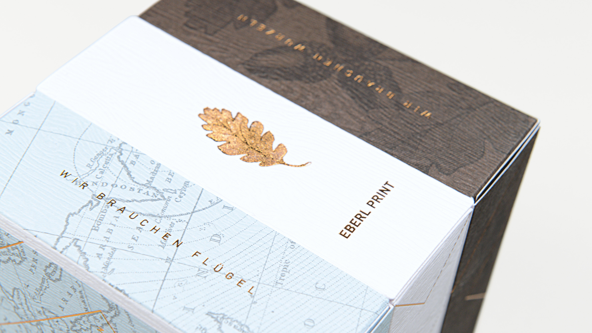
On one side of the box you’re presented with a die cut “W” through which peeks a picture of a forest underneath. “We all need roots” this side declares in German, “Wurzeln” being German for “root.” The Brown background here enhances the natural pattern of the Gmund paper’s wood grain texture to put one in mind of trees. And the square line art of the shipping box is repeated here through the use of hot foil stamping.
On the opposite side is a die-cut “F” through which you glimpse a bit of cloudy sky, surrounded by the phrase “We all need wings” in German, “Flügel” being German for “wing.” Around this is printed a map, again overlaid with the same square foil pattern.
Unable to contain your curiosity any longer, you try to separate the 3 boxes from each other, and surprise, surprise – it’s actually a single package with a hinged lid on either side, each held closed to the center piece with magnetic closures!
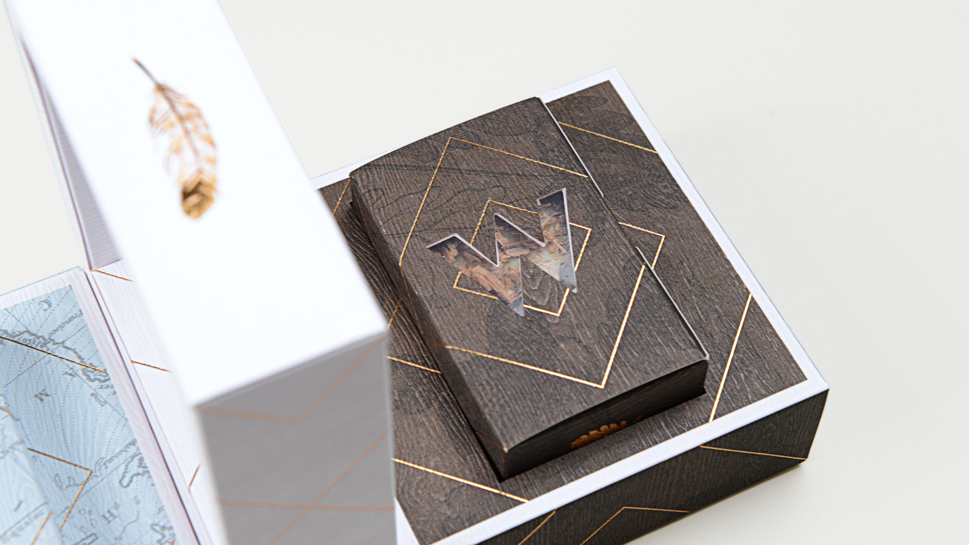
Lifting open the “W” side reveals a bar of Bahnhof-Apotheke handmade soap housed in a Brown Gmund Wood folding carton, complete with a second die-cut “W.”
Removing the “W” soap bar reveals a die-cut depression inside the lid, with a tiny Gold foil stamped leaf at its center. The same embossed version of this leaf appears on the outside of the soap package.
Yes, we are in the presence of perfectionists, where nothing is left to chance and a new delightful surprise is waiting around every corner. Here are a few more:
- Opening the “F” side of the box presents the respective Flügel soap setup, with an “F” die cut.
- The tray and soap packaging here feature a feather – representing the wings (Flügel).
- The geometric hot foil stamped lines on the soap packaging line up perfectly with the tray, and even with the insert on the bottom of the tray.
- A larger, embossed version of the feather appears on the outside of the package along the White center piece.
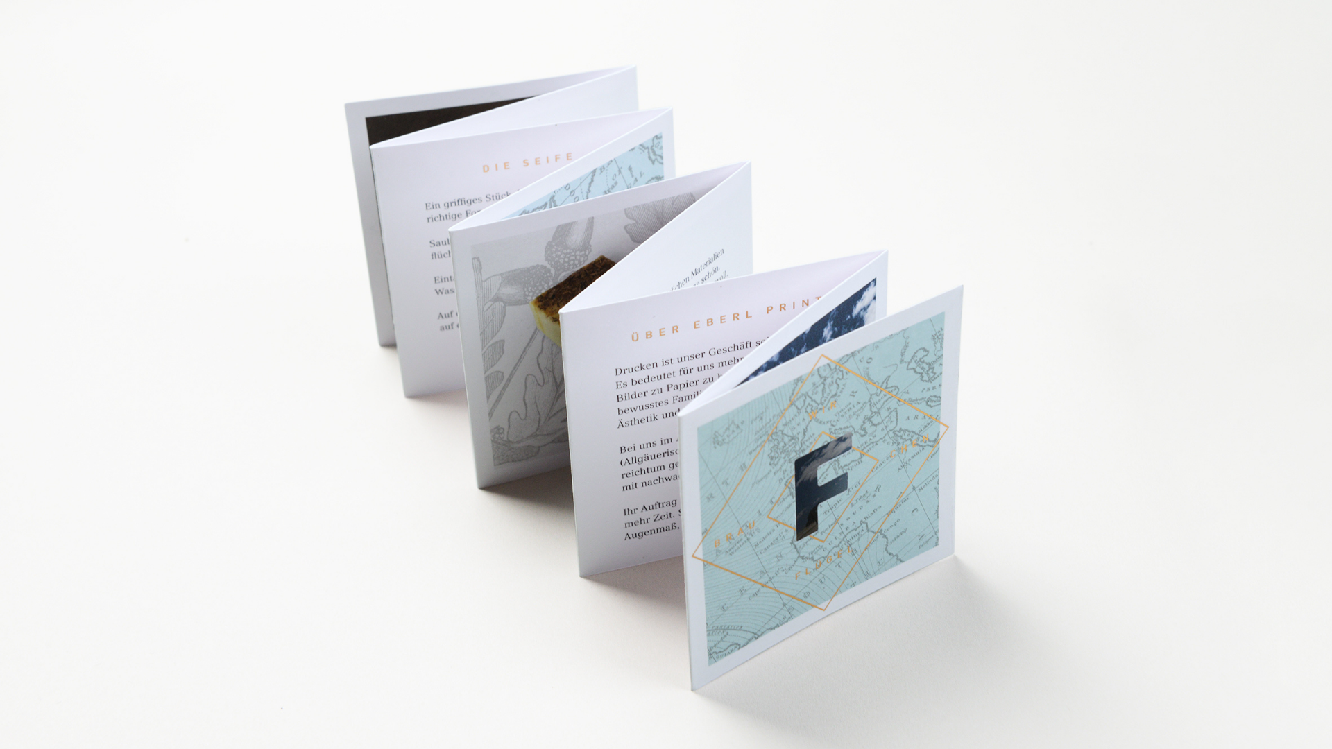
Which brings us to that compartment floating between the Brown and Blue sides. Tucked neatly in this space is a small, accordion folded brochure that expands on the ideas of home and travel, exploring in the process what drives us all creatively. The front and back also feature the now-familiar “W” and “F” die cuts.
As you can see there are so many sumptuous details here, I can’t possibly touch on them all. (We never even got to the soap itself, which looks as well crafted as the packaging.) Suffice it to say that it transforms the concept of packaging and marketing materials into a genuine, multi-sensory experience. It doesn’t get much better than that 🙂
Hot foil stamping added an elegant touch to an already elegant piece in this instance, but there are so many other ways to add that beautiful shine to your work. Discover all of your foiling options, including vital specs for each, in our free Foil Cheat Sheet. Download yours right now!


