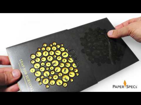
This package definitely comes from the “less is more” school of thought. The bold black type on bright yellow stock screams strength and detail awareness. It conveys a simple, clear identity that oozes trust.
The standout element is of course the bold choice of 225 gsm Colorit in yellow. Yep, the stock is actually this vibrant, attention-grabbing color – not printed with a flood of ink. (Nothing wrong with printing color of course. It’s just that so many hesitate to go for it in this way with paper!)

The designers also cleverly combined the use of offset and foil stamping on some pieces and even did a black-on-black treatment (blind embossing on black stock) to great effect.
The business cards are also key players in this identity package. The thick feel and the black foil-stamped “A” logo convey quality and a style that rises above the crowd.
I’ll invoke the Attido’s tagline (Until it’s done.) and say, “Well done!”