A good calendar can amaze and inspire, but it takes just the right blend of design, paper and printing to create one that makes you smile again and again, no matter how many times you see it. Let me introduce you to the Mitchell Digital Perpetual Typographic Calendar.
Shortly after 90-year-old Mitchell Press launched its digital printing arm, the Burnaby, British Columbia company challenged Nancy Wu Design to craft a promotional piece that would demonstrate just how effective this printing technology can be. “We wanted to blur the lines between offset and digital printing because really, digital printing doesn’t have to look digital anymore,” explains Mitchell Press’ Scott Gray.
With the same imagination and style that characterizes her other work, Nancy borrowed the idea of the perpetual calendar – a relatively old piece of technology – to show off the quality output and versatility of Mitchell’s Kodak NexPress digital press.
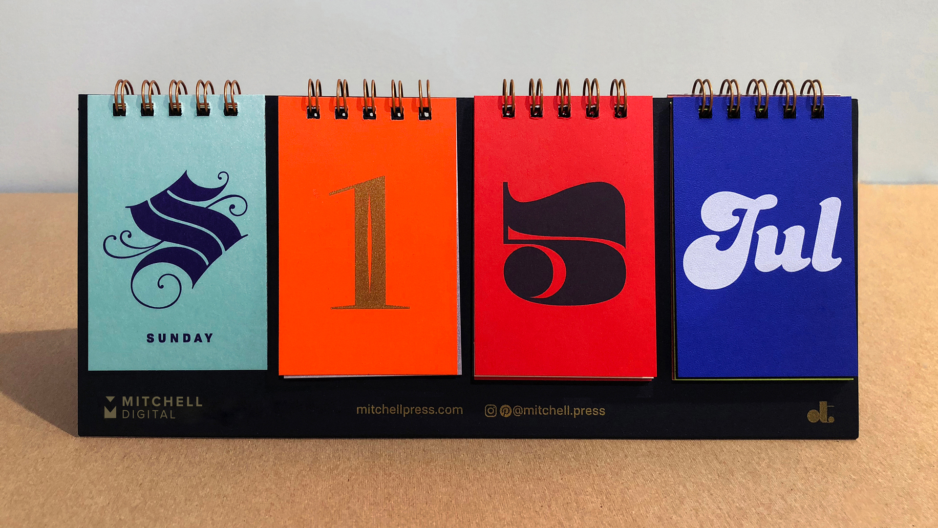
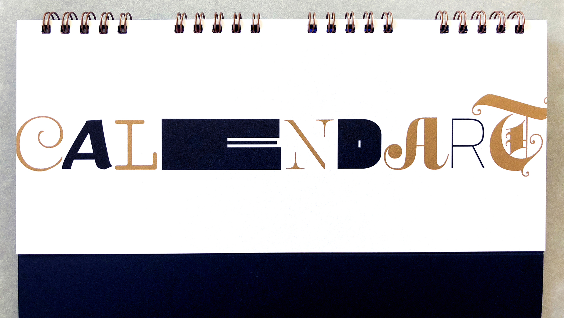
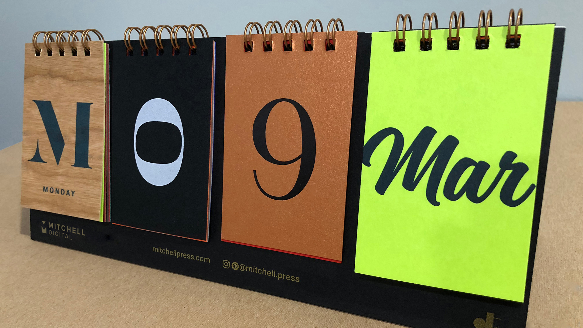
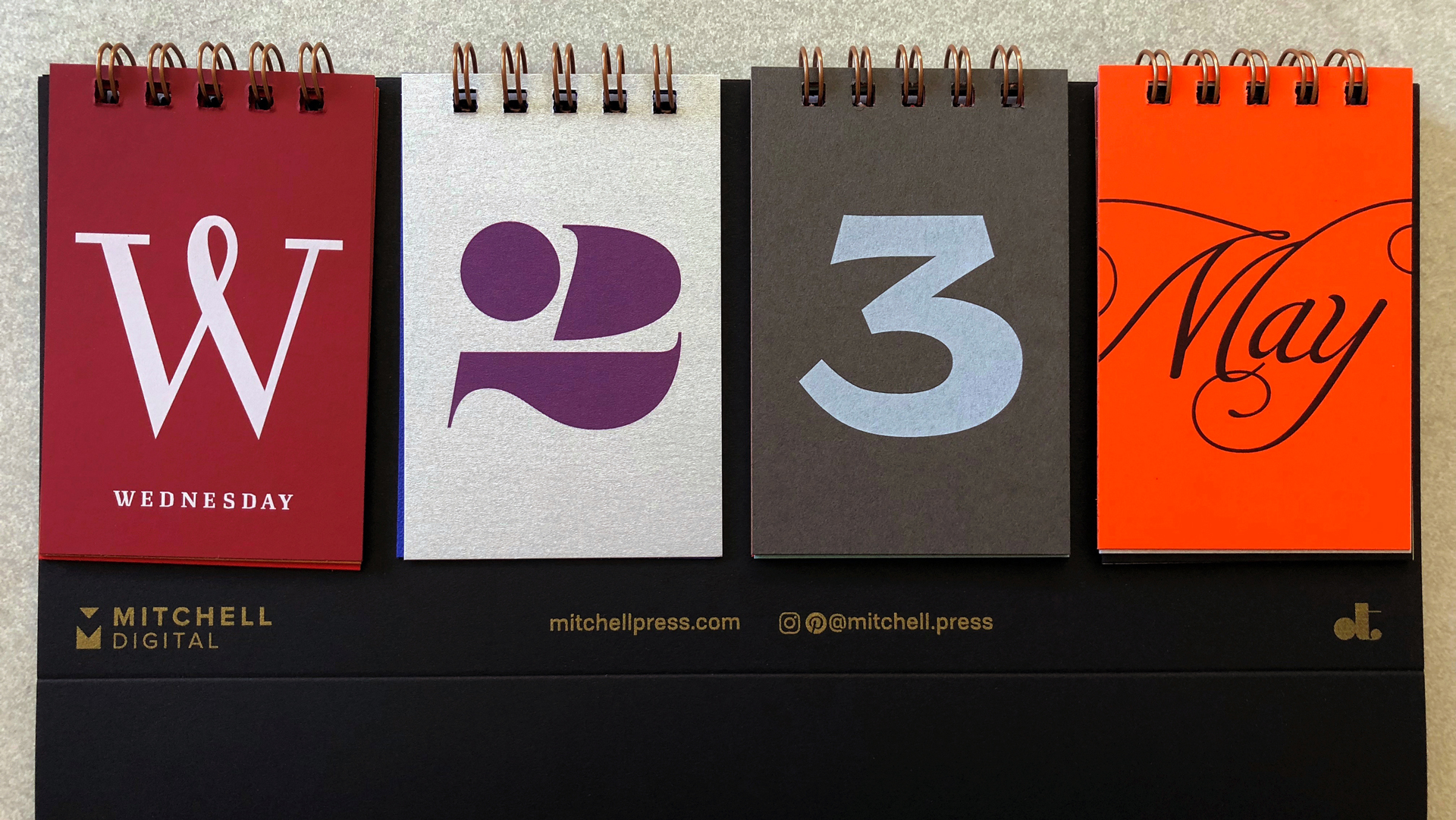
From the moment you remove the oblong piece from its envelope, you’re met with an intriguing presentation – the word “Typographic” nicely rendered on a black rectangular card on the front, “Calendar” on another card on the back. Flip up the front card on its Wire-O binding [PRO Guide to Spiral Binding] and all becomes clear – you’re now looking at four sets of smaller cards in a row: the first tells you the day of the week, the next two the day of the month, and the final the month itself.
“We started talking about design promos that get sadly thrown away, but also pieces that stand the test of time,” reveals Mitchell Press’ Scott Gray. “We also talked about everyone’s love of typography. We posed the question ‘What would be the coolest thing we could create with beautiful paper and digital printing that graphic designers and type nerds alike would all love to have?’ ”
Do Scott and Nancy know us or what? Never has the day looked so vibrant and full of possibilities, with each card printed on a different paper in a different color ink and in a different typeface.
For those keeping score at home, that’s 14 unique substrates, 66 different fonts, and 35 unique combinations of paper and print effects. Spend some time scrutinizing these cards and you will also notice that they also show off a great variety of textures as well.
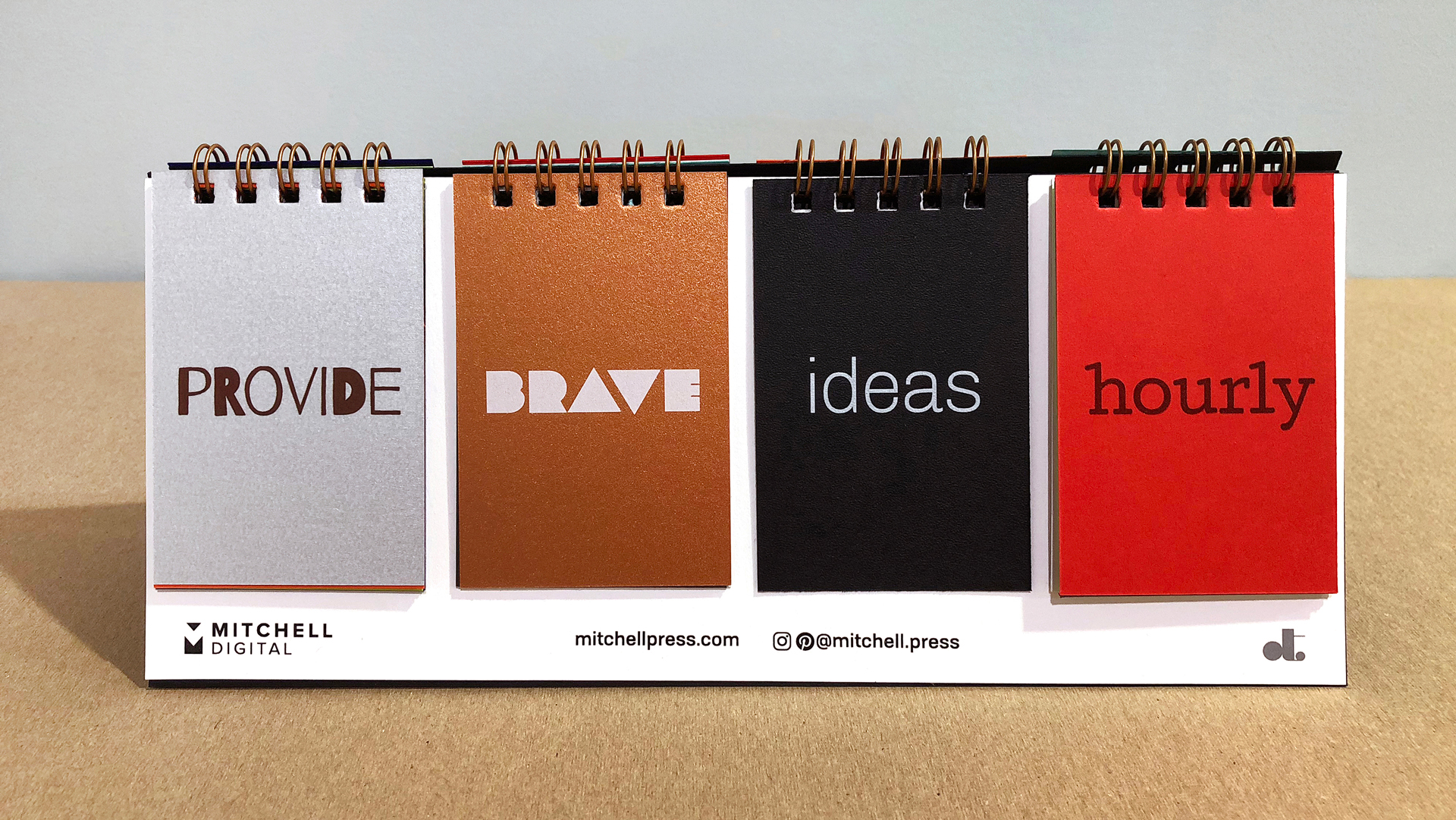
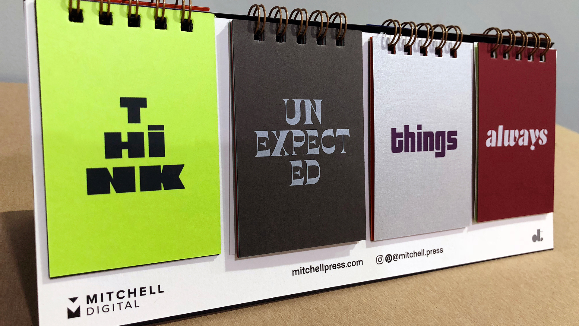
Don’t worry if you’re spending a longer-than-usual amount of time drinking in this creation, because the people sitting across from you are getting a treat as well. That’s because if you look at the BACK of the cards facing away from you, each boasts a different word that together create a Mad Libs-esque phrase, such as: “Provide Brave Ideas Hourly.” (Now that’s a challenge!)
Notes Scott, “You can sense the love and pride taken in curation of each number and letter, the way the type styles dictated the paper and ink selections to bring out its distinct personalities, and the way the random phrase generator always has a positive message for those viewing from the other side of the desk. Nancy enlisted a collective of talented type designer/friends who generously provided beautiful fonts, made up one of her own, and the balance were researched or licensed from online sources, many from independent foundries who often don’t get (but deserve) recognition. It is truly a useful and unique creation that will stand the test of time.”
It also makes for a random showcase of some pretty great papers including everything from several of Neenah’s Classic lines to the edgier Stardream and Plike.
The printing techniques, too, dramatically demonstrate the range of Mitchell Press’ digital printing capabilities. Highlights include spot dimensional clear ink, metallic gold ink and extended gamut colors.
As Nancy observes of the whole project, “We turned a seemingly innocent ‘what if’ conversation into a reality through shared ideas, passion for design and print, and pushing things to be the best they could be. We didn’t get lazy in any part of the process, being tenaciously invested in the details and keeping our eyes focused on the prize.
“Most of all, Scott and I treated this project like a Lennon & McCartney creation, having joint ownership of this project that we were equally invested in it throughout, keeping communications healthy, open and respectful….The overwhelming interest, feedback and industry talk about this unique piece has demonstrated that projects like this don’t have to be one in a million.”
In this case, of course, that’s exactly what it is 😉


What an extraordinary combination of so many different elements – paper, finish, finance, and words. The words alone are ingenious, conjuring up memories of those clever flip books that combined head, shirt, and pants of people. This may not be one in 1 million brilliant ideas, but it sure appears like it.
So glad you enjoyed it, Chaz!
How can I get one of these awesome calendars?
This beautiful and functional piece of art is a designer’s dream project. Congratulations! Thank you Paper Specs for always showing cool work 🙂
Thank you so much for the kind words 🙂
I NEED one of these!! <3
Very cool and so different! I emailed you all as noted above!
I am very interested in getting a copy of the perpetual calendar. Hank you so much for sharing your fabulous paper and these amazing design talents.
Hi Debbie – We’ve passed your email address on to Mitchell Press; hopefully they will be able to tell you more about how to get one 🙂
I would love to have one of these for my high school Graphic Communications classroom. How can I get one? Harris County High School in Hamilton, Georgia.
Hi Cheryl – We’re passing your contact info on to the great people at Mitchell Press; hopefully they’ll be in touch with you soon about this. Thanks for writing 🙂
Hi all – Just a quick note to say that Mitchell Press has officially run out of the calendars as of this moment. If you got your request in before 3PM PT on Sept. 17, 2018 – rest assured that we forwarded it on to the company. As they only had a few on-hand to begin with, not everybody who requested one was able to get one – but all had their opportunity to make their case to Mitchell Press. Thanks to one and all for all the enthusiasm you showed over this piece; it was our pleasure to share it with you, and I know you made both Mitchell Press and Nancy Wu Design who worked so hard on this calendar feel very appreciated 🙂
Nicely done, Nancy Wu. If you are able to dig up another sample, I’d love to receive it!
Hi Lauren – Your best bet is to get in touch with Mitchell Press, which printed these. They’ve recently floated the idea of launching a Kickstarter to print up more. We’d suggest leaving a comment on their LinkedIn post about that here: https://www.linkedin.com/posts/scottgraymitchell_perpetual-typographic-calendar-activity-6585650306430881792-RSY9
It was shocking how Newark Trade Digital’s concept and design of our Perpetual Calendar for the Museum of Printing was completely STOLEN. I know that PaperSpecs received their copy today! I am sickened by the blatant copying of our idea. The Museum of Printing in Haverhill, MA has been carrying this for months! I am sickened by this!
YOU SHOULD BE ASHAMED OF YOURSELVES!
Bummer that this post is 5 years old, hopefully they make these available to purchase again sometime!
Hi James – it was never available for purchase but rather used for promotions. And we’ve all been quietly (and sometimes not so quietly) hoping that it might be transformed into a crowd-funded project someday.
Really cool idea… to bad it was 5 years ago. Hopefully they do something like this again.
We think a great design piece is timeless, Suzanne. It’s as effective today as it was then…and because it’s a perpetual calendar, it can never be “outdated.”
Wowza, as a designer I’m goo goo gah gah for this sucker. As a marketer, BLOW AWAY. Forget all year long… it’s good forever because it doesn’t have the typical “2024” year theme AND its’s a functional sample kit? Bookmarking this in the “ideas to steal” folder.
Thanks for that, Carleen – it remains one of our favorite pieces 🙂
I want one, too!!! Absolutely stunning!