Speaking as a reputed “Paper Queen” and former Aussie myself, I was naturally predisposed to adore anything called “Letterpress Queen” emanating from Melbourne letterpress shop Saint Gertrude. And then I got a gander at these scrumptious self-promotion pieces and boy howdy, you know I was hooked.
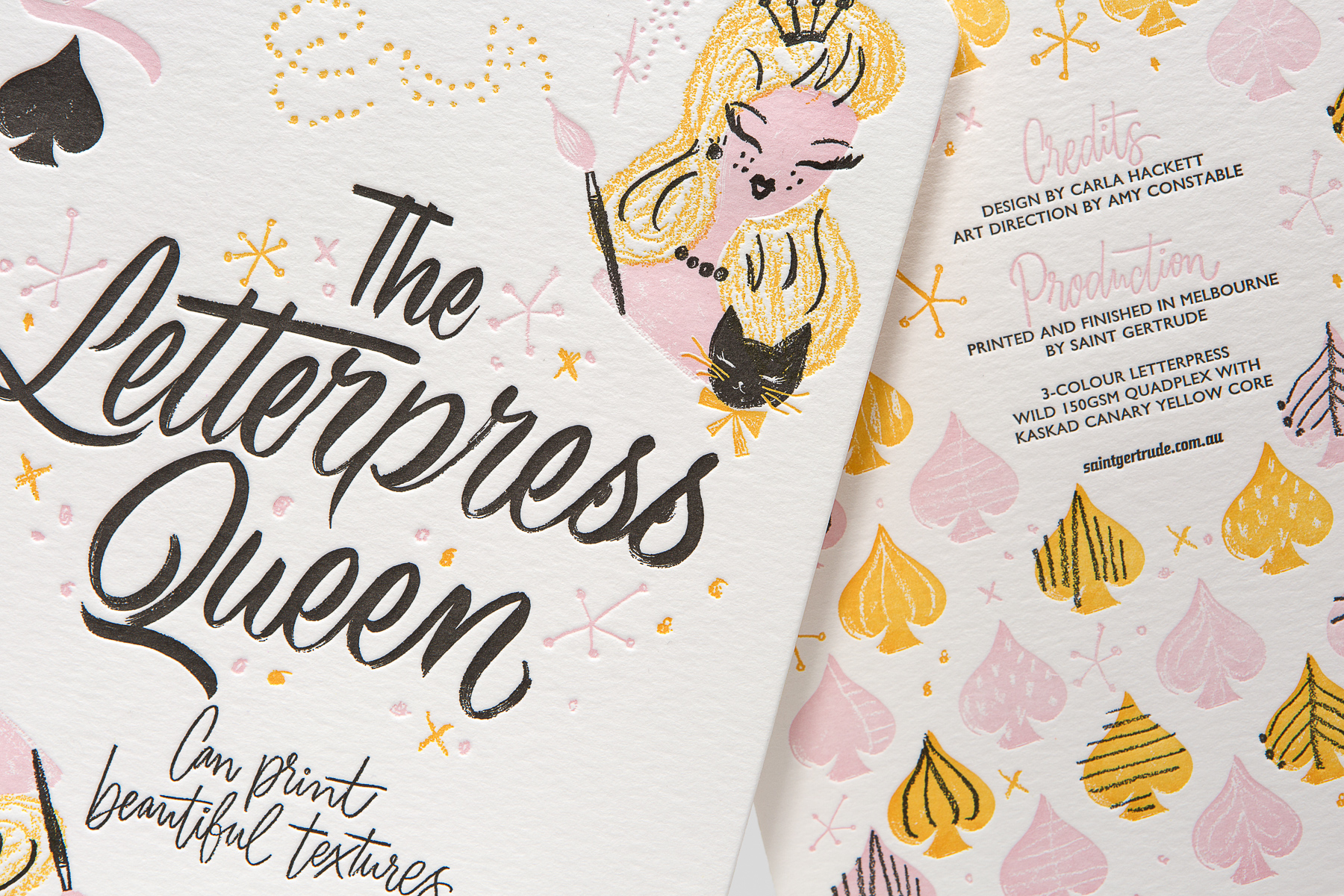
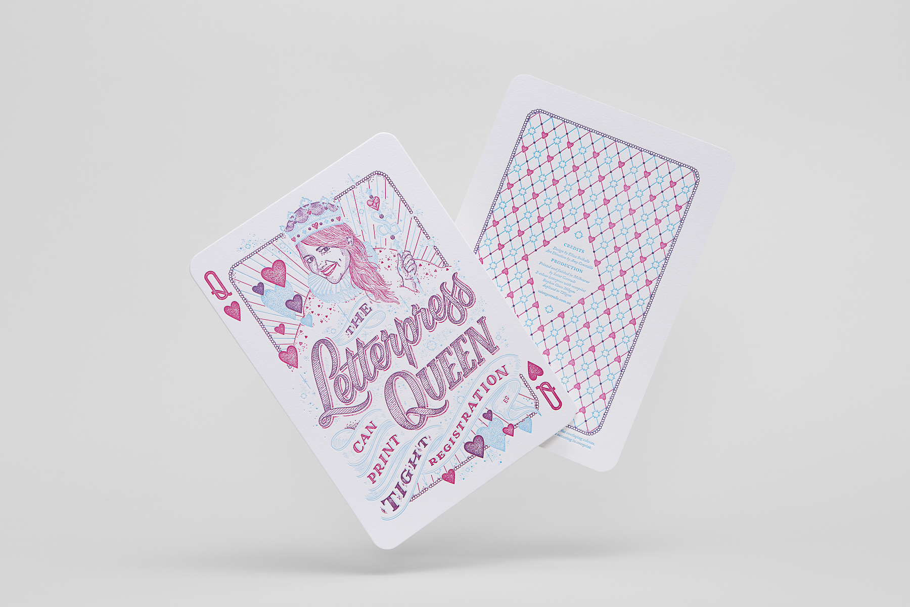
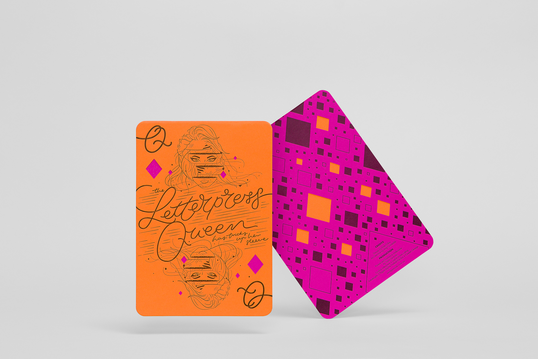
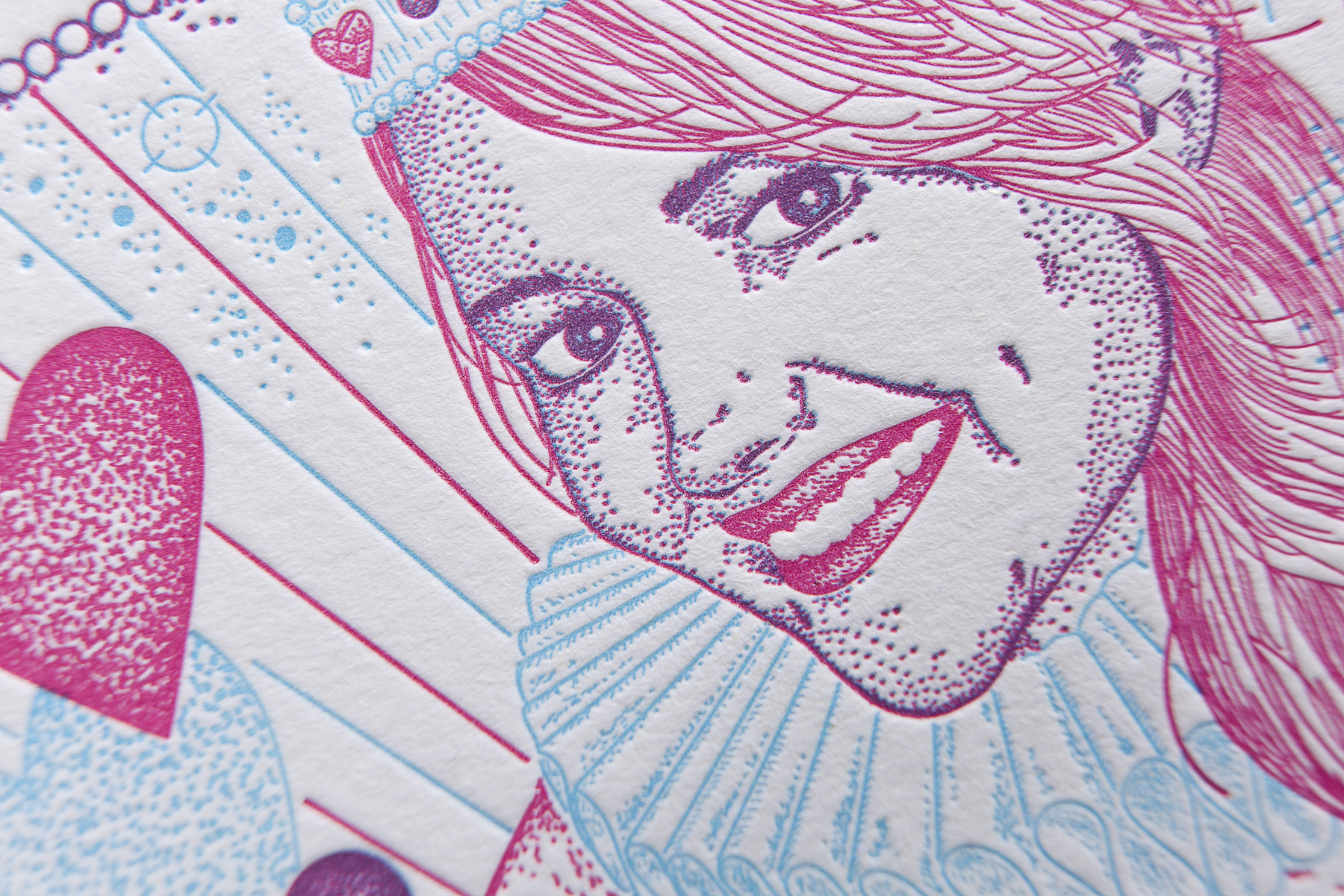
Dubbed “the letterpress queen” by her clients, Saint Gertrude Founder Amy Constable collaborated with lettering group “The Letterettes” (Kate Pullen, Carla Hackett, Eliza Svikulis and Wanissa Somsuphangsri) to craft four oversize playing cards, with a fifth recounting the story of Saint Gertrude.
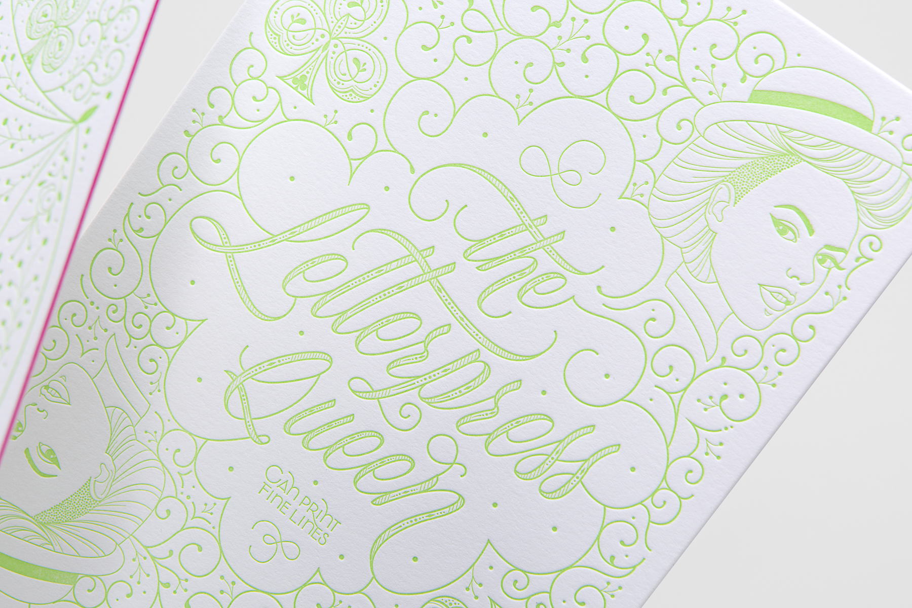
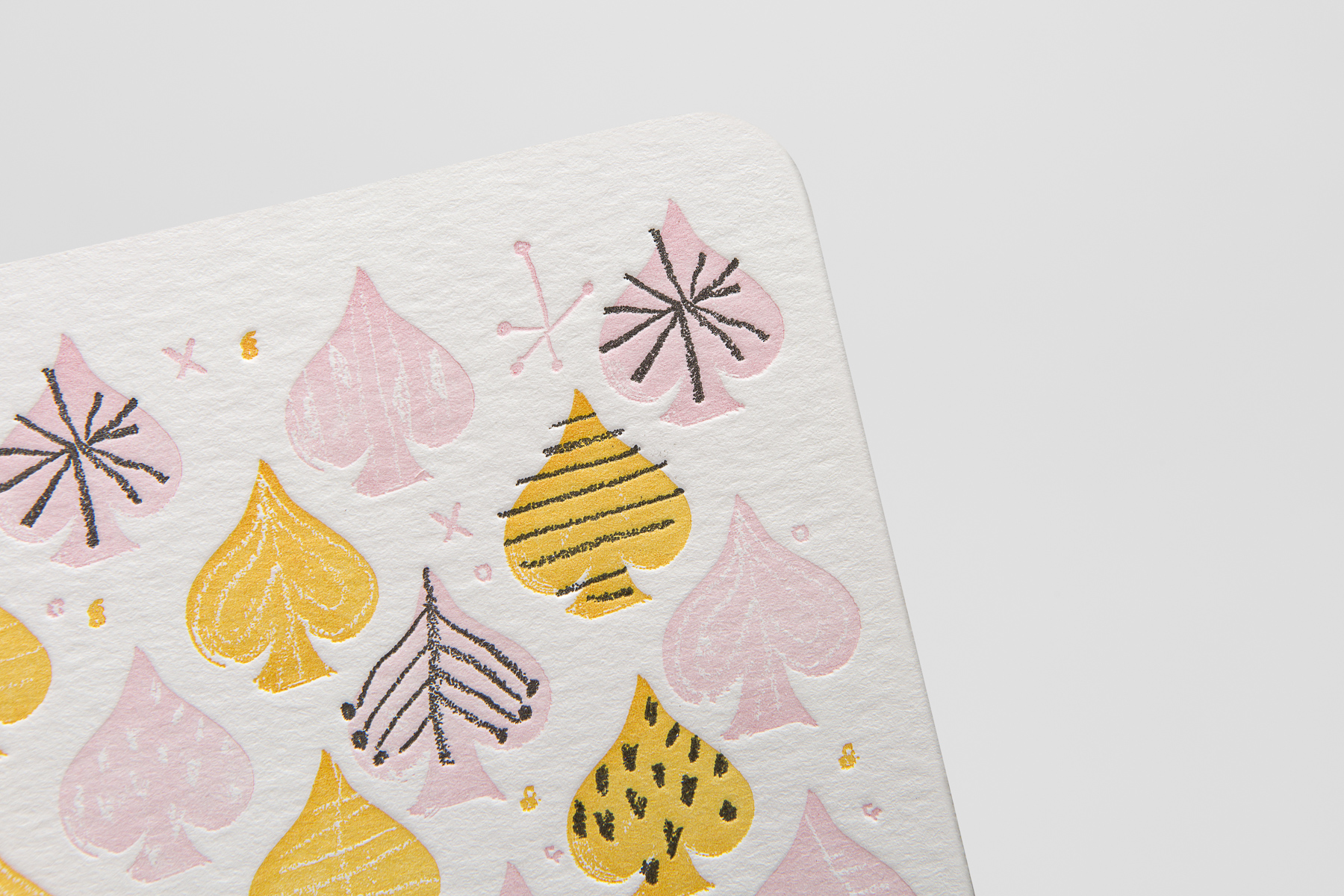
Leaving aside the gorgeous lettering and illustration (and the super-tight registration) for a moment, each playing card is like a masterclass in a different capability of letterpress printing. I can’t think of a better way of showing a potential client what is possible with this diverse-yet-poorly-understood print form.
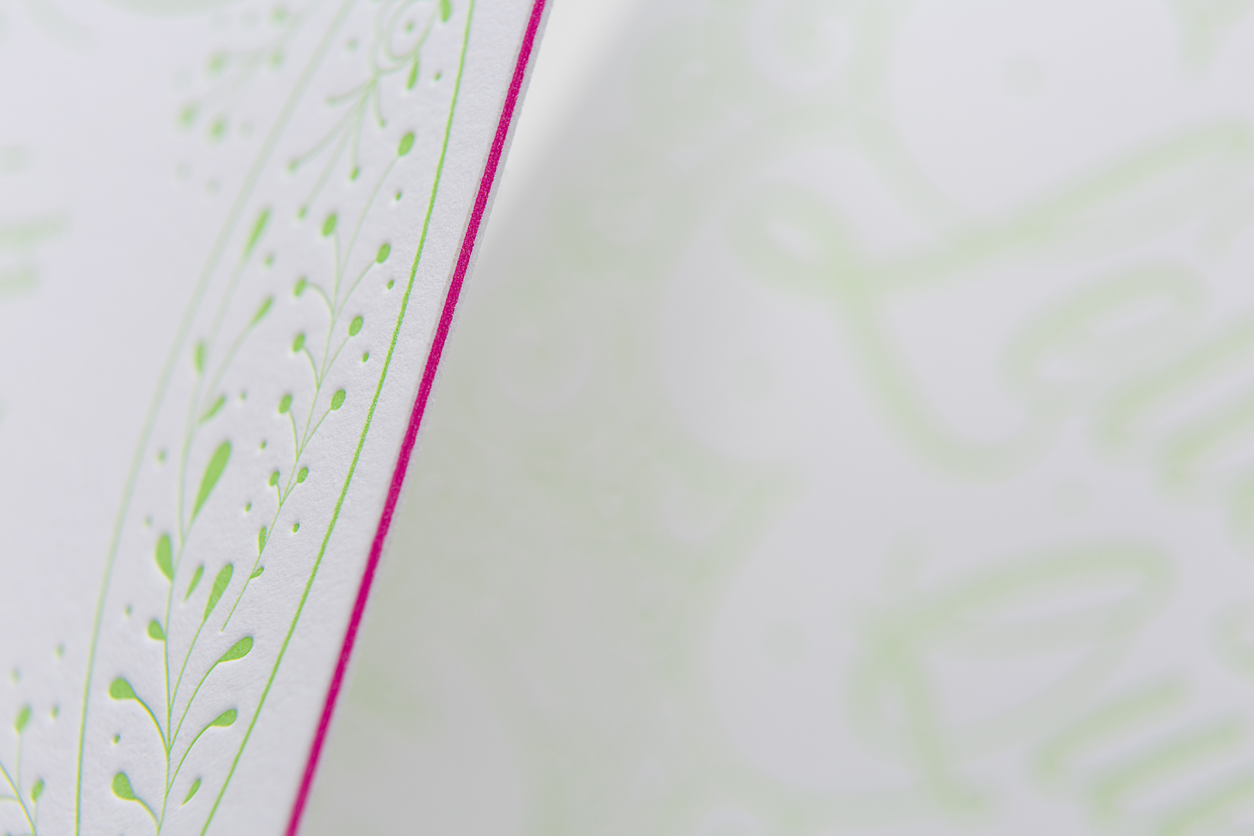
What really makes these promos so stellar is the wild abandon with which Amy tackled these pieces. You can always tell a self-promo in part because there’s not a whiff of design-by-committee to be found, and that goes double for these pieces. Duplex, triplex and quadplex lamination? Let’s try them all, thought Amy, and did. For those playing along at home, the cards break down to:
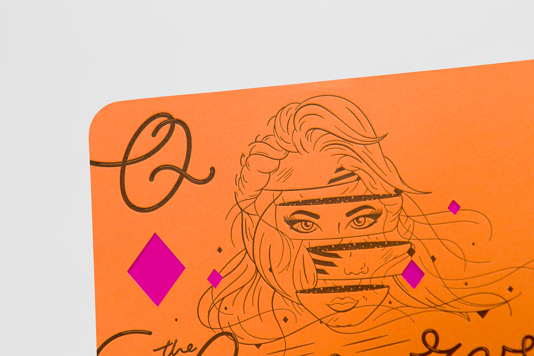
- Queen of Diamonds: Quadplex
- Queen of Spades: Triplex
- Queen of Hearts: Duplex.
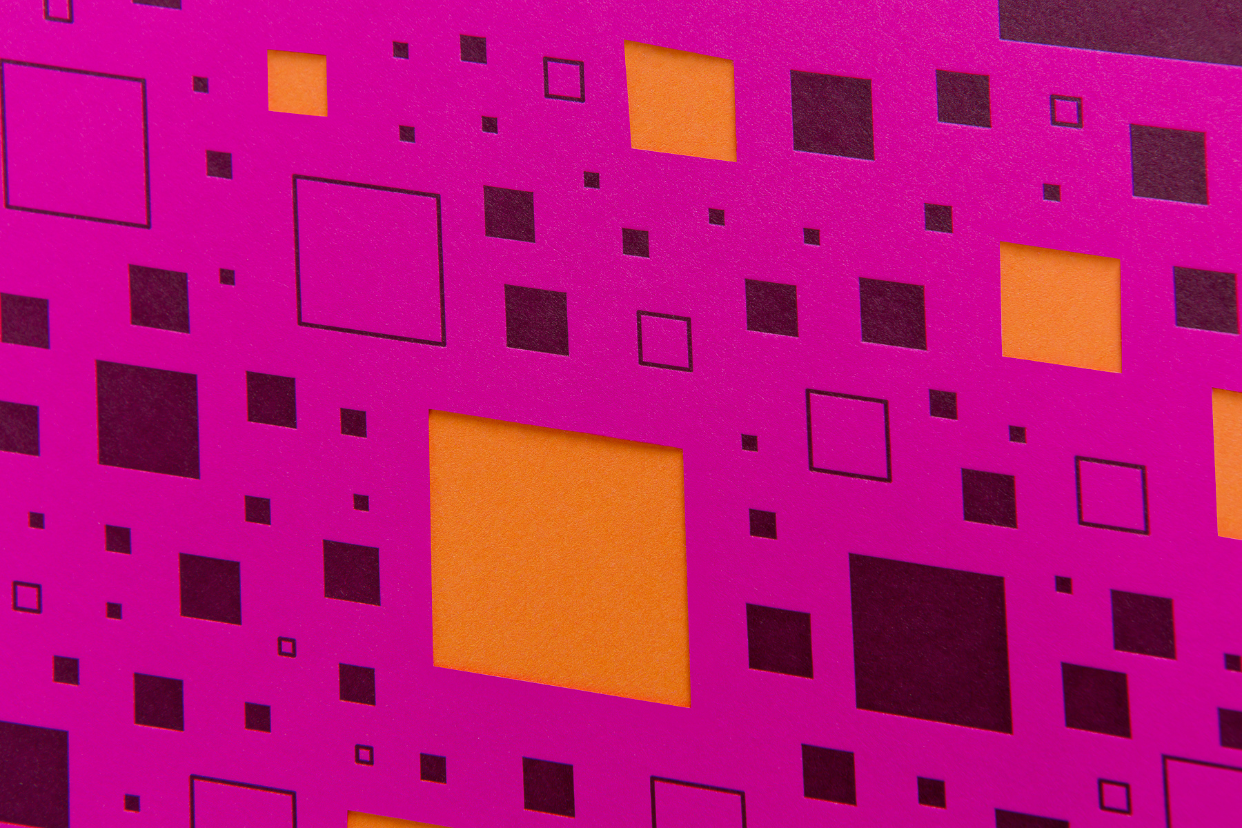
And that retina-slapping Queen of Diamonds? Neenah’s Astrobrights put to great use, and featuring an intricate die-cut on both sides.
From one member of paper royalty to another, Amy, a hand well played!
PRO members, don’t forget to check out your:
Love this piece? Like it, share it and add your comments below.

