Occasionally when a designer appears to be in complete control of their tools, paper choice and inspiration, the art of design arguably becomes something more like science. It was the gorgeous business cards that Chad Michael Studio created for Sespe Creek Distillery that started me thinking along these lines. That’s fitting really because its founder and head distiller, a former drug researcher and developer, approaches the art of crafting fine bourbon like a science. “So,” I hear you ask, “Where exactly does the rooster come in?” Patience, my friends. We have some cool debossed business cards coming your way. But first, a brief history lesson.
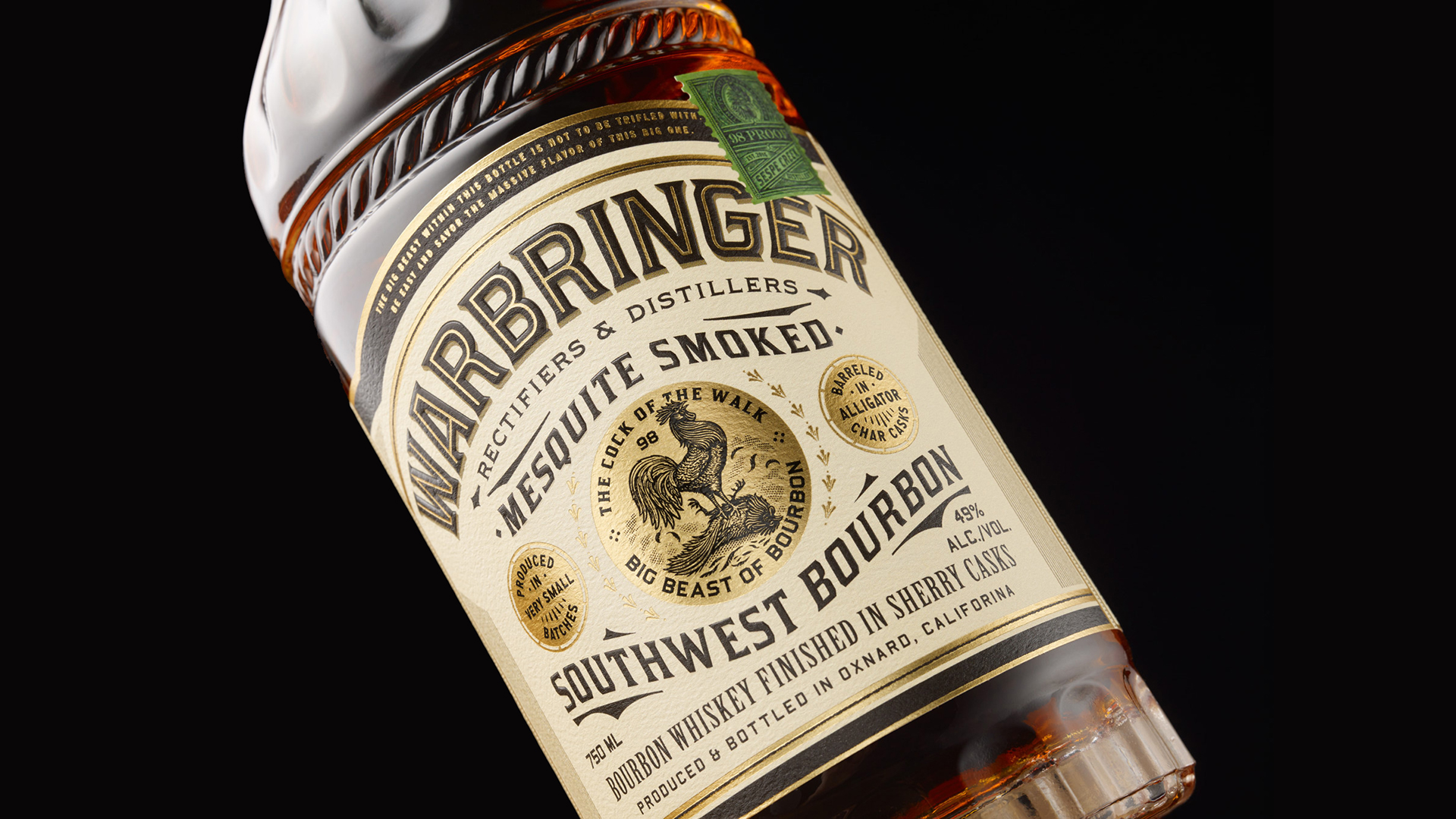
A rooster is actually the mascot for the distillery’s Warbringer Southwest Bourbon, whose name and labeling were both created by Chad. “The Sespe brand was inspired by the Old West and the style that surrounded the era,” he explains. “Antique feed bags, farming equipment, and old General Store items.”
At the center of the bourbon label, a rooster in profile stands triumphantly atop the body of another – presumably the competition – beneath the self-explanatory tagline “The cock of the walk.” When it came time to craft the Sespe Creek Distillery identity, the designer kept the western motif and played up the more cartoonish possibilities of the rooster.
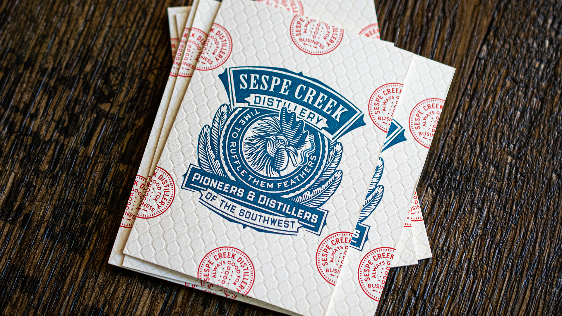
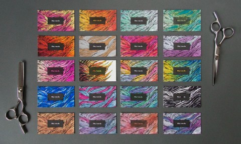
As you can tell by the catchphrase, this distillery is all about attitude, and their business card has it in spades. It starts with the choice of paper. With the precision of a scientist, Chad has gone with two 111 lb. Gmund Colors Matt sheets duplex laminated into a chunky 222 lb. attention magnet. You’d be amazed at how strong an impression a truly thick card makes on people; they simply can’t stop handling it. (I’ve seen this first-hand for years at trade shows with my own cards.) And that’s just the beginning.
The Power of Debossed Business Cards
With the help of frequent collaborator Clove St. Press, Chad took the rooster from Warbringer and letterpress printed [PRO Guide to Letterpress Printing] a cartoonish, cigarette-smoking version of it on the front of the card in Blue ink, surrounded by the words “Time to ruffle some feathers.” This is accompanied by the Sespe Creek Distillery name and “Pioneers & Distillers of the Southwest” – also in Blue.
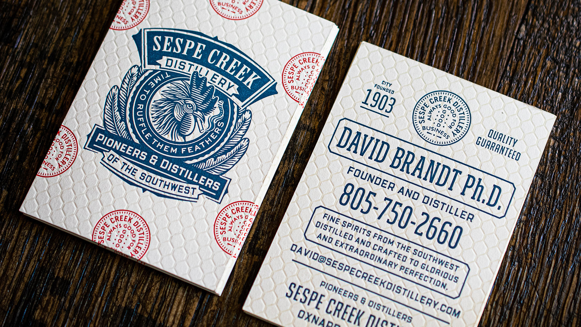
Letterpress printed along the edges in red is a repeated stamp with the distillery’s name and the phrase “Always good for business.” None of the stamps are completely intact – each is either half or three-quarters rendered – yet taken together we can instantly tell what they say. On the back of the card, the founder’s name, contact details, product information and the stamp are all letterpress printed in Blue.
The final flourish comes with a finger-pleasing deboss pattern of distinctive chain-link fencing, deep impressed with a nearly blind letterpress run – just a hint of custom-mixed ink was used to enhance the pattern. It’s as if the rooster is thrusting his head through a gap in a chicken coop – a fantastic example of what debossed business cards do so well.
It’s not just a clever idea, but a testament to what a creative, and almost scientifically precise, designer can accomplish when client and inspiration come together. Still, Chad confides, “With every letterpress piece I send to press, it is increasingly obvious that the final result and success of a piece depends on the passion and talent of the letterpress printer you hire.”


