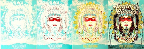
 Seems like there’s always something cool on press over at Mama’s Sauce, a print and design shop in Orlando. We really love this uber-colorful silk screen poster for the Angie’s Curves Downhill [Skateboarding] Event in Pala, Calif. – more so after we learned a bit about how designer Derek Hall created it.
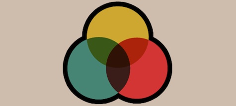
To get the fine colorful details on this sheet, he used transparent overlays, in which you print a semi-translucent ink on top of another ink – a simple and effective way to create more colors for your spot-color designs. Each time you do this, you essentially get two colors for the price of one. And the whole thing is as simple as setting your top color to “Multiply” in Illustrator.
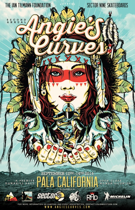
As Hall told Mama’s Sauce:
“…the more colors used, the more difficult the print can be, so keeping the colors down provides less room for error and missed registration… and it’s cheaper. HA!”