Winning a spot for your business inside the second-largest passenger airport in the Chicago area is huge, and the Hudson Group knows it. Its Hudson News subsidiary is the largest operator of airport newsstands in the world. Which is why the company went all out with its request for proposal (RFP) to Chicago Midway.
“The Midway Partnership RFP submittal was a unique partnership between Hudson Group, SSP and Vantage for the opportunity to manage and operate concessions at the South Side airport,” explains Hudson Group Creative Director Steve Goulbourne. “We had to show a design that inspired smiles and excitement in the unboxing of the RFP so we decided to take inspiration from the approach that Apple takes when creating a box for their iPhone or laptop computers.”
What they came up with is a bit hard to describe which, believe me, is actually a good thing. This is definitely one of those times when “you really had to be there.” Fortunately with this video, you are 🙂
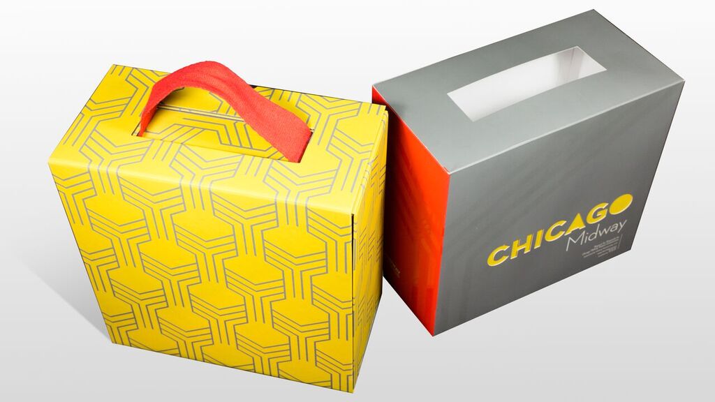
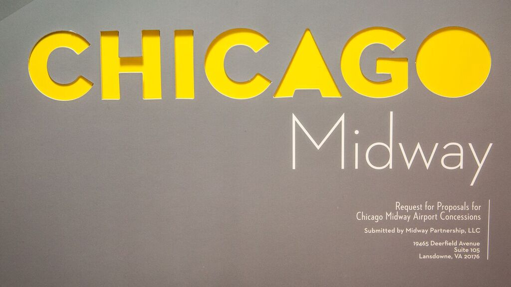
The creative pulse gets pumping right away with the die-cut “Chicago” on this box’s outer sleeve. Where lesser designers might’ve just let the pattern on the box beneath show through the die cut, Hudson Group put a yellow backing on it. Not only does this make “Chicago” seem to radiate with a bright intensity, it also delays the reveal of the pattern beneath the sleeve. (Though I can’t confirm whether said pattern is identical to the carpets at Chicago Midway, it certainly does look like the type of thing you’d find beneath your feet at an airport.)
“There are layers to the Midway RFP packaging starting with the (sleeve) that holds everything together, which is a designer using the right vibrant colors as well as some spot UV treatments,” Steve explains. “The graphic design treatment is very Chicago-centric and uses colors that scream local Chicago.”
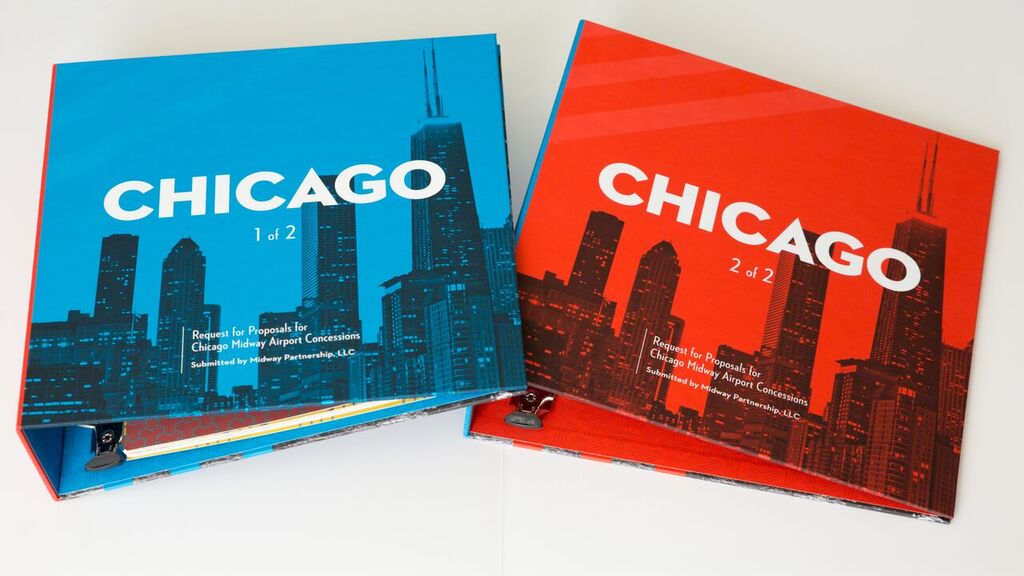
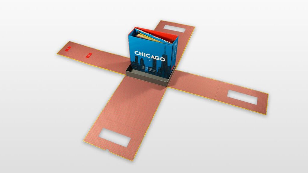
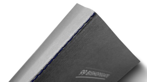
Once the sleeve comes off, the box beneath opens very precisely like a blossoming flower with the slightest of tugs, thanks to cleverly concealed magnets. There’s something inherently Japanese about this opening process, an understated elegance – like origami in reverse – that makes you forget that this is an RFP presentation. Inside, the twin binders that greet you are well-thought out color-wise, alternating reds and blues – a vibrant treat for the eyes. From sleeve to box to binders, this whole package was beautifully brought to life by Integrated Printing & Graphics.
Of course there’s only one way to truly measure the success of any business proposal – was it successful? In this case, absolutely. They won their bid for a spot in Chicago Midway Airport. (Don’t you love happy endings? 😉 )


Very clever, like the slick design and the ease of use with form & function.
Glad you like it, Bob 🙂