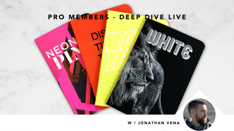
Metallics, white, and fluorescent toners are still underused in digital print – not because they’re difficult, but because many designers (and printers) don’t understand how layering changes the result.
This session shows how to:
• expand your usable color gamut
• create bespoke, high-impact effects
• push digital print far beyond “CMYK + silver”
When you understand what the toner is doing, you can design more intentionally – and have more informed conversations with your printer.
The Big Ideas
- Think in layers, not colors
Specialty toners are functional, not decorative.
Where they sit in the print stack (“under” vs. “over” CMYK) determines whether they:
• shift color
• add shimmer
• soften contrast
• or simply highlight an element
Start with intent. Then choose placement.
- White toner is a strategic tool
White isn’t just for dark stocks. It can:
• boost vibrancy and clarity when printed under CMYK
• soften and stylize imagery when printed over CMYK
• control how much fluorescence or metallic effect shows through
Opacity and percentage matter more than people think.
- Fluorescent pink acts like light from underneath
Fluorescent pink isn’t just a color – it behaves like a backlight.
Used well:
• under CMYK → energizes oranges and skin tones
• under metallic toners → creates champagne or rose-gold effects
• under white → adds vitality without screaming “neon”
This is why pink is often the most versatile fluorescent toner.
- Metallic toners behave differently than foil
Metallic toners are subtle and mixable:
• silver + gold = champagne
• lower coverage often looks richer than 100%
• under CMYK = shimmer
• over CMYK = highlight
They reward experimentation and restraint.
Practical Do-Its
- Decide the role of the toner first
Highlight, soften, energize, or mutate color – don’t guess. - Ask your printer about the toner order
“Under or over?” is a meaningful design decision, not a technical footnote. - Experiment with percentages
5%, 20%, 40%, and 80% can look radically different. - Adjust fine type when printing white on dark stock
Slightly thicker strokes = cleaner results.
Want More Detail?
Jump to these moments in the video – or use the search feature within the video to find exactly what you need.
- Layering logic explained visually → ~15:00
- Metallic toners vs. foil → ~20:00
- Fluorescent pink use cases → ~25:00
- InDesign layering walkthroughs → ~35:00
- White toner myths + realities → ~50:00
Bottom Line
- Digital print can do far more than most designers realize – if you design for it.
- Metallics, white, and fluorescent toners aren’t gimmicks. They’re tools.
- Used intentionally, they turn good print into unforgettable print.
Presenter
Christine Yardley, Co-Founder/ President, Print Panther Direct
Under Christine’s leadership, Print Panther Direct has earned multiple Gold Leaf Awards, Benny’s, Gold Canadian Print Awards, and has taken home Best in Show honors—proof that innovation and craftsmanship can (and should) coexist. She also shares her passion for print under her personal brand: Eat Print Love.