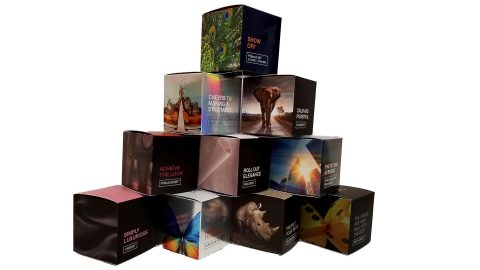
Spotlight: Monadnock Paper Mills
Designing for any audience is challenging enough, but trying to craft something exciting for the higher-education market without resorting to the same old snoozy scenes of students and campus lawns – well that’s a real uphill climb. So what better way to grab designers by the eyeballs than with a promo boasting a rock climber on one of the most colorful covers of 2019? Amazingly, the piece in question – Monadnock Paper Mills’ “Single Image Volume II: Matt Lester” – is a wild ride for your fingertips as well as your eyes thanks to intelligent paper choices and a few unexpected, and unexpectedly useful, surprises.
When Your Design is Ambitious, Paper Choice is Everything
Created to show off the way that multiple grades of Monadnock’s premium uncoated papers can dramatically enhance higher-education marketing materials, it was ultimately decided that a single stock – Astrolite Silk – would be used for the book itself, while loose samples of others would be tucked inside. This struck everybody as the best way to go because of the rich contrast, vibrant colors and deep blacks that Astrolite Silk can achieve, to say nothing of its unique premium feel, says the promotion’s designer, Jenny Hamilton of Blossom Creative
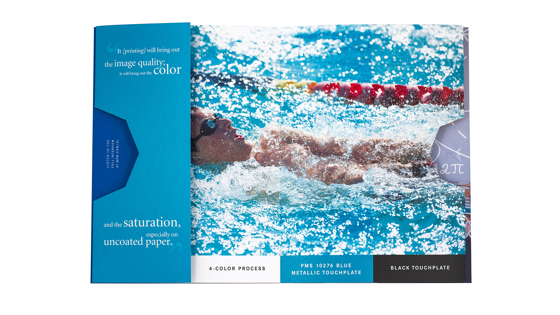
“It’s so soft,” she explains. “Also, unbelievably smooth. And when working with a printer who has the knowledge of how to use this paper to its full potential, it can perform much like a coated sheet. This paper doesn’t absorb quite as much ink as other uncoated papers, which is why it’s able to achieve the deep, rich, even blacks and solids on the back and on the foldout panels. The superior formation and smoothness of Astrolite Silk also made it possible to use the PMS metallic blue, and achieve a hint of shimmer on the solid foldout and in the touch plate area of the swimmer photo.”
To demonstrate just what is possible, Jenny added embossing, foil stamping, intricate folds, touch plates, saddle stitching and strategic die cuts to the piece. Though admittedly daunting when seen together like this, she learned that these techniques are all well within the reach of any designer, and will come out beautifully, so long as they pay close attention to the details during planning and production.
Greater than the Sum of its Parts
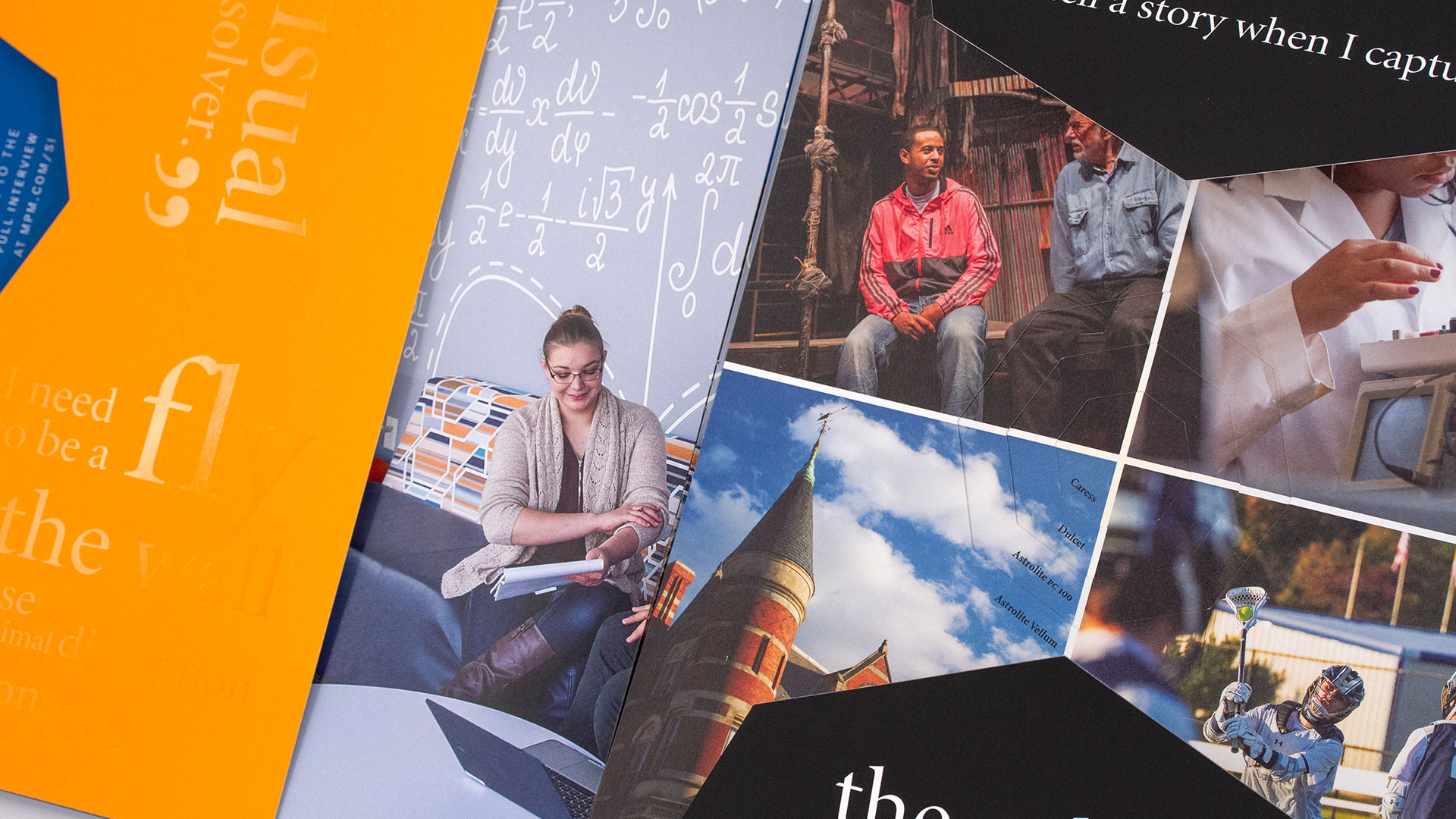
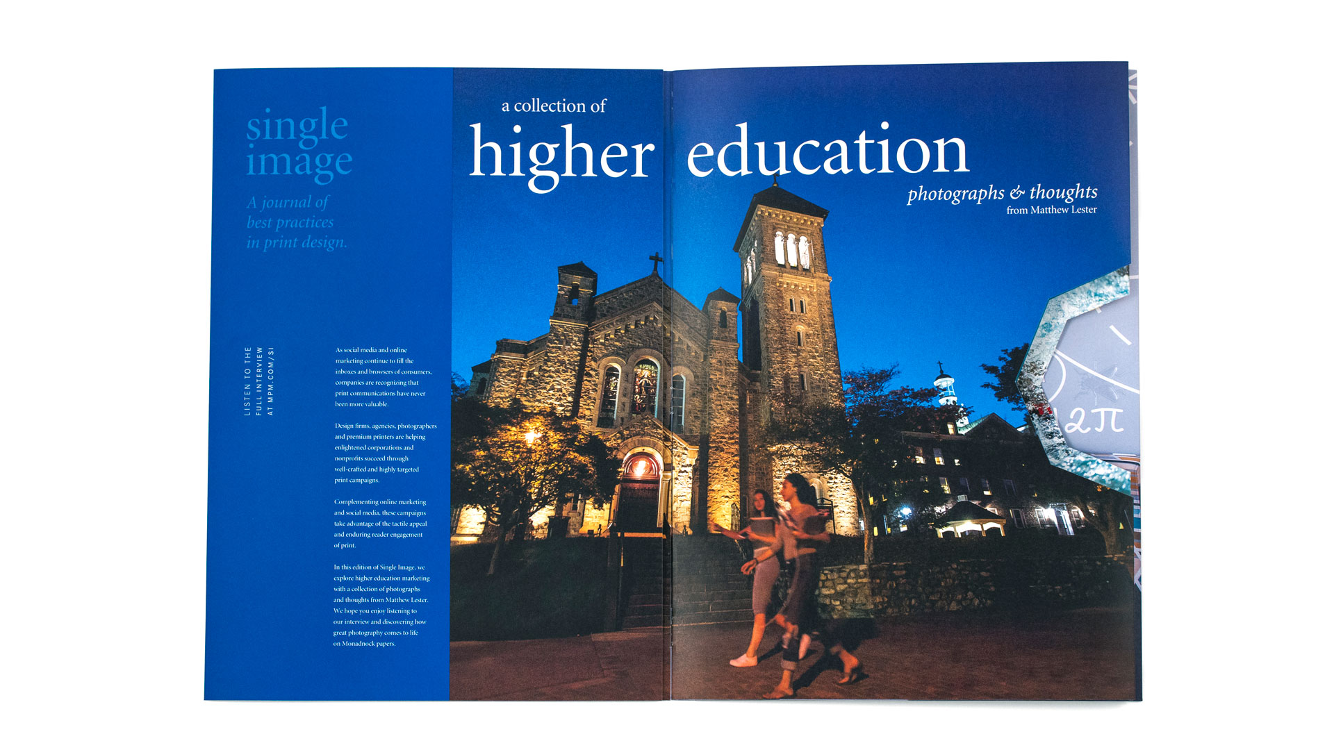
Working closely with Monadnock, Jenny knew that the piece would feature images from – and an interview with – photographer Matt Lester. “As soon as I saw the photo of the rock climber, I knew it had to be the cover,” she admits. “Between the dynamic rainbow of colors, the concept of climbing in relation to higher education, and the potential it had for special treatments to make the cover sing, it was the perfect fit. My first plan was to emboss the rocks and hide the back of the emboss by gluing what is now the gate-folded panel.”
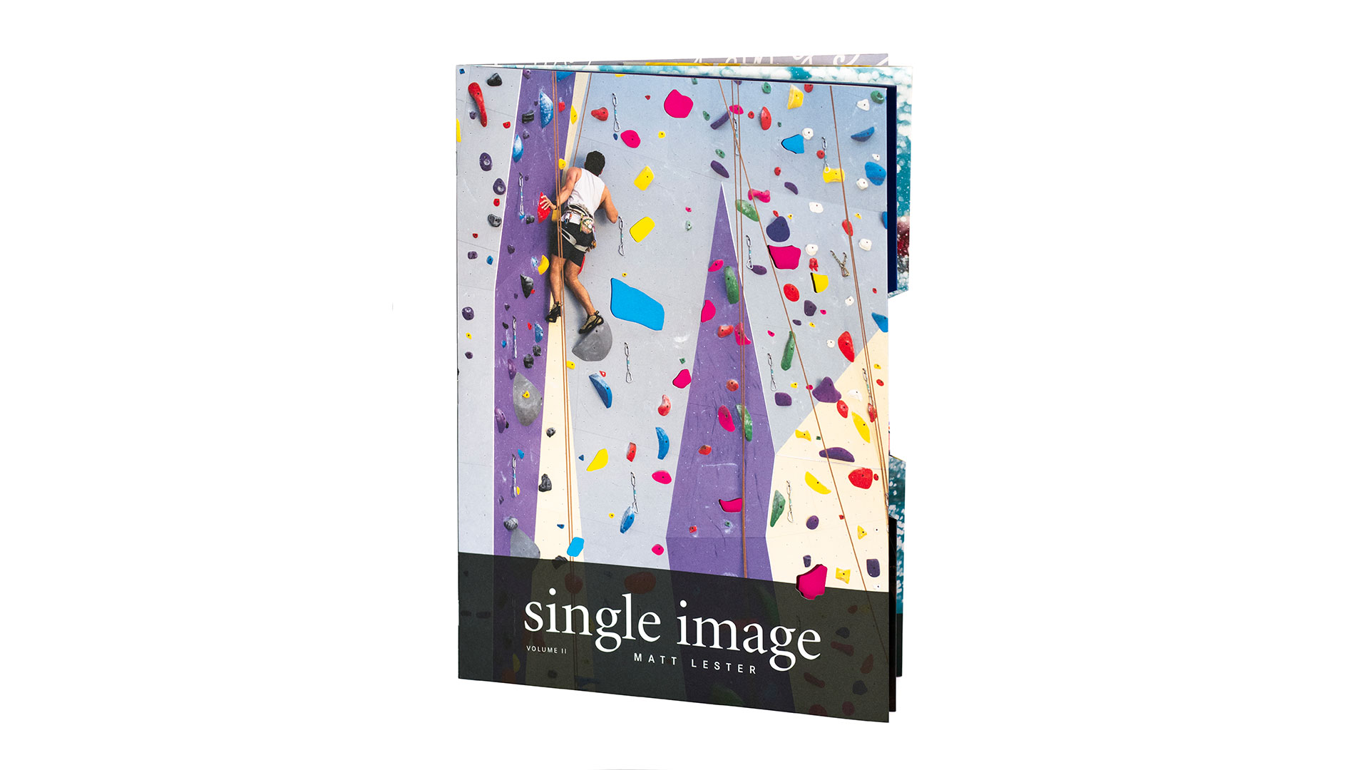
Jenny ultimately decided to focus on showing off the colors of the climbing wall in a unique way instead, incorporating several rock-shaped die cuts where different colors showed through – these printed as squares on panels behind the main cover.
Says Jenny, “It was an evolution to get to the final cover design, and the process really rings true to the quote on the inside cover: ‘The final product is greater than the sum of its parts; the photography, typography, design and paper stock it’s on.’ As I got a little further along in the process of compiling the content for the book, I caught the aforementioned quote. Originally, that quote was going to serve as an introduction to the book helping explain its intention, and foreshadowing that the reader was in for an exciting experience. It was then that the lightbulb went off, that I could take it a step further by deconstructing the cover to show how layers and interactivity can come together to create a greater experience with the printed piece.”
A Smart New Way to Sample Papers
The first time you see the paper samples in “Single Image II” you’re bound to think to yourself “Brilliant – why don’t paper companies do it this way more often?!” And doubtless the printer, designer and Monadnock all would reply: “Because it’s a real bear to pull off.”
Tucked neatly at the back of the book, the sample sheets – each printed on a different Monadnock paper – feature the same four colorful photographs. Crucially, they also each boast a hexagonal die cut at their center. By moving the sheets up and down and from side to side while keeping them stacked, you can compare and contrast how the same images and colors appear on the following Monadnock papers:
- Astrolite Vellum Brilliant White
- Astrolite PC 100 lb. Bright White
- Dulcet Neutral White
- Caress 80 lb. Cover Mellow White
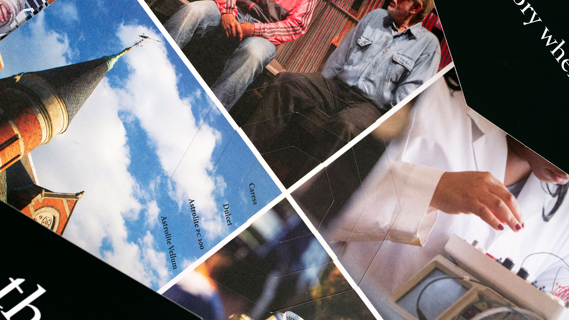
It’s a clever, highly effective way to gauge how each sheet influences the artwork. And as you can imagine, the printer had their hands full making sure it all came out perfectly.
“We worked very closely with the printer, DG3, in creating several full-scale mockups,” Jenny reveals. “The printer meticulously made sure that each sheet was die cut perfectly, otherwise the stack would never have lined up and it would have been an obvious mistake. More importantly, the mockups helped refine the overall structure of the piece because there are so many different things happening between the complex foldouts, two triple-photographic crossovers, layered die cuts, and the loose sample stack in the back. We had to make sure the binding method and spine were perfect, and that the samples were going to be secure. Without these mockups, this project could have been a disaster!”
Instead, Monadnock, Jenny and DG3 crafted a stunning piece well-tailored for the higher-education designer that is, itself, an education in print design.
So How Do I Get a Copy?
[THIS CONTEST IS NOW CLOSED] The good people at Monadnock are generously offering “Single Image II: Matt Lester” to PaperSpecs readers for a limited time. Enter to win one of 100 copies by clicking the button below now! Hurry, this contest ends July 25th. (North American entries only, please.)
PROS: Get Your Guaranteed Copy!
(Not a member? Why not start your PRO membership today?)