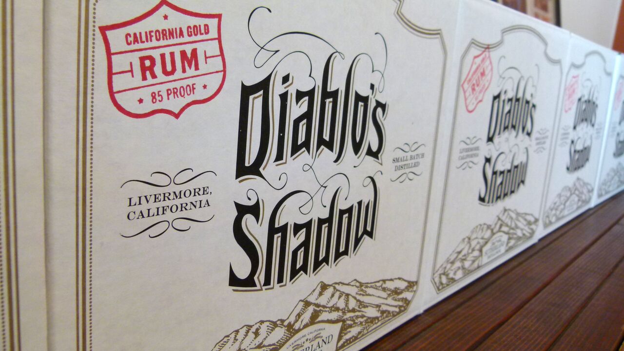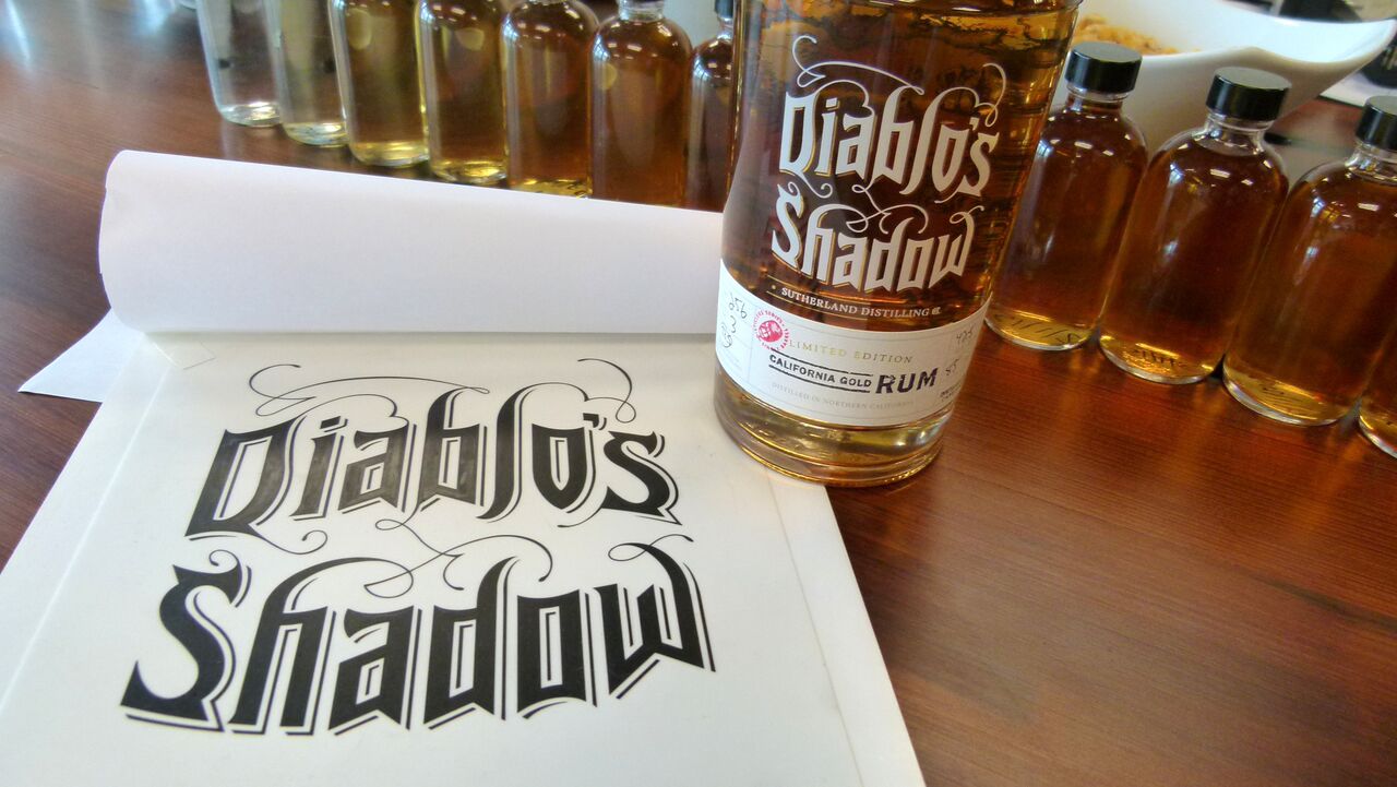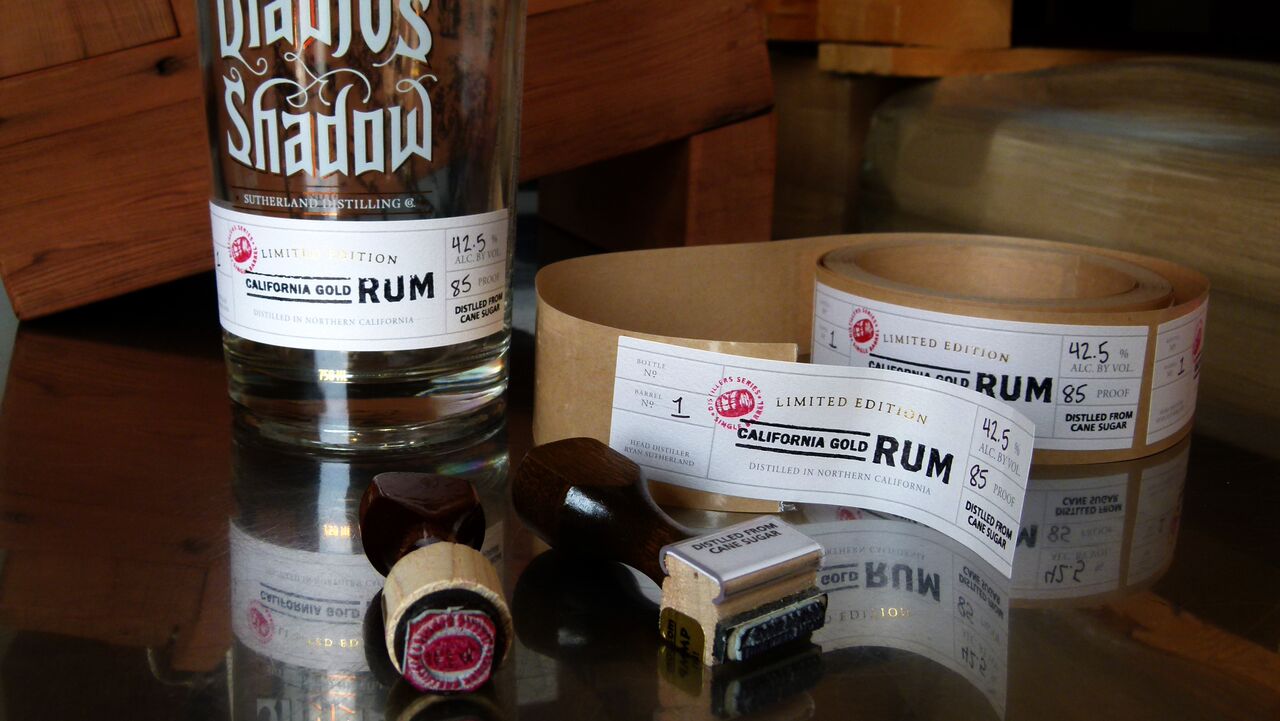
Few industries are as widely known for their creative packaging as the wine and spirits biz. And when you have an evocative name like “Diablo’s Shadow,” the pressure’s on to be that much more visually stunning. Employing gothic lettering, felt-like paper labels and a simple-but-clever illustration trick, Cult Partners ensured the packaging for Sutherland Distilling Co.’s line of rum and vodka would match the hand-crafted quality of its spirits.
Watch Cult Partners’ Jeff Hester and Sutherland Distilling Co.’s Ryan Sutherland discuss the achievement that is the Diablo’s Shadow packaging in this video from our “In The Design Studio” series.
[youtube=http://www.youtube.com/watch?v=kWjZfTgVdWI]
The Neenah Classic Wine Label on the front of the bottle “really gave it a dimension of class,” says Sutherland Distilling Co. CEO and Head Distiller Ryan Sutherland, and no wonder. Its debossed gray lines look almost as if they’ve been letterpress printed, and help to set off the gold foil accents. Hand numbering and rubberstamping complete the effect, which is one of Old World attention to detail.
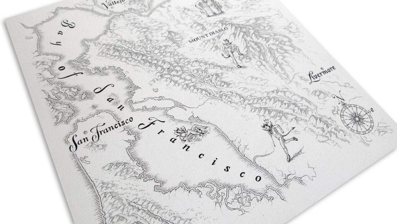
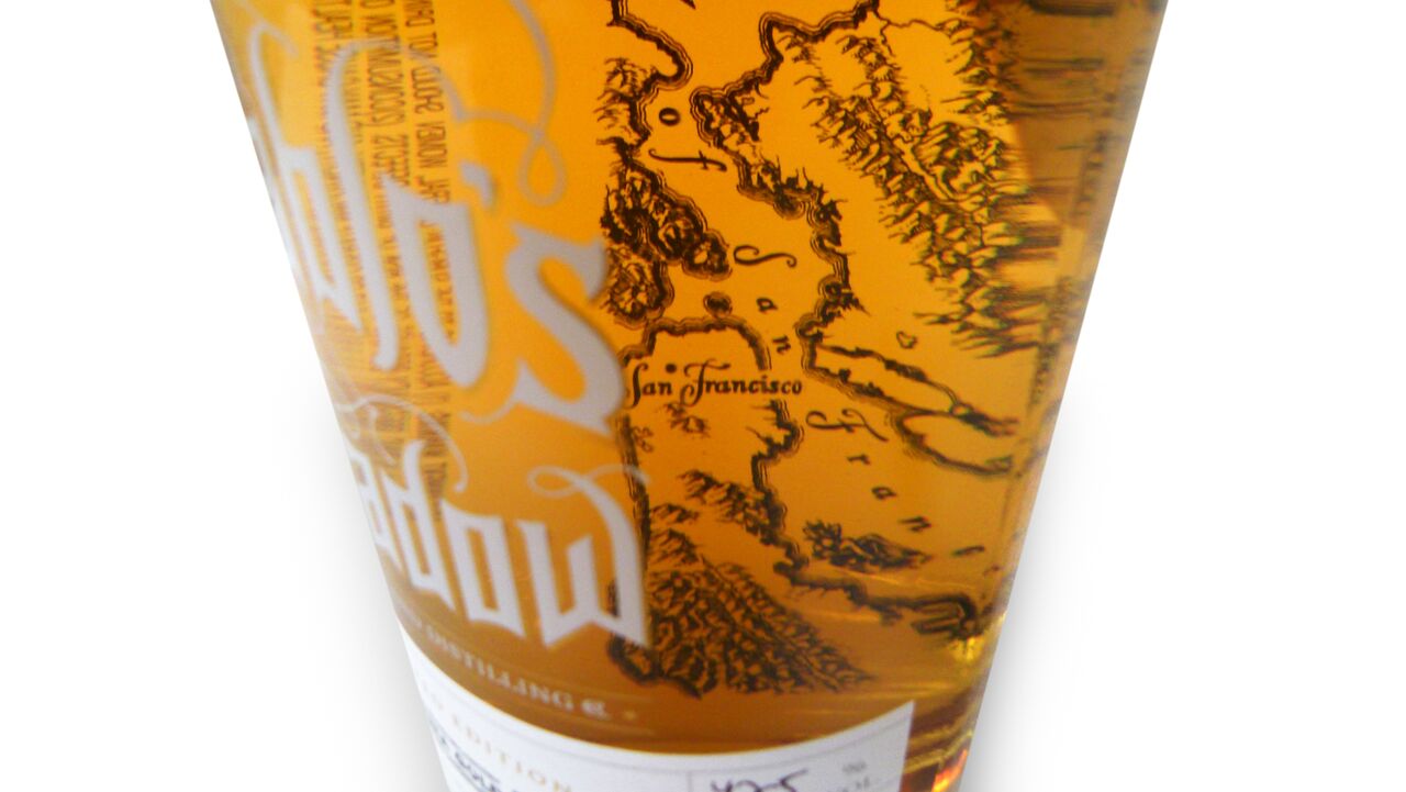
Further underscoring this creativity is a hand-drawn map of Mt. Diablo and the Bay Area silkscreened on the rear of the bottle. While nearly illegible from the back, it is gloriously magnified when viewed from the front through the bottle and its contents.
Jeff Hester’s takeaway from all this? “Anything is possible” in Diablo’s Shadow.