Loved that this entry mentioned the handcrafted quality of the pre-computer age, but should I actually admit here that I remember the 70’s and 80’s with pasted up type and camera ready art that got shot by a camera?
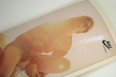
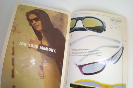
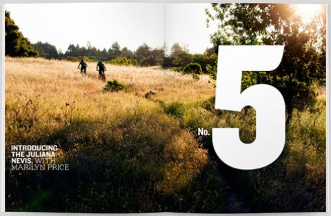
Why not? It worked beautifully for this design team and is precisely why this Nike piece is so effective! The freshness of today’s product shots contrasted with the faded look of those vintage images brings the marketing message into focus. And the reticulated UV spot varnish treatment made me take off my shades for a closer look. Delightful!
So – everything old is new again – in fashion and graphic design.
Nike Vision Vintage Catalogue was featured as a Paper Inspiration.
[youtube=https://www.youtube.com/watch?v=bDgbLDO7BA4]