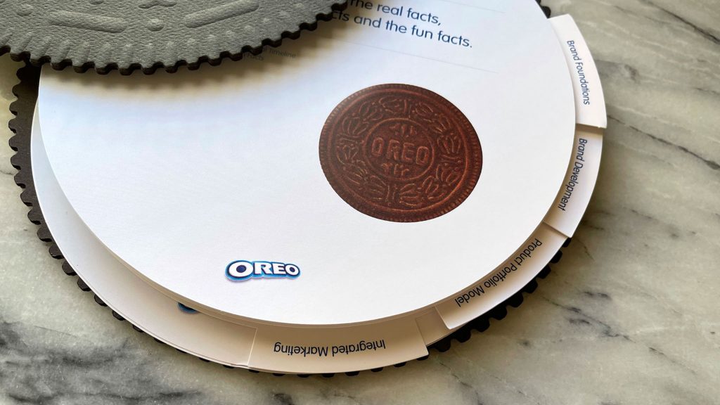
There’s always been something a little magical about the Oreo cookie. With its dark chocolaty wafers and cream filling, it easily stands apart from the crowd. So it should come as no surprise that the guide that Nabisco published to outline its branding guidelines is no mere binder. Instead, it looks for all the world like an enormous, 14-inch Oreo cookie! The extra treat inside? A mysterious binding technique that keeps everything neatly together.
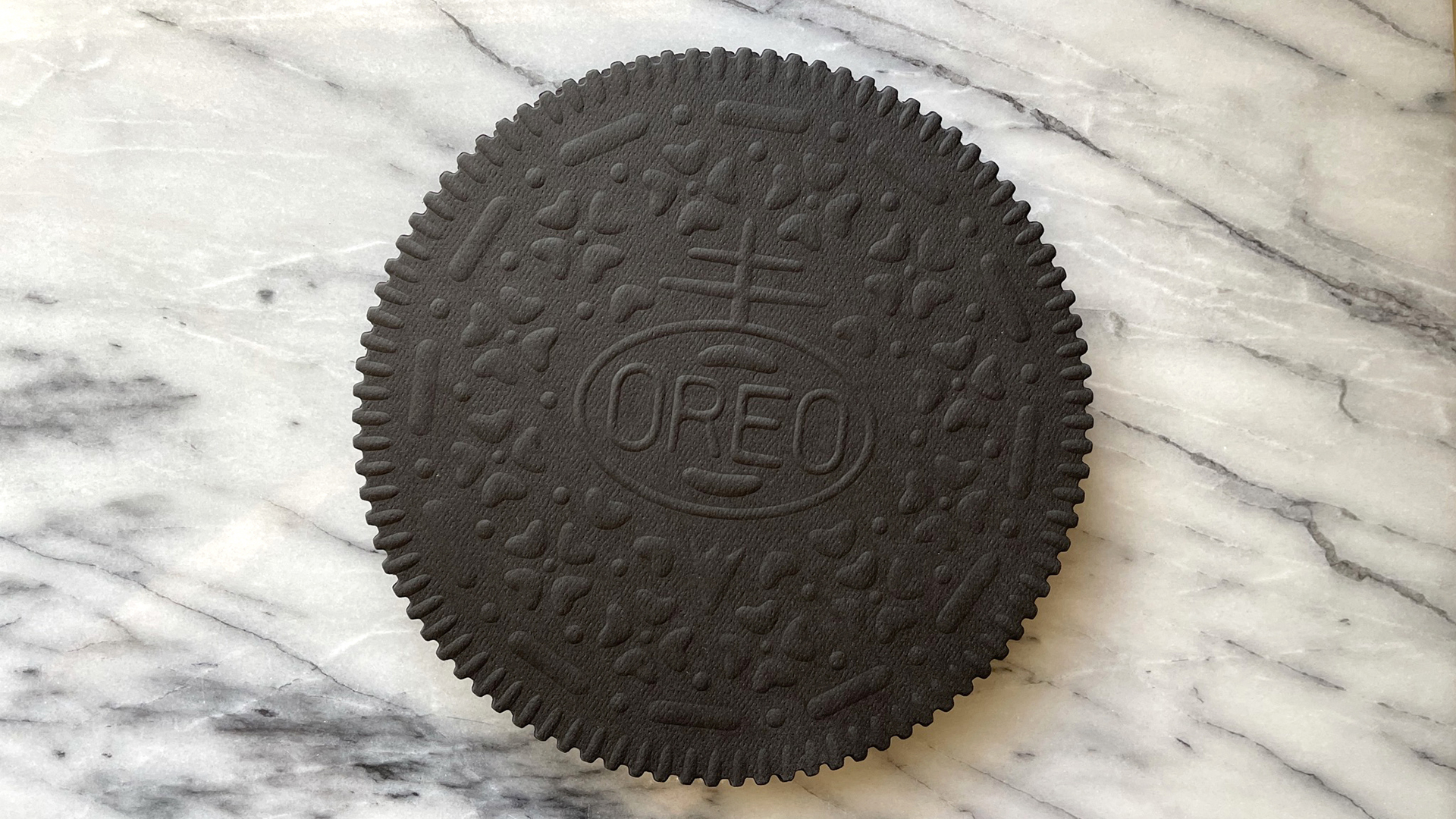
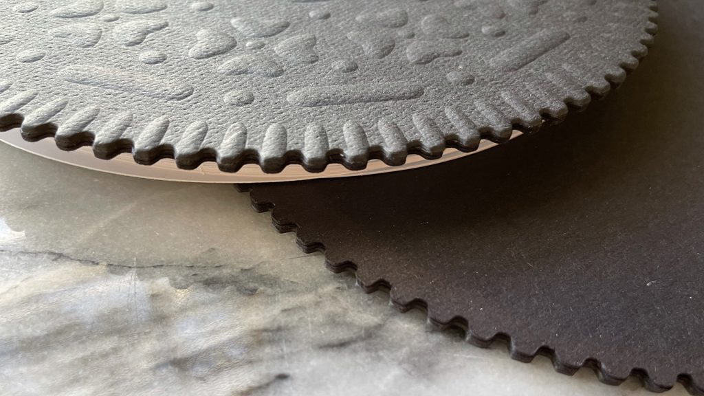
The first thing that hits you about this book designed by Nabisco’s in-house team and offset printed CMYK by Sandy Alexander is just how much it looks – and feels – like a giant Oreo; you half expect your hands to come away with the familiar black crumbs those cookies leave behind.
Contributing to that realism are the super-thick covers made from Eclipse Black 80 lb. Neenah Royal Sundance Cover [Get Swatchbook!] mounted to paperboard, mimicking the chunky nature of Oreo wafers themselves.
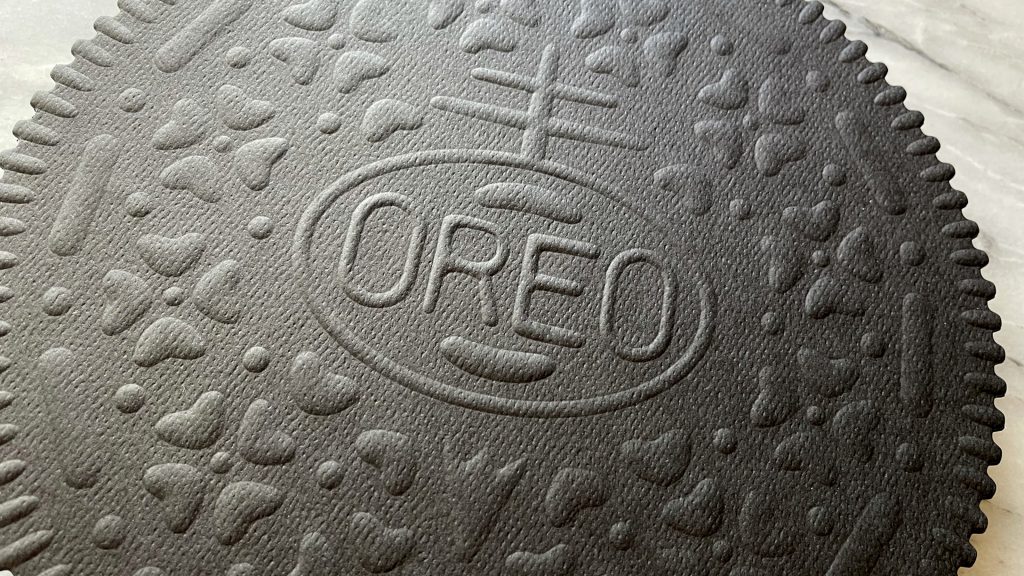
The uncoated paper’s surface is blind embossed with the Oreo logo and trademark outer ridges, as well as the dots, dashes, florets and other textures that make the cookie so unique.
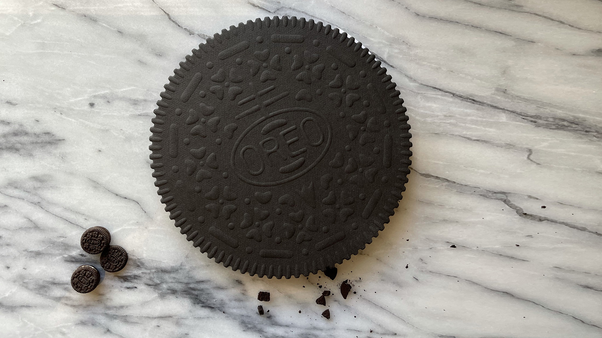
The White coated pages between the covers – 100 lb. Sappi McCoy Text [Get Swatchbook!] – further the cookie illusion, resembling that famous creamy middle. In fact, the mammoth proportions of this piece, combined with the fine level of detail, can make you feel like a shrinking Alice in Wonderland confronting a real Oreo cookie 😉
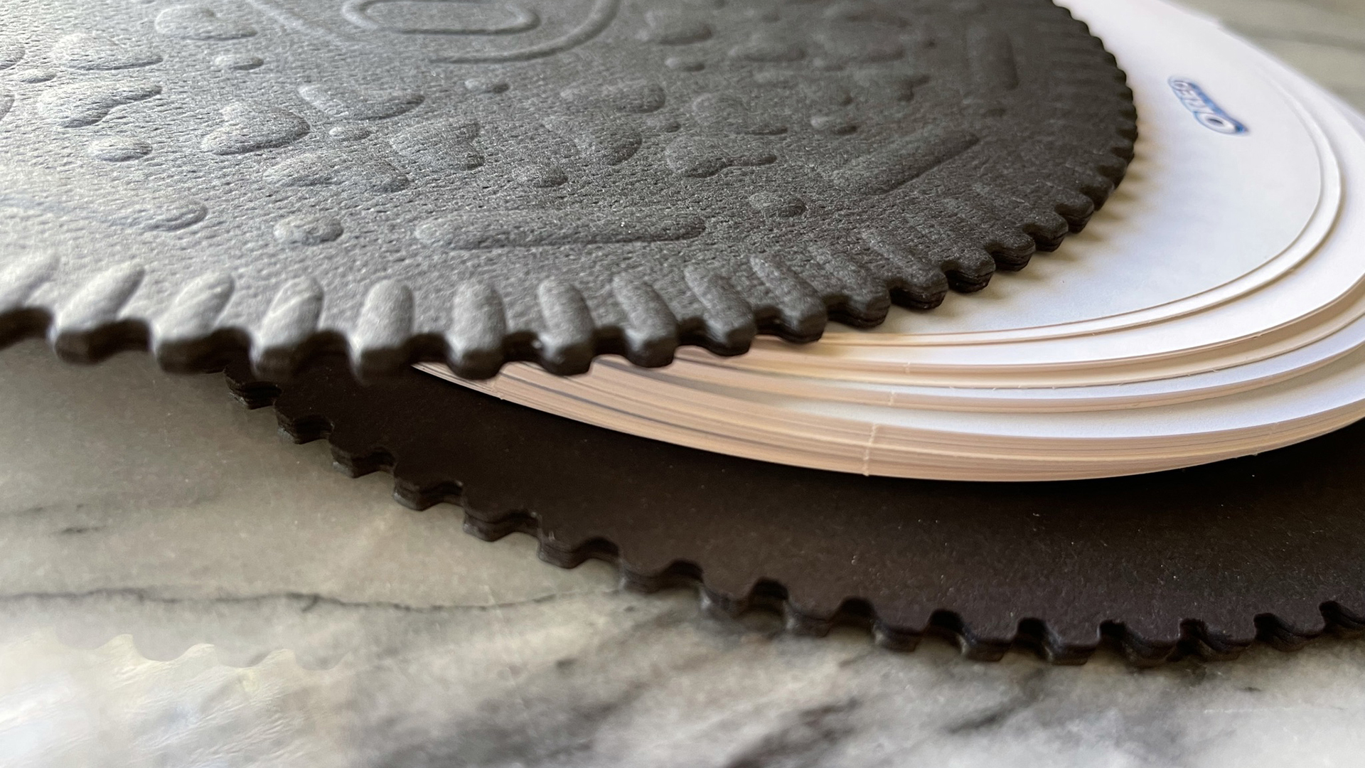
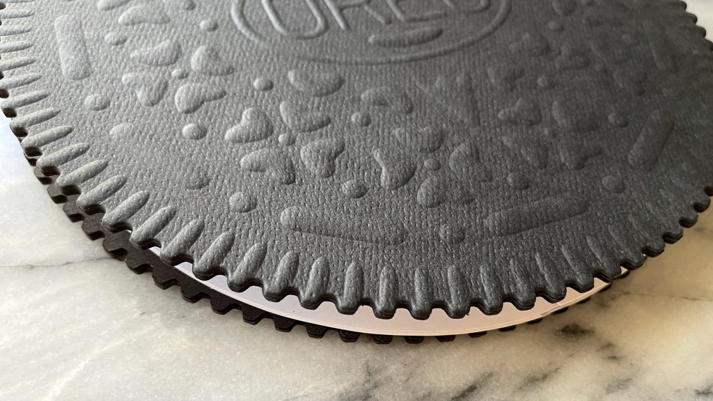
Impressive as all this is, the real magic comes when you open the book. Rather than flipping up as expected, the front cover actually pivots out of the way like a peephole cover to reveal the page beneath. As it turns out, all the pages turn this way, with information easily findable thanks to rounded die-cut tabs – printed on 120 lb. Sappi McCoy Cover – that spell out what each section contains.
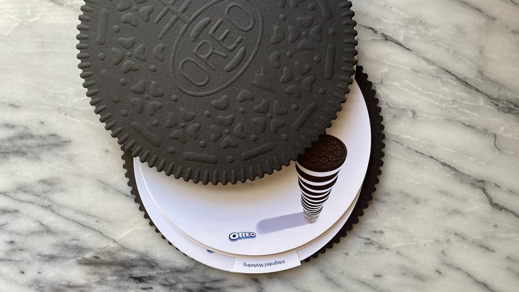

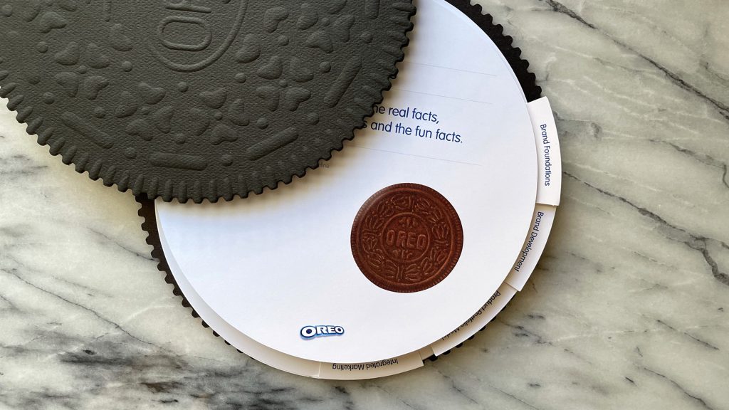
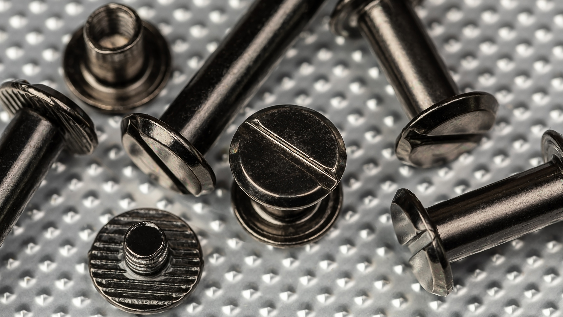
So…how exactly did the wizards at Sandy Alexander pull off this delicious binding miracle? You guessed it: our old friend Chicago screw binding. [Check out our PRO Guide to Chicago Screw binding!] A hole was drilled through one edge of the pages, and then an aluminum post was slipped through the hole, capped off with a slotted cap screw. In this case, the binding was concealed by those extra thick cookie covers. Front or back you can’t see so much as a hint of it – ingenious!
While Chicago screw binding turned out to be a perfectly scrumptious way to keep the pages of this unique book neatly together, there are many different binding options available to you today. Discover 12 of the most popular, including relative costs and benefits, in our free Binding Cheat Sheet. Download yours right now!


This is stunning! I don’t eat Oreos but I’d love to have one of these. What a creative use of embossing and brand incorporation.
High praise indeed, Ryan 🙂
Brilliant! But I’d love to know how they concealed the Chicago screw on the covers. Is there a hidden flap somewhere???
Great question, Michael! The base cookie with Chicago screws is concealed by additional layers (with the actual cookie emboss) that were laminated on top. Hope that helps!
Incredible!