Penny & Rose may be in the business of selling home fragrances, but its true stock-in-trade is nostalgia, and as we all know, there is no drug more potent than that. So when it came time to design everything from the logo and brand design, stationery, packaging, and pretty much everything else, Jess Glebe Design did everything they could to remind us of days gone by.
“We worked from the ground up with Penny & Rose to brand this timeless line of products, whose roots honor the lives of [the founder’s] two extraordinary grandparents — Penny & Rose,” Jess explains. “The creator of Penny & Rose envisioned a line of home products which connected core childhood memories of her time on her grandparents’ farm with specific scents.”
The designer began with hands-down one of the most heartwarming logo marks I’ve seen in some time – a silhouette of a young girl with pigtails caught in mid-swing on a tire.

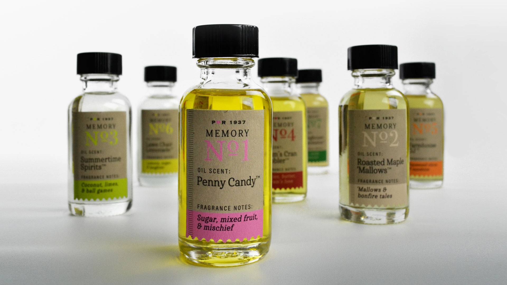
Caitlin Riley, co-owner and in-house copywriter for Jess Glebe Design, generated names for the individual scents guaranteed to stir memories of yesteryear – including Penny Candy, Lawn Chair Lemonade, and Gram’s Cran Cobbler.
Caitlin also wrote short, creative nonfiction stories to be included inside folded hangtags (more on those later) all about what it was like to grow up on the farm. Here’s just a taste: “When summer was drawing to a close and the cranberries were ripe on the vines, we knew my gram, Rose, was about to make her famous cran cobbler…”
Playing to this “good old days” vibe, the design studio avoided slick labeling and packaging in favor of a look that, at first glance, wouldn’t have been out of place in a general store at the turn of the last century in terms of simplicity. Yet look closer and you’ll see some clever, sophisticated surprises.
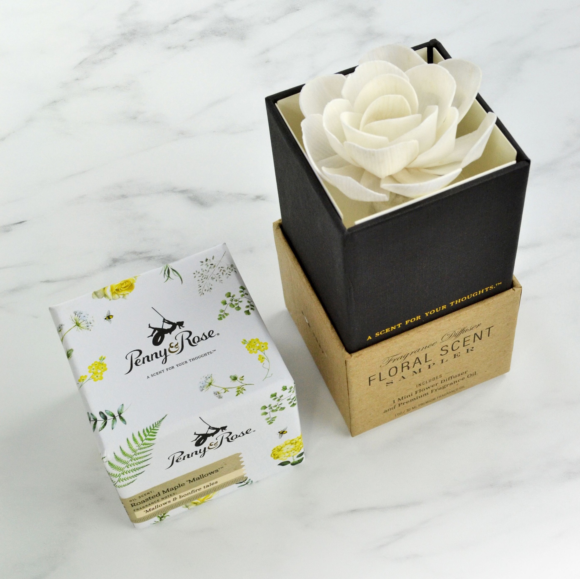
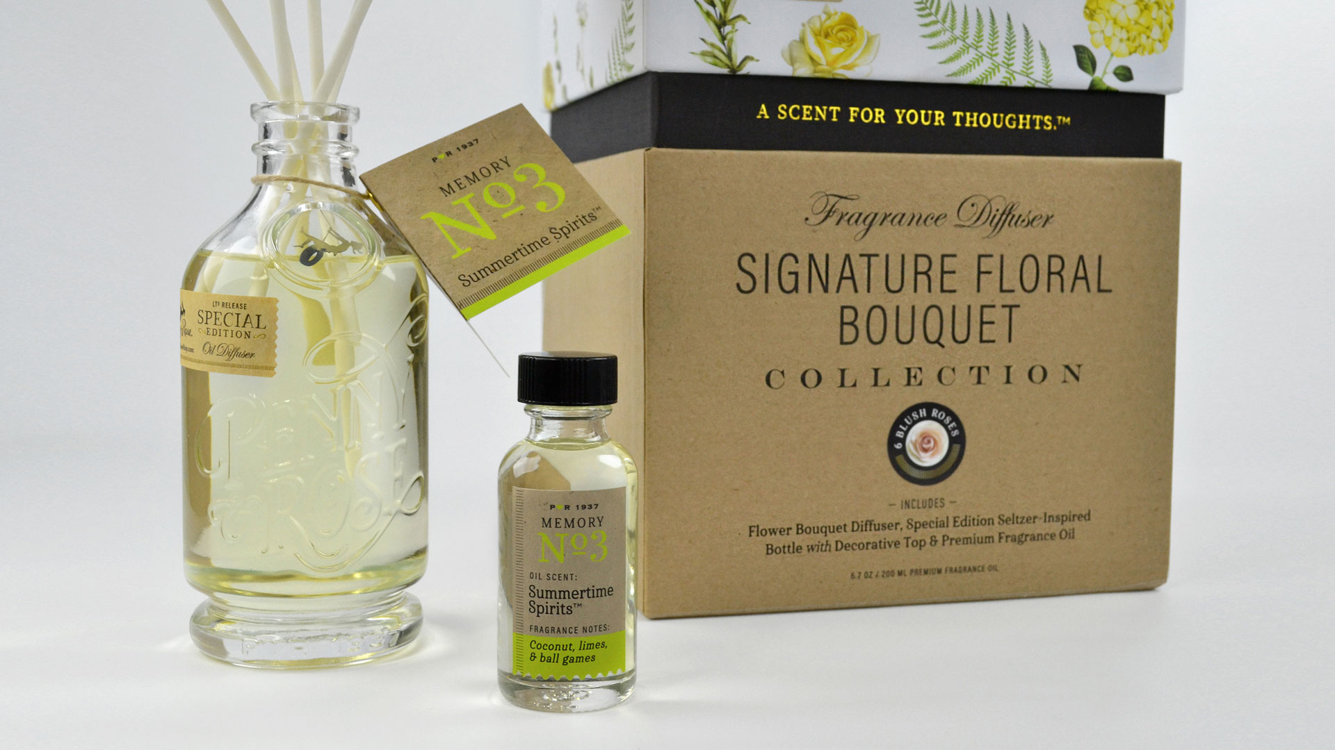
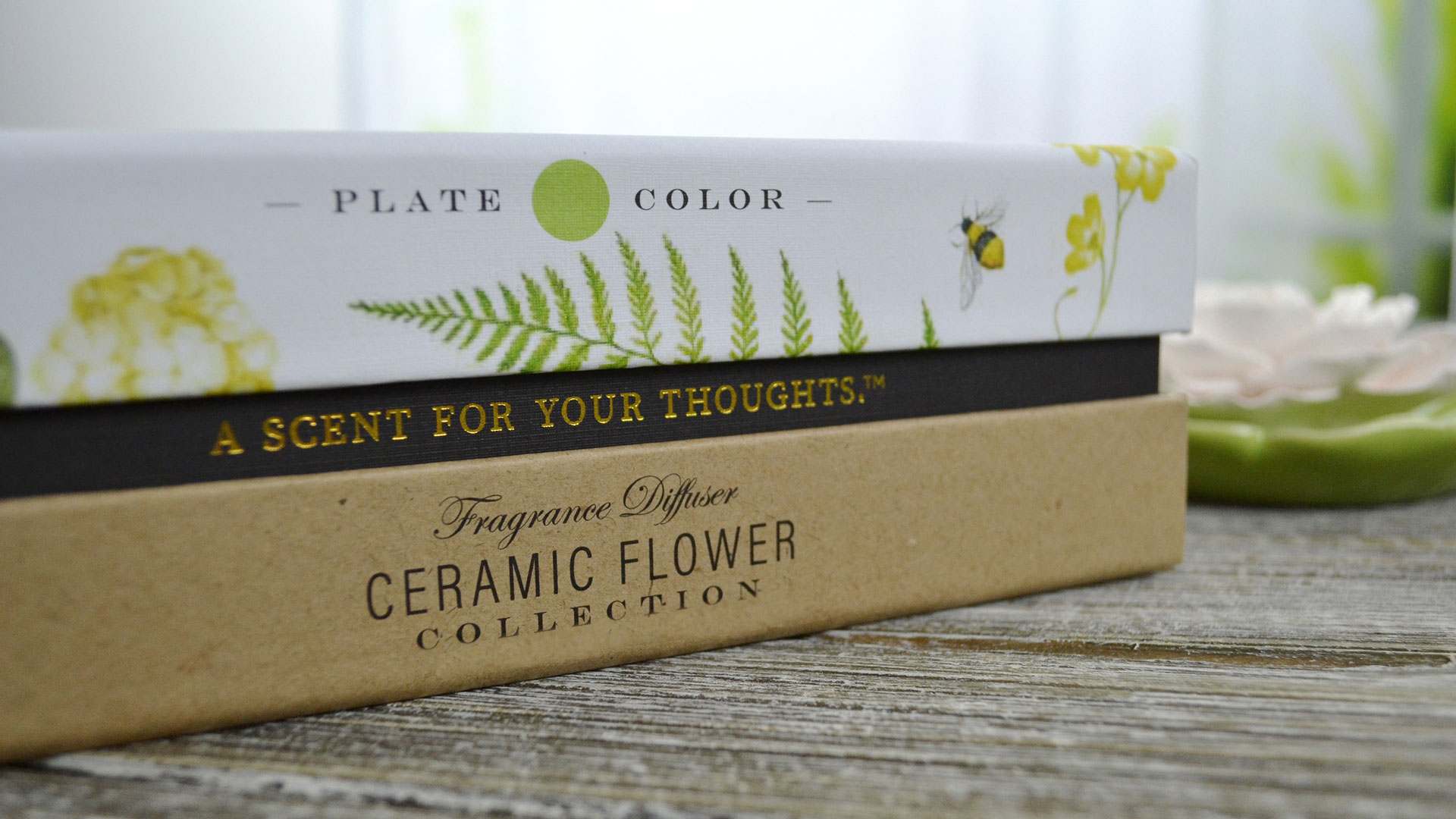
Take the Penny & Rose boxes, which come in different sizes depending on the product, but all bear the same overall aesthetic.
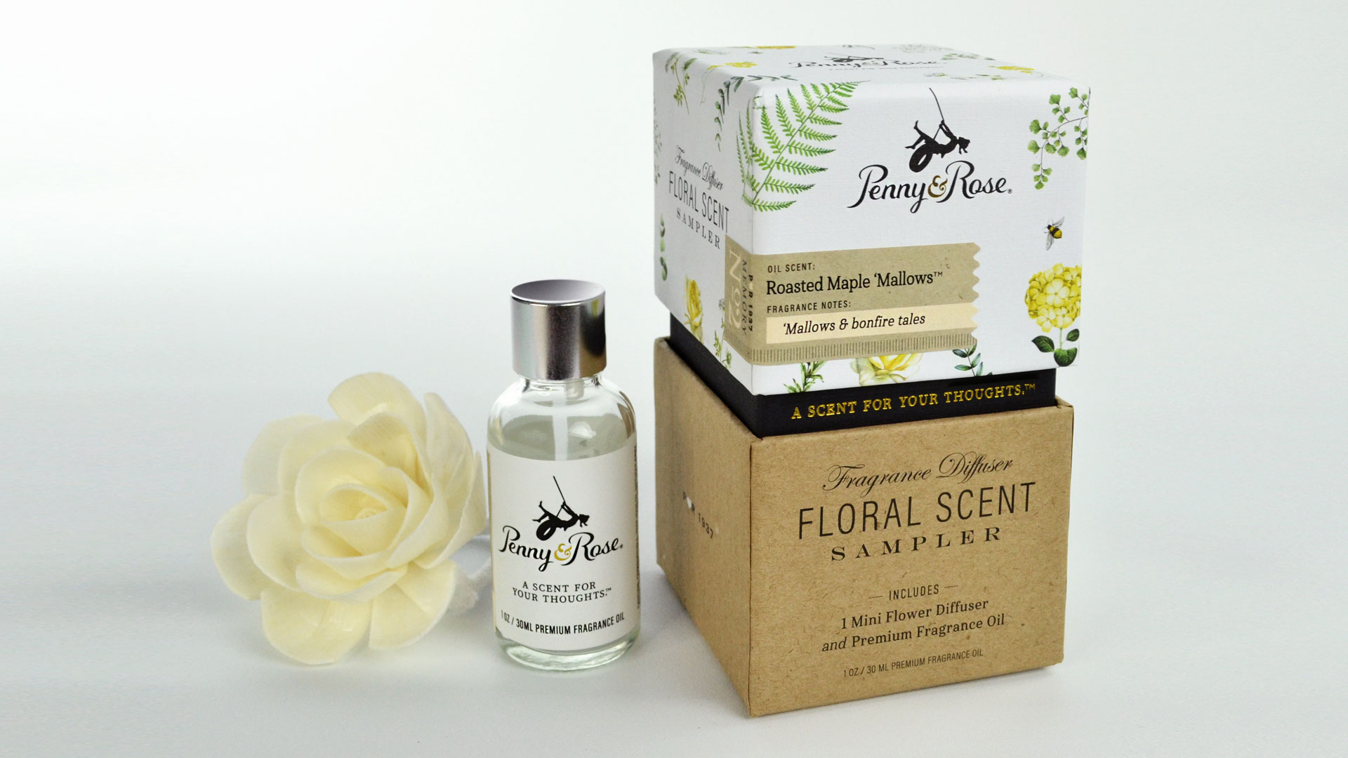
The top – a telescoping lid – consists of white linen paper that’s been offset printed CMYK plus 1 spot color by TrueScent with floral artwork and that charming logo, and then wrapped around cardboard. (On some of the larger boxes, the inside of this lid actually contains a “thank you” message printed inside, along with a glued-in lucky penny to toss “in a fountain, buy a gumball at the market, or leave it heads up on the sidewalk for a lucky passerby.”)
The bottom half is kraft paper printed with black ink and white foil stamping (the little hearts), and wrapped around cardboard as well. In the gap left between the two halves are the words “A scent for your thoughts” stamped in eye-catching gold foil on black linen paper.
Other highlights include:
- Labeling for the 1 oz. fragrance oil bottles digitally printed CMYK by Labelworx on 70 lb. Bright White Wausau Felt
- The aforementioned hangtags printed CMYK by Greenerprinter on 80 lb. White Neenah Royal Sundance Felt Cover [Get Swatchbook!] before being scored, punched and grommeted to be tied by a ribbon, which features the “scent for your thoughts” slogan once more.
- Additional labels that were also printed by Labelworx with a brown kraft paper texture on 70 lb. Bright White Wausau Felt to achieve that distinctive kraft paper look. “The [kraft] stocks the printer had on hand were too dark for our liking,” Jess admits, “so we faked it. Plus the Wausau had a nicer weight and texture than the actual kraft, so it was a win-win.” One edge on each label was given a perforated edge courtesy of a custom die cut.
Finally, one of the most intriguing uses of paper can be found in the diffusers used to actually circulate the fragrances – beautiful handcrafted flowers (see below) made from Mulberry paper! The oil is absorbed through fiber reeds and drawn to the paper flower above, where the fragrance is diffused through evaporation.
Taken together, the branding and packaging for Penny & Rose does exactly what the company set out to do: Provide us all with a charming whiff of how things used to be.