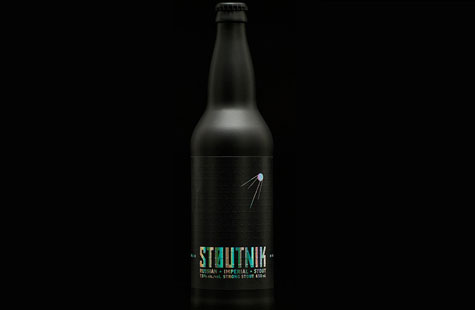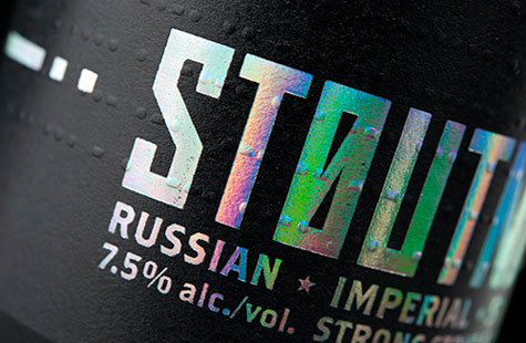
To vie for visibility in a fiercely competitive West Coast craft beer market, this product label sends us over the moon. (And who could resist the tongue-in-cheek Sputnik reference for a Russian stout?)
The all-black packaging and frosted matte black bottle grabs your immediate attention, but the label really takes off thanks to some clever design choices.
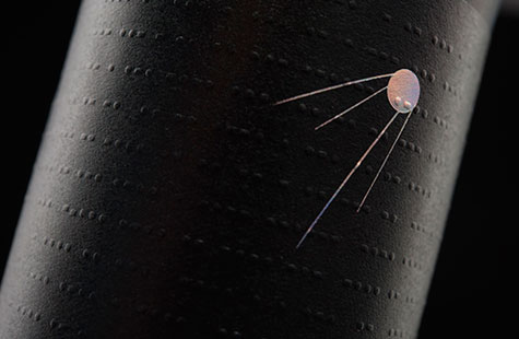
With the twinkling and shifting colors of prism foil stamping, the label appears to be animated, which will certainly draw the consumers’ eyes. (A special nod to the printer here for pulling off the delicate rays of the satellite.)
Once in hand, the texture of a blind-embossed dot pattern adds further intrigue. Are these dark planets or unseen meteors headed toward Earth? You get a clue with the dots-and-dash graphic flanking the logo. (It’s Morse code telling the brand’s story.)
Stylish, sparse, intelligent – Stoutnik’s label is in an orbit of its own.
Stoutnik was featured as a Paper Inspiration.
[youtube=http://youtu.be/4sDq9COC-QI]