[youtube=https://www.youtube.com/watch?v=c8CMk-lJJ7w]
The boxes stand out because they’re personalized to target different types of consumers and tap straight into their hearts. The mission was twofold: not only make delicious handmade artisan chocolate bars, but to bring the comfort of ‘home’ to customers, wherever that may be.
– Jenna Millemaci, Tap Packaging Solutions
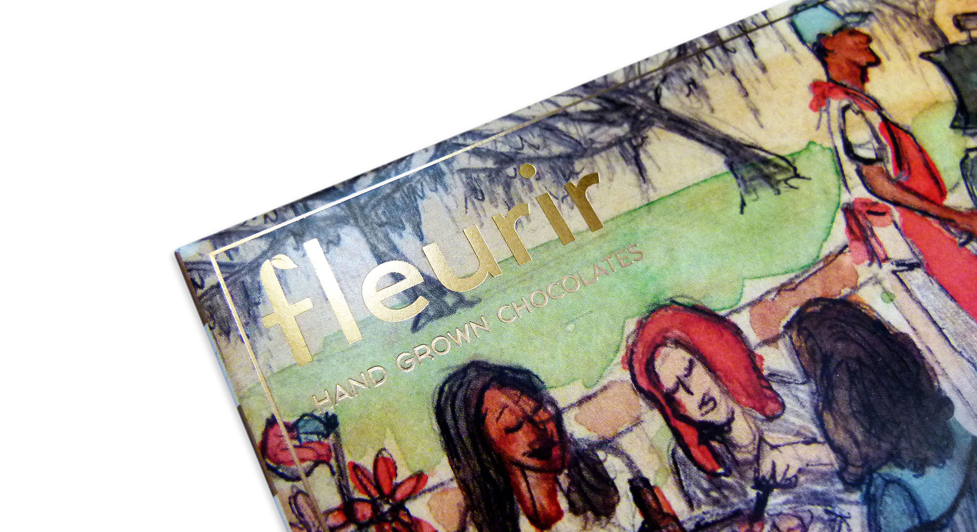
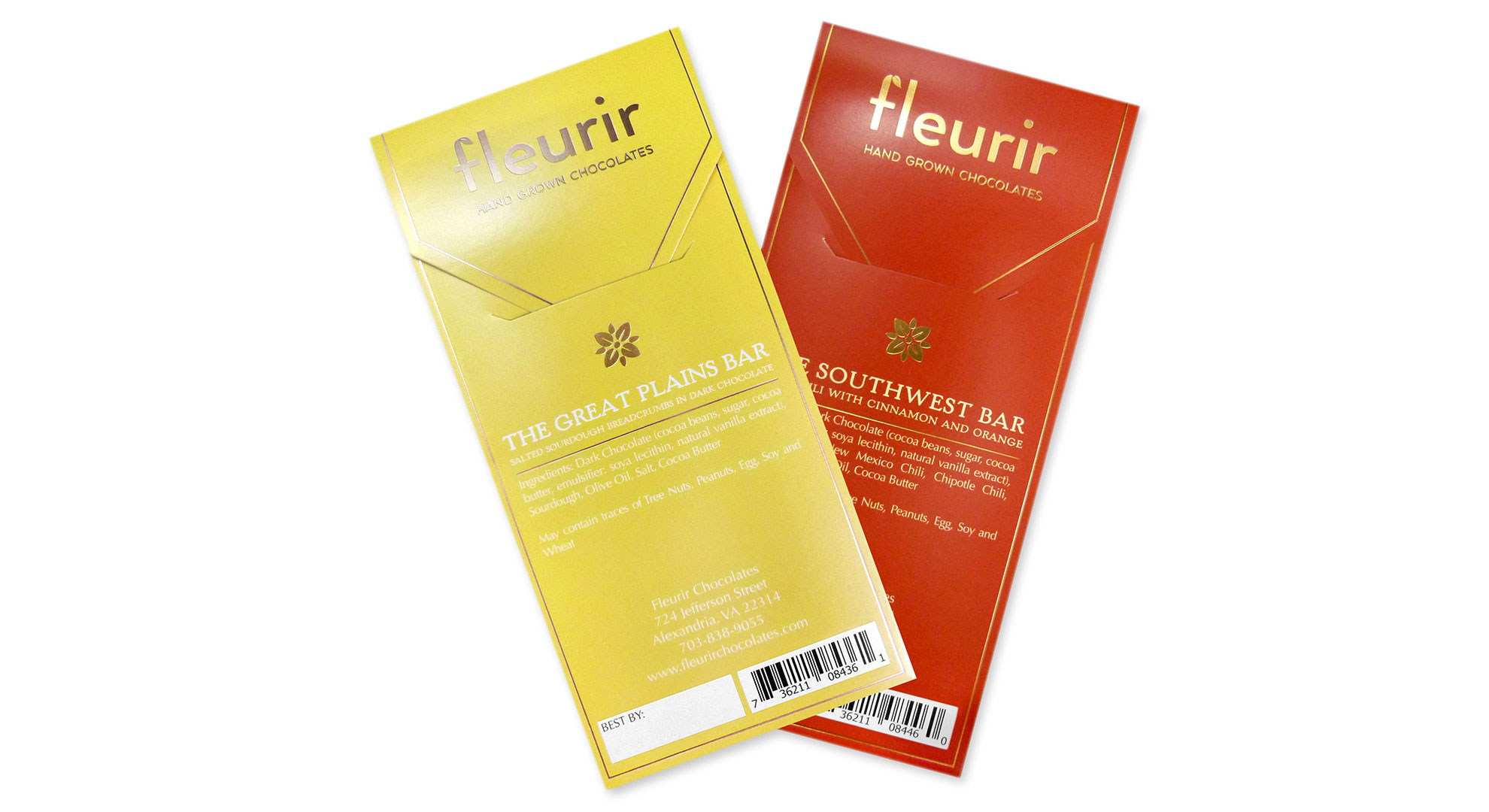
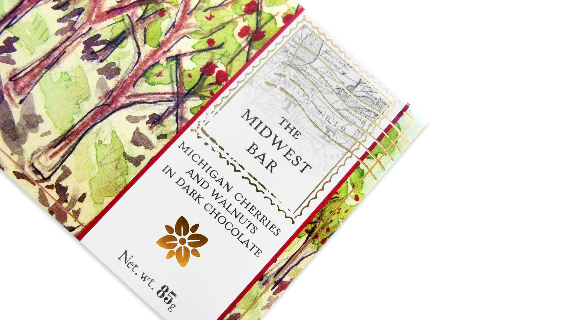
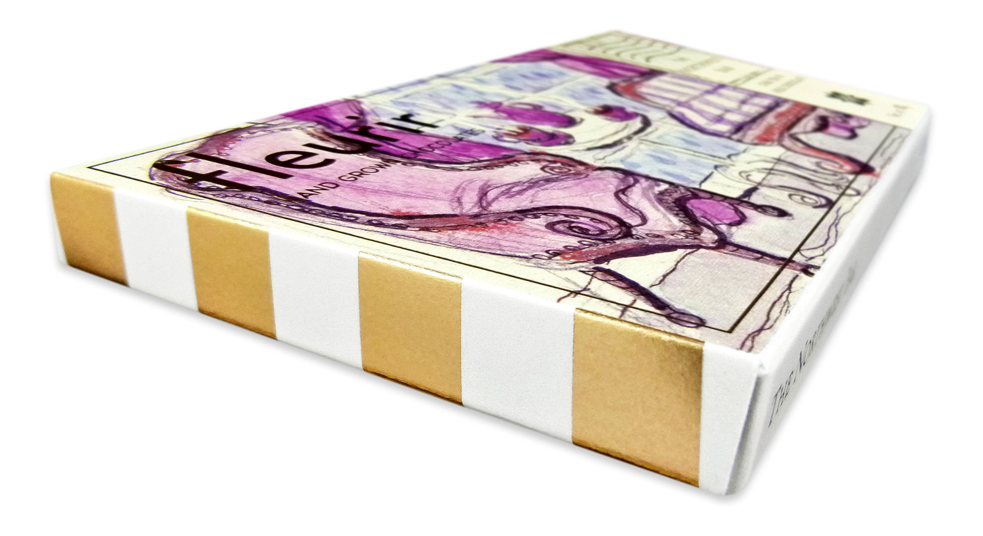
Artisan chocolate shop Fleurir Chocolates is nestled in Alexandria, Va.’s Old Town area, a charming little cluster of shops and restaurants that’s probably what you picture when someone says “Main Street USA.” Yet this packaging for Fleurir’s line of chocolate bars celebrates the fact that each is made with ingredients sourced from a particular part of the country for a flavor that could only come from the South, Great Plains and four other unique regions.
Fleurir Owner Robert Ludlow “wanted to use these region inspired illustrations to make the packaging feel like ‘postcards’ so customers would be able to easily understand what the product is and connect with its meaning while browsing his store,” explains Jenna Millemaci of Tap Packaging Solutions.
Graphic design engineer Brittany Vazquez “came up with a creative solution to unite all of the regions by subtly designing the packaging as postcards with matching gold foil stamping,” Jenna explains. “The watercolor technique that Ludlow’s illustrator used harkens back to simpler times and evokes the consumer’s imagination to fill in the blanks with their own memories.
“Our designer used these illustrations as a starting point for the color choices and incorporated various mailing symbols that would be suggestive of a postcard. The artwork was designed to print in 4-color process on our HP Indigo 30000 – the very first digital press designed specifically for folding cartons – in order to obtain the sharpest print quality and show off the illustrations as though they were hand done right on the boxes.”
And “since Ludlow needed these boxes urgently for the holiday season,” Jenna reveals, “we chose to use common foil stamping artwork to save time and cost on stamping dies and machine setup. This way, all flavors could be foil stamped then die cut in one production run, and separated before the gluing operation.”
Not only did the resulting packaging win a prestigious HP Inkspiration Award, it helped chocolate lovers to, in the words of Fleurir’s tagline, “taste the nation, bar by bar.”
Love this piece? Like it, share it and add your comments below.