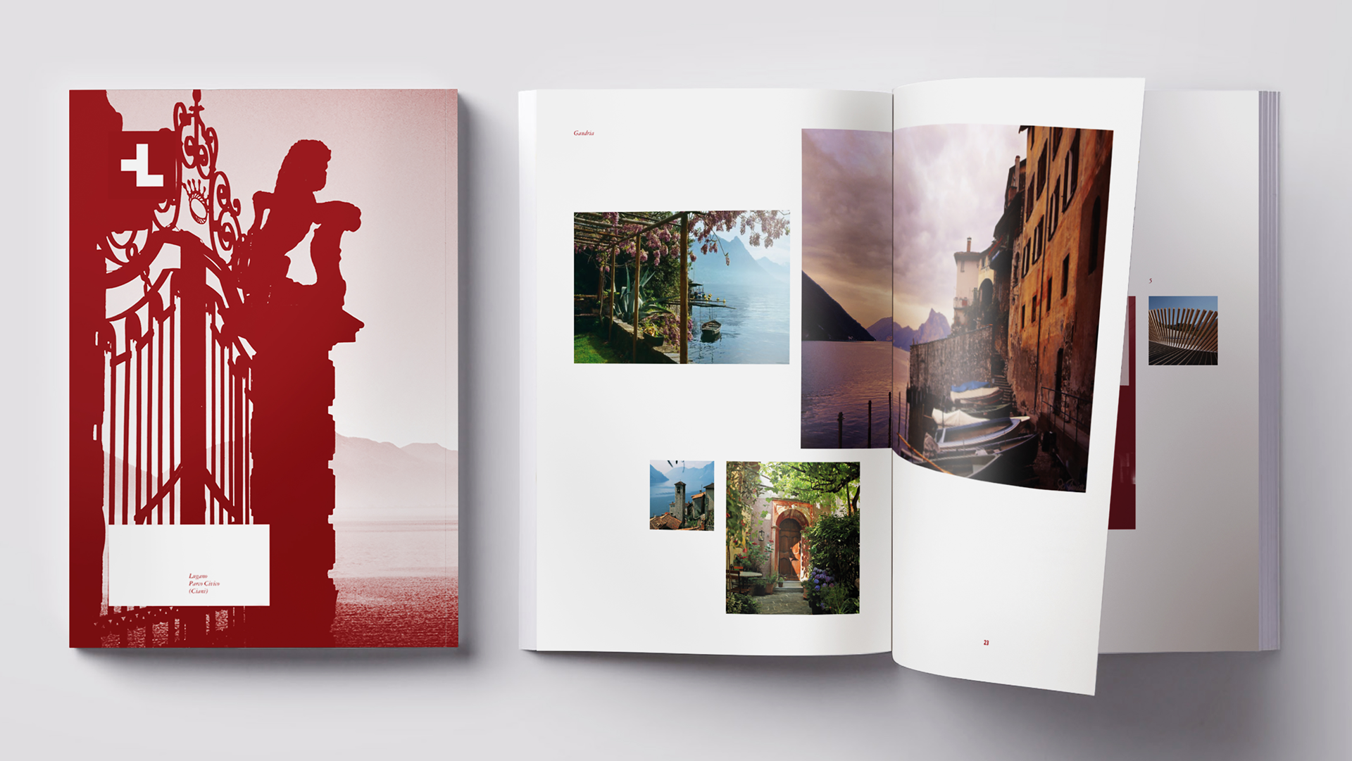
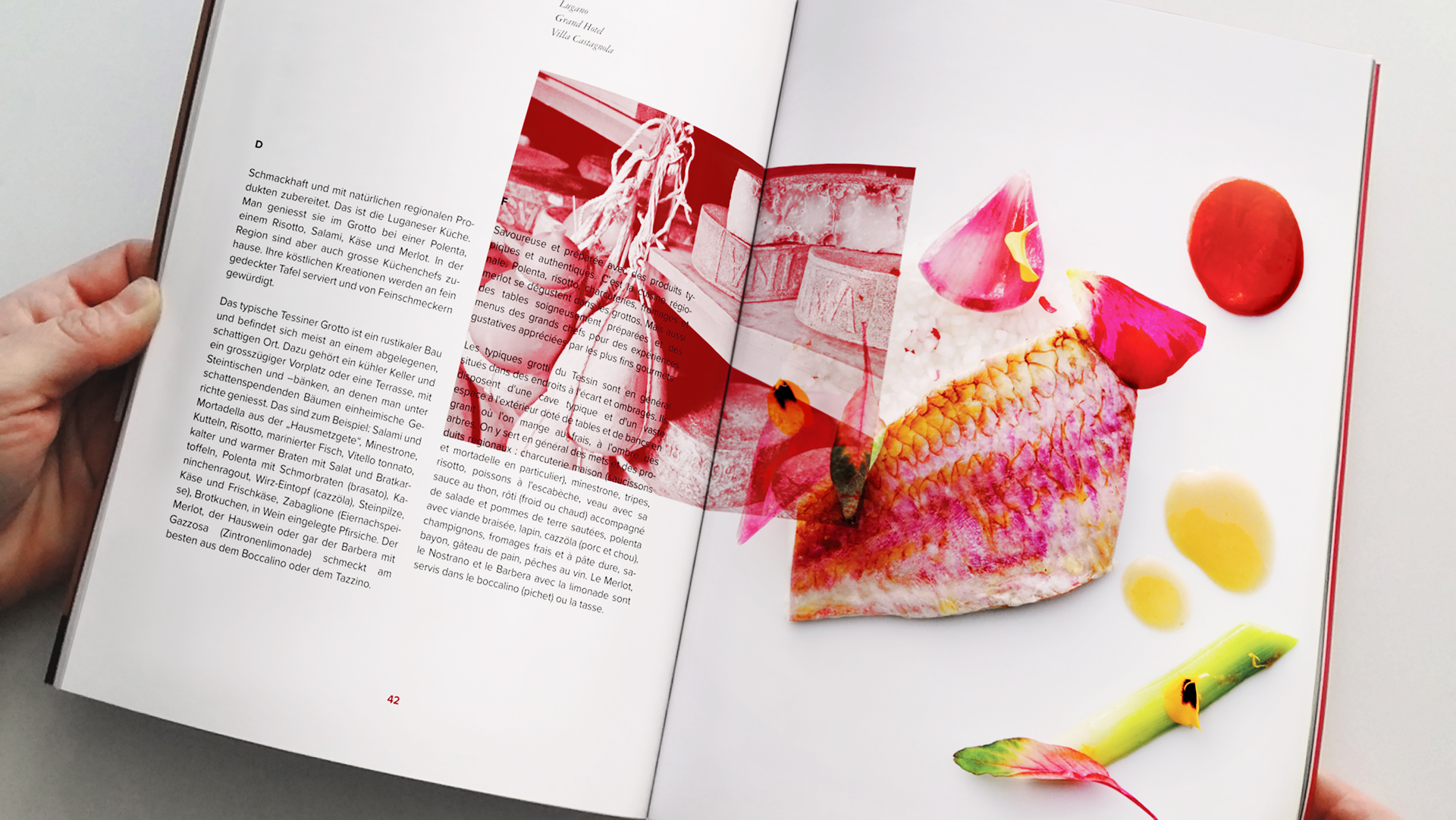
Sometimes one of the biggest challenges we face as creatives isn’t a small budget nor insufficient time to do what we need to do – it’s our own tendency to overthink our designs. Faced with promoting Lugano, one of Switzerland’s most popular regions, Caselli Strategic Design put aside all of the various delights associated with the area, and focused instead on emphasizing how different it is from the rest of the country.
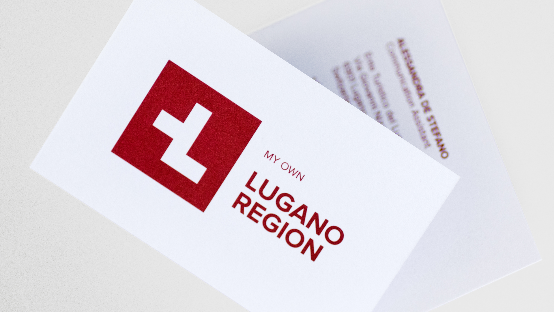
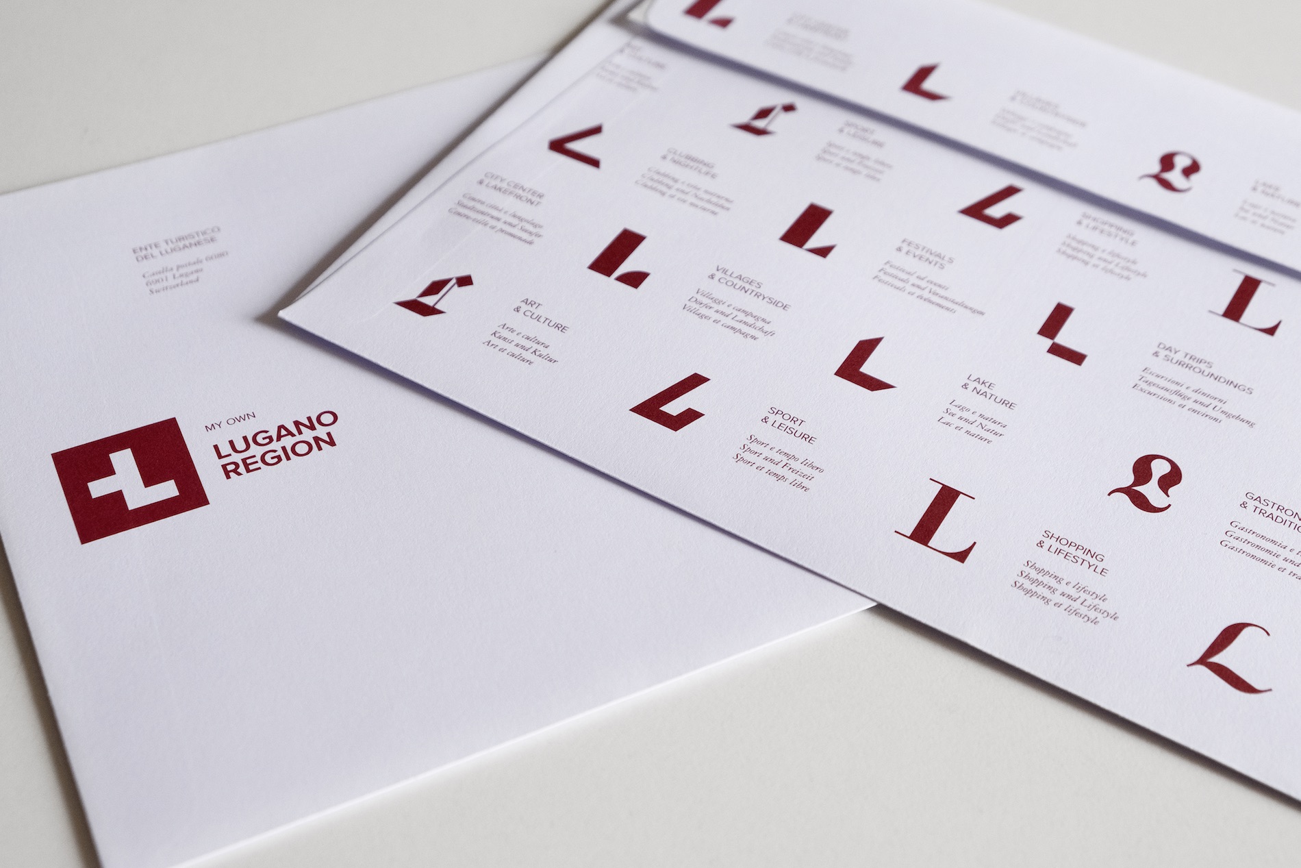
Inspired by the Lugano region’s unusual mix of cultures, palm trees and Mediterranean weather and cuisine, Caselli came up with the concept “differently Swiss,” which they interpreted graphically through the transformation of the Swiss flag’s white cross on a red background – made famous the world over by its ubiquitous Swiss Army knives – into a single letter “L.” This now graces everything from signs and trains to brochures, envelopes, business cards and yes, even limited-edition Swiss Army knives.
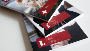
Yet that is only half the story because, in order to display all this region has to offer, they also designed a different style of “L” for 12 different regional offerings, including Day Trips & Surroundings, Sport & Leisure, and Shopping & Lifestyle. This design system lends a distinctive connotation to each category, while also maintaining an overall unity throughout. This is very much in keeping with their slogan encouraging visitors to embrace and make it “My own Lugano Region.”
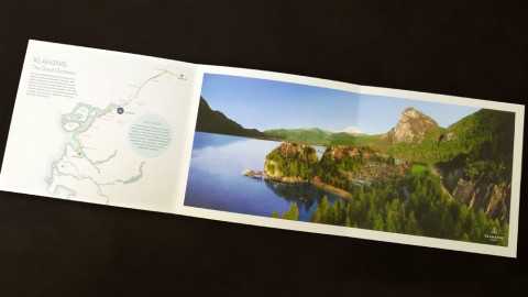
Their perfect-bound brochures, packed with photos and information about the region, were offset printed CMYK + Pantone 187U Red on Arctic Paper’s 200 g/m2 (130 lb.) uncoated Amber Graphic paper for the cover, and 70 g/m2 (50 lb.) Holmen TRND, a matte magazine paper, for the interior pages. The choice of tactile, uncoated paper for these pieces was a smart one, instantly bringing to mind that gritty, outdoors sense of adventure that the Lugano region hopes to inspire in potential visitors from both overseas, as well as other parts of Switzerland itself.

The stationery, in contrast, has a delightfully smooth quality to it, thanks to their use of Arjowiggins’ Conqueror Wove for everything from business cards to envelopes and letterhead. (My favorite part of the stationery set though – and I know my fellow type nerds will agree – is the depiction of all the different style “L’s” in their collectively beautiful typography on the back of the envelopes.)
It might seem like a no-brainer, but you’d be surprised how often the choice of paper for a design project is left to the very last minute. PRO members: Discover vital tips for harnessing the connection between touch and emotion right from the beginning of the design process in this recording of an exclusive PaperSpecs webinar presented by Hybrid Design’s Caleb Kozlowski. (You might know Hybrid from their exciting work on The Mohawk Maker Quarterly, so yes – Caleb definitely knows his stuff!)
Not a member? Start your PRO membership today!
![]()