[youtube=http://youtu.be/3a_RkusphSM]
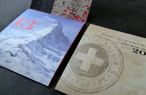
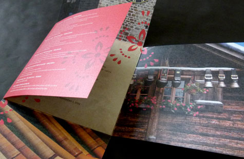
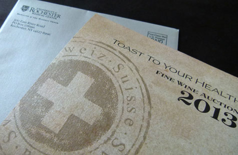
With the Swiss Alps as inspiration, K2 Communications used an unexpected stock choice, an unusual fold and highly saturated four-color photographs to create a glistening invitation for this charity wine auction.
If you’re a purist, the general wisdom is that high-end full-color images look their best on white, coated stock. If you’re up for an adventure, you’re perfectly willing to try uncoated paper too. Here, the design team scales some awe-inspiring heights by selecting Esse Pearlized White. The images, printed offset, take on a warmth and glow and richness that surely wowed the invitees.
Given the graphic on the Swiss flag, an iron cross fold was clearly a perfect choice. The diecut shape allows the story to unfold on each panel in an interesting and organized progression. A silver mailing envelope adds another touch of shine and texture to convey the exclusive nature of the event.
Love this piece?
Like it and share with your friends below.