 By Jack Bredenfoerder
When I consider where color direction is likely to go, I think it is best to start by examining the psyche of the overall marketplace. Where are the consumers’ minds at? How can we reach them, and how can we help them communicate with color? I like to take these questions and create a color story to help define the direction and clarify the forecast. (PRO members, don’t forget to check out the replay of Jack’s PaperSpecs Webinar “Composing Your Color Story.”)
Three years ago, I predicted a huge boom of bright, assertive colors in a forecast that I called “War Paint.” My observation was of a growing conflict in our society over practically every social issue. I felt that color would be used to shout those opinions to the world. Bright, assertive colors would also be used to cheer individuals when they felt down from all the conflict. This color direction did materialize, and we are still in a very high color cycle, but that cycle is finally beginning to shift.
Healing and Hospitable Colors
After several contentious years, it seems that the majority of people are growing tired of all the shouting and are beginning to seek some concordance and mutual respect. It also seems that consumers are growing weary of the color overload and seeking richer, grounded color statements.
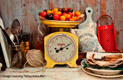
I sense more of a direction toward stability and resolve. I am suggesting these would be colors that we might experience with a fine meal. The rich, healing and hospitable colors we experience in the preparation and sharing of food creates an environment where we can respectfully discuss our differences. Sharing a meal, and the conversations that happen there, are more respectful, and have an essence of manners and order.
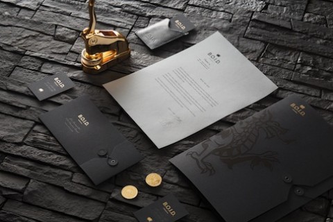
I believe the food-based color direction will continue to emerge, grow and develop. As I examine many of the fashion directions for fall 2014, black is not just appearing in the simple classic black-and-white combinations, but it is also taking on a major role as a ground and binding agent for many rich and strong color combinations.
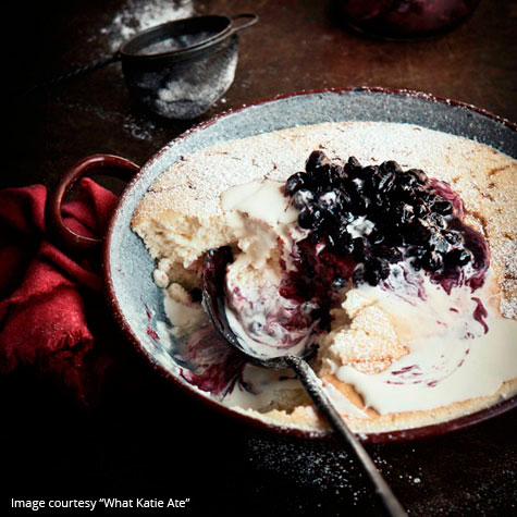
The food colors are also very strong: rich red and purple berry and wine colors; deep luxurious blues, greens and teal. Chocolate brown is also showing again in formal wear, and gold continues with rich root vegetable and spice colors. Accent dessert colors include citrusy greens, yellows and orange, along with many pinks and bright purples, including Pantone’s Radiant Orchid. Silver and whites inspired from fine flatware and linens are also in the mix.
Rather than “War Paint” the direction, I would suggest that we are now experiencing a “Color Feast.” Let’s share this meal we have prepared and try to work things out.
Next week: Jack Bredenfoerder explores the psychology of color, Pantone’s “diva of a color story,” and reveals his own pick for the color of 2014. We’ll save you a seat!
………….
 Jack Bredenfoerder is a seasoned color design and marketing professional with more than 19 years of brand design experience at Landor Associates, where he specialized in color strategy, trends and forecasting. Jack’s perspectives on color have been featured in leading business, consumer and design-industry trade publications including the Financial Times, The New Yorker, Communication Arts, ID and Advertising Age. He has also served as an advisor to HGTV.