 Most designers adore them. Many are hopeless at making them, and all have their favorites. But occasionally we get it wrong and create an identity that is fine aesthetically but somehow scars the psyches of those who see it. In the ’70s and ’80s it was the “satanic” Procter and Gamble logo. And earlier still…that of Screen Gems.
“The S from Hell,” a tongue-in-cheek short documentary that played Sundance and earned raves from the likes of The Hollywood Reporter, is an interesting watch from a design perspective. Those interviewed vividly recall being terrified by the Screen Gems image and accompanying synth music, which followed screenings of shows like “The Flintstones” and “Bewitched.” One person in the film notes its similarity to the black-and-yellow nuclear fallout sign.
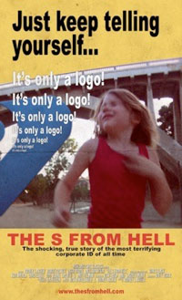 Though clearly played for fun, “The S from Hell” is partially based on a real problem. Some people, especially the young, can react to your logos in some surprising, and surprisingly negative, ways. (Other apparent offenders include an early PBS logo and the “Neon Mickey” Disney used before its presentations.)
Check out the 8-plus-minute “The S from Hell” by Rodney Ascher below. (Note: There’s a slightly disturbing clip in there from “Halloween III” that some might not like to see – not gory, just….not for the squeamish.)