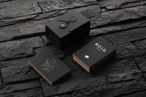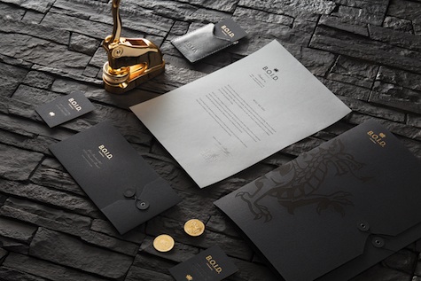
If you’re going to tout yourself as THE online journal of impressive branding examples, you naturally have to make sure your own branding passes the swoon test. We think it’s safe to say that BOID Journal has more than met this challenge with gusto, panache…and dragons. Crafted by Russian design studio Eskimo, the BOID identity likens the journal’s curation of top branding examples to a dragon guarding its treasures in its lair. Here they walk us through its implementation:
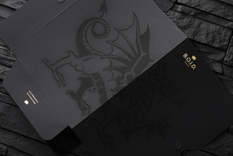
“B.O.I.D’s logo is based on traditional European heraldic dragon images but stylised by adding sharp edges and little angularity common for cave stones. The idea of the hidden and guarded gold was implemented by designing triplex business cards (black-gold-black) and small gold accents applied to other mediums using foil block stamping technology.
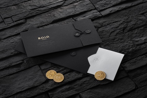
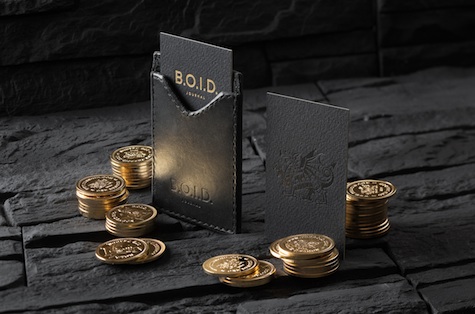
Each new journal project corresponds to a golden coin in the dragon’s treasury.”
And lest you think this is mostly bluster, there are actual gold coins involved….or at least gold-toned. Now that’s commitment to a metaphor.
But leaving the coins aside for a moment (painful though that is), take a look at the paper portion of this identity. Those document holders, those smaller envelopes, the gold foil stamping on the cards, the…the…the… (passes out in a giddy paper fit and is promptly eaten by a dragon).