 University? Logo change?
Huh uh, no more – pass.
After the tempest in a chai cup that was the University of California identity crisis, we can certainly understand that reaction. But the recent updating of Harvard University Press’ branding brings up an interesting question for designers everywhere: Just what medium are you designing for?
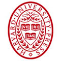
New York’s Chermayeff & Geismar did away with the 100-year-old imprint’s ornate seal because the former was “too complicated to work effectively in the digital realm,” according to Creative Review.
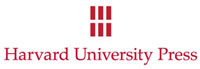
In its place, C&G partner Sagi Haviv opted for a capital “H” formed by six rectangles that simultaneously represent books on a shelf or tablet computers, he says. The press name is spelled out in Palatino beneath. “While it is not an uncommon typeface, we found it to be perfectly suited for Harvard University Press, as it is traditional in appearance, thus providing an appropriate counterpoint to the modern symbol. It is bold and distinctive, with a hand-lettered quality.”
 We are all for clean, simple design, and many of these university seals do have an unintended kitschy quality in the post-Hogwarts era, but we keep coming back to that earlier sentence: “too complicated to work effectively in the digital realm.”
Now computers and the like have their share of shortcomings, but an inability to reproduce complicated branding is not one of them. However, it does raise an excellent question: Does the efficacy of a design depend on whether its for a digital or paper medium, or is good design simply good design wherever you find it?