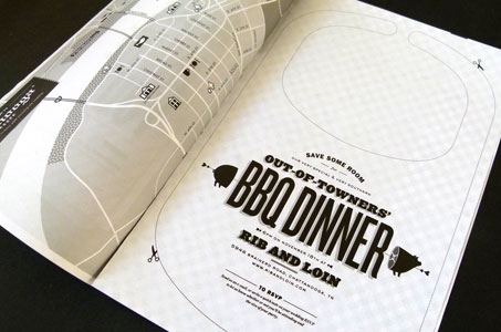
When this graphic design couple decided to get married, their refreshing interpretation of the wedding invitation likely took most of their invited guests by surprise. After all, how many wedding invites have you received that are printed with black ink on newsprint in a tabloid format and include a BBQ bib and a potentially disturbing portrait of the bride and groom?
“This was our chance to play and have fun, create our own personal plan for our own special day. So we just kind of went with it,” explains Kelley Galbreath, who along with her then fiancé Joe Galbreath created the design that won the PaperSpecs Gallery Take Note Award for Quarter One 2013.
Refreshing and Well Executed
Brian Dougherty, creative director of Celery Design Collaborative, served as the guest judge for the quarterly competition sponsored by Erickson Stock. “I chose the Galbreaths’ wedding invitation because it is so refreshing and well executed,” commented Dougherty during the judging process. “The piece really plays well with the strengths of the paper.”
Joe, an assistant professor of graphic design at West Virginia University, and his wife Kelley, a designer, chose newsprint paper and an unexpected black-on-white color palette to reflect a very casual, laid-back afternoon wedding.
[youtube=https://www.youtube.com/watch?v=H-YVYtldOI4]
Their personal sense of humor and inclination for fun can be seen throughout the invitation suite:
- a BBQ bib designed to be cut out and used for an out-of-towners dinner the night before the nuptials;
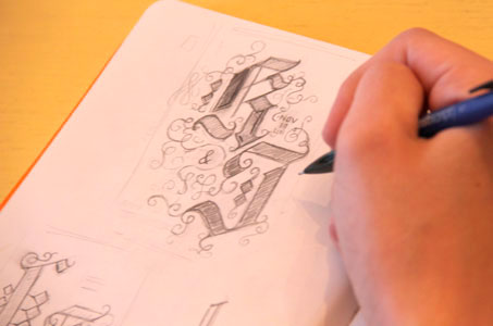
- a no-fuss, fold-me-up-and-take-me-along tourist guide complete with maps, local history and tourist destinations of the host city; and
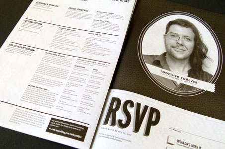
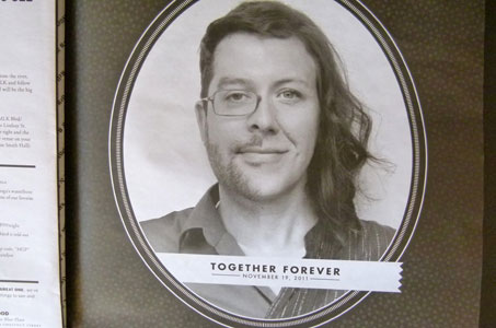
- a blended photo the couple created of themselves (left half is his face/right half is her face) with the caption reading “Together Forever.”
“That photo was a last-minute addition that I think got more comments – good and bad – from everyone that received it,” laughs Kelley. “I loved that you can take the invitation, fold it up, shove it in your pocket and really use it as a guide around downtown Chattanooga. The newsprint printing-concept, for me, is everything. Anything else wouldn’t have felt appropriate.”
“The map was such a nerdy design technical thing to do, but it was really fun to work on,” remembers Joe.
An Unexpected Splash of Color
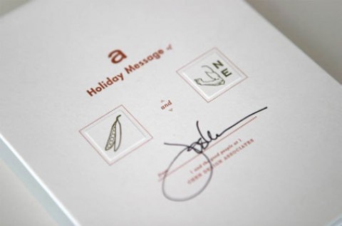
Chartreuse, the only splash of color on the wedding invitation, made its appearance as a sticker adhered to the front cover of the tabloid-sized piece. The sticker contained a newsy headline (“After 3 years, 2 cities, 2 states, 2 degrees, 4 jobs, and 16,000 miles …”) that set the tone for their personal love story, design inclinations and wedding style.
“We thought the sticker would be an interesting hand-applied element, a nice counterpunch to this mass-produced artifact, something that’s hand-applied and makes it special,” says Joe. “We actually brought that through into the wedding. If you were a friend or family of the groom, you got my face on the sticker. If you were a friend or family of the bride, you got Kelley’s face on the sticker. If you were friends with both of us, you got the split-merged face to wear on your lapel.”
“And honestly, the color helps,” adds Kelley. “That little shot of neon is a break from the black and white. Later, we used similar-colored envelopes for our thank you cards.”
Hold the Precious
Both designers have backgrounds in letterpress and screen printing so it would have been easy and tempting to print the wedding invitations themselves.
“What we really wanted was a casual, non-precious artifact so that made working with the newsprint vendor not only interesting, but the best design choice. We knew it was all about concept and serving the piece and making sure that we were making decisions based on the mission and the goal of what we were trying to do,” offers Joe.
As designers, both Kelley and Joe have experienced being asked to design wedding invites. Clients often start by asking for something really different, really expressive.
“But what most people want is script on nice paper,” says Joe.
Kelley agrees, “Our wedding was a really laid-back afternoon so the standard, formal invite package just wasn’t going to fit. Plus, that’s just not who we are.”
Who are Kelley and Joe Galbreath as people and graphic designers? You need only look at their wedding invitation to know that!
NOTE: See more inspiring designs in our weekly Paper Inspiration video series.