 Neenah Paper
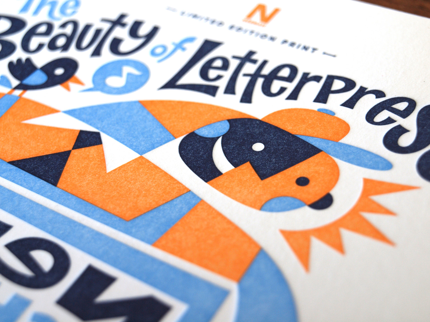
Von Glitschka is an illustrative designer doing the full-tilt creative boogie out of his home studio in the land of Bigfoot. He’s also an author, a speaker on the creative circuit, and the newest member of the impressive list of the Beauty of Letterpress designers.
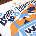
Glitschka’s print is Issue 11 in this growing collection of limited-edition letterpress prints — a project conceived by Neenah as a way to both celebrate the art of letterpress and simultaneously contribute to the funding needed to preserve one of the world’s largest collections of historic wood type, housed at the Hamilton Wood Type & Print Museum.
We asked him a few questions about his contribution to the cause.
What made you want to get involved in the Beauty of Letterpress project?
Even though I’m a digital artist, I still leverage analog methods to create my work. So the whole creative contrast between digital art and analog letterpress really intrigued me. And letterpress is only as good as the paper you use, so Neenah really helps make this time proven, craftsman-driven method beautiful.
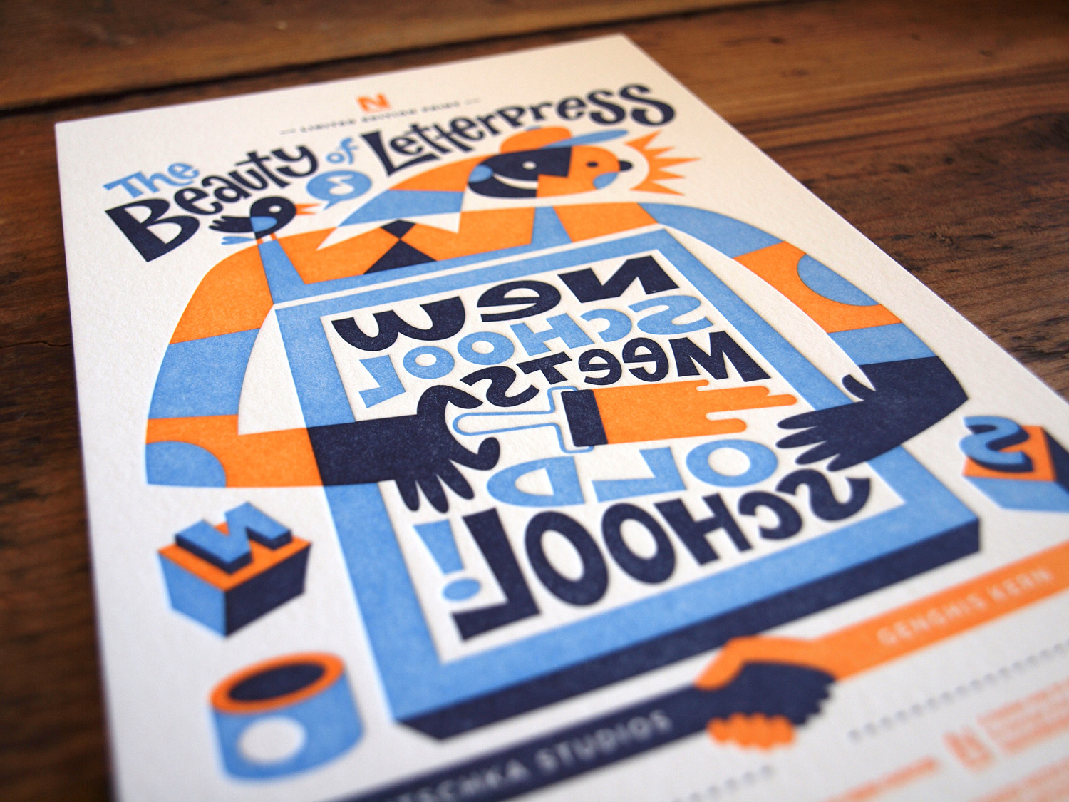
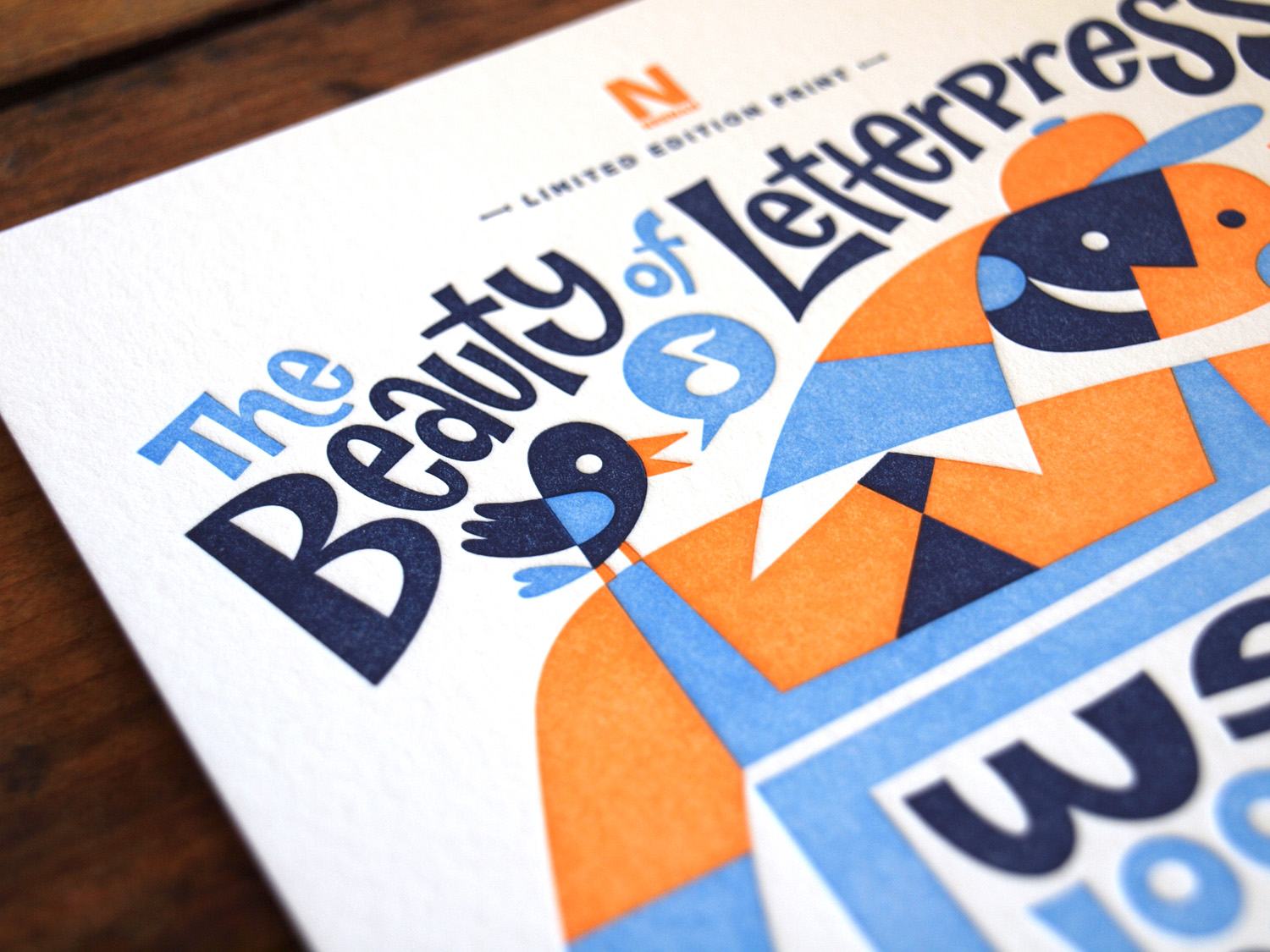
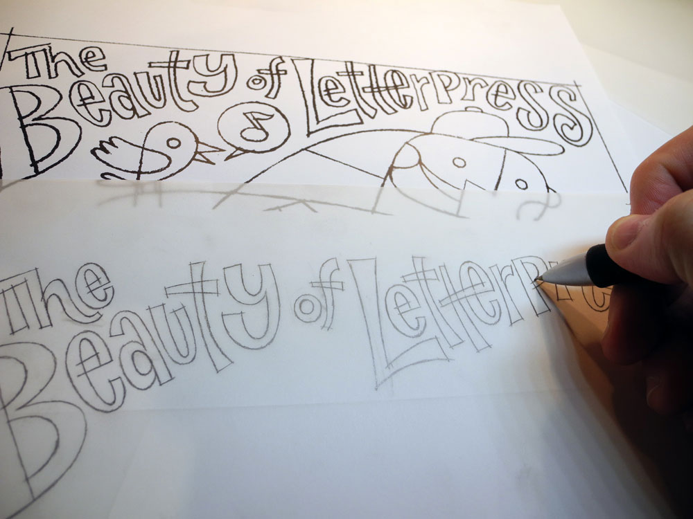
Tell us about the title of your print, “Old School Meets New School.”
“Old School” equals analog methods, while “New School” refers to digital methods. This creative yin-yang balances the old and new methods — digital allows us to create things with greater ease while analog printing like letterpress allows us to reproduce it with the aesthetic that only antiquated methods can produce.
Old school are the letterpress machines that have that distinct steampunk look and feel: flywheels spinning, swinging mechanical appendages, open air inkwells, and other moving parts that make watching them very hypnotic. New school digital printers are kind of boring in comparison, but digital tools that produce the design and create the plates that the old school printers can use is where the real beauty happens.
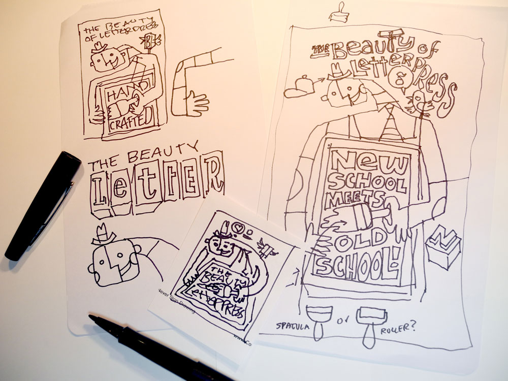
What was your vision when designing your print?
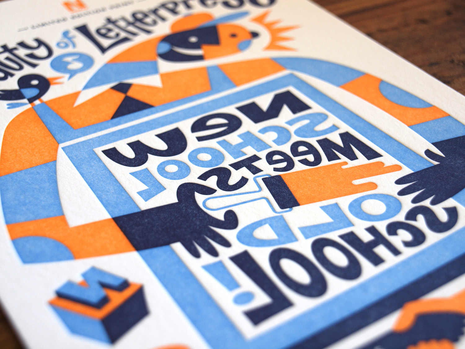
The whole aesthetic and tactile aspect of letterpress is what still draws people to this form of reproduction. So my approach was to feature the true star of this format, the printer who is masterfully practicing his craft. I always try to inject some fun into these visual narratives and not take things too seriously. Thus the style is whimsical, and the bird represents inspiration.
Is there anything different about the way you design for letterpress?
The charm of the final print methodology is its subtle imperfections and surface texture. So I find bold shapes and contrasting colors work well.
You printed with Jason Wedekind of Genghis Kern; what was that like?
Jason in my opinion had the hardest task for this project. You have to have patience to do letterpress well. His work is impeccable, and he’s one of the funniest creatives I’ve ever met – just look at his awesome studio name.
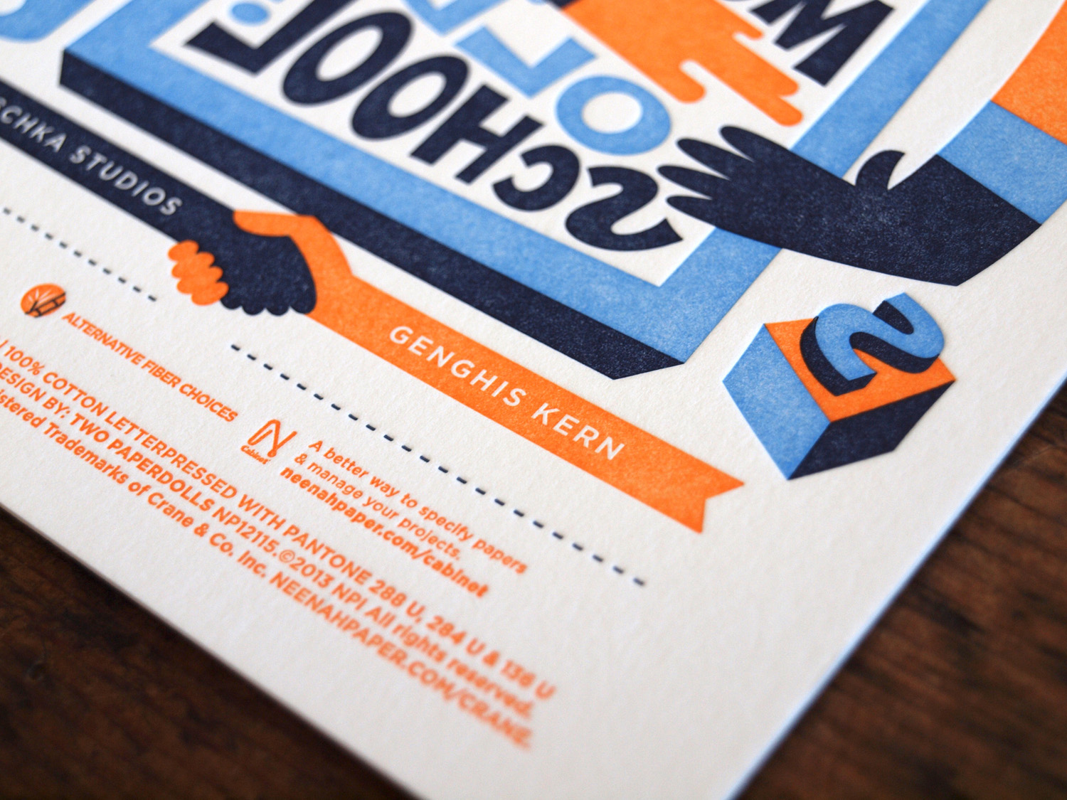
What’s your favorite part about the print you and Jason created?
This may seem odd, but I liked the backward type in our design. It actually makes people take notice of the methodology of letterpress. When my daughter saw it she asked, “Why is the type backwards?” So she noticed and I got to explain the process.
Why do you think it’s important to support the Hamilton Wood Type Museum?
There is the saying “If you don’t learn from history you’re doomed to repeat it.” But that is in context of all the bad decisions made in the past. If we don’t bother to learn from history in the context of printing we’re doomed to forget it, lose it because there are easier ways to print, and that would be a shame. So in an age of digital ease where we simply push a button and have a print a few seconds later, it’s important that we don’t take what got us here for granted. Digital is nice, but tactile is far more immersive and students need to familiarize themselves with the old methods to better understand how to use the new methods. Just because something is old should never mean it’s no longer useful or relevant.
“Old School Meets New School” is available for $5, and all proceeds go to the Hamilton Wood Type & Printing Museum, thanks to Neenah and the Beauty of Letterpress. You can order here.
See previous Beauty of Letterpress prints here.
PaperSpecs readers, enter to win one of 10 copies of the new Beauty of Letterpress print by Von Glitschka. Hurry, contest ends May 14th!
SORRY THIS OFFER HAS EXPIRED
————————-
The Beauty of Letterpress was conceived by Neenah, with the goal of celebrating letterpress and preserving Hamilton and one of the world’s largest collections of historic wood type. To date there have been 11 prints issued. Last year Neenah presented a $30,000 check to the museum — half from sales of the limited edition prints and half from a donation by Neenah.