By Cyd Peroni
How many seminal moments and ideas have been recorded on napkins? That rough sketch. An insightful poem. The promising phone number. To honor this unassuming-but-influential piece of paper, WAX Partnership Inc. designed Napkinisms, the seventh issue of Wayward Arts magazine and PaperSpecs’ Take Note Award winner for Quarter Four 2013.
Flash Reproductions, a Toronto, Ontario printing company founded in the 1960s, produces Wayward Arts magazine, dubbed the “home for errant creative.” Each month a different award-winning Canadian design studio works with the fine print craftsmen at Flash and the finest paper to produce the magazine of their dreams. Napkinisms is one of those dreams.
[youtube=https://www.youtube.com/watch?v=gO-kUv0Fzuo]
Don’t all great ideas start on a napkin?
“At the root of it, we’re a print shop, but we like to look at ourselves as more of a design production center where we talk with graphic designers who are trying to achieve amazing things in print,” says Rich Pauptit, president of Flash Reproductions.
Over the years, Flash Reproductions has expanded not only their printing capabilities but the company’s vision and purpose.
“We discovered a designer’s best work was not necessarily the commercial stuff, but the personal projects done in off-hours. Wayward Arts evolved organically out of this realization. We developed the magazine as a forum for all of that non-commercial work from commercial artists – the photography, the illustration, the typography, the writing.”
At first, Pauptit and his team created each issue. They soon came realize that the artists wanted to do the planning and designing.
“We had enough people asking, so we decided to hand over the entire magazine to an individual graphic design studio in Canada and let them run with it. It’s been a monumental success because the designers that we’re working with approach it with such enthusiasm and have such great ideas. They’re left to go hog-wild, and we work to make the design a reality.”
Napkins of the daring and creative
WAX Partnership (Calgary), an advertising, design and digital agency, conceived the idea of creating an issue made of napkins.
“The theme of this series was community,” says Monique Gamache, partner at WAX. “We wanted it to be about the creative community that inspires us. We’ve worked hard over the past seven years to differentiate ourselves by consistently working on delivering insightful creative for our clients, and felt the piece could also serve as a way to give inspiration back to them.”
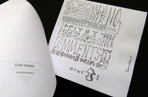
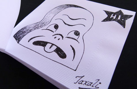
This wouldn’t be just a plain stack of napkins. The designers elicited inspiring thoughts and pointed insights from the brilliant people that inspired them (e.g. Stefan Sagmeister and Debbie Millman), which would then be printed on the napkins.
They mailed a napkin to every designer whose work they admired and asked them to jot something down on it and mail it back.
“It’s tantamount to sending out your autograph book to all the famous people you love and asking them to sign it and send it back … then those people actually doing it. All of the napkinisms we received – Feck Perfection by James Victore, Ian Grais’s pointillism portrait, Yes-No by Nancy Vonk – these were the highlight of the project for me,” says Gamache.
Along with the printed piece, WAX created an online catalog that could build on the sense of community by providing digital napkins so other designers could scribble their thoughts and ideas. Doodles of dogs, love notes and messages like “This is some Don Draper shit.”
So many ways to fold a napkin
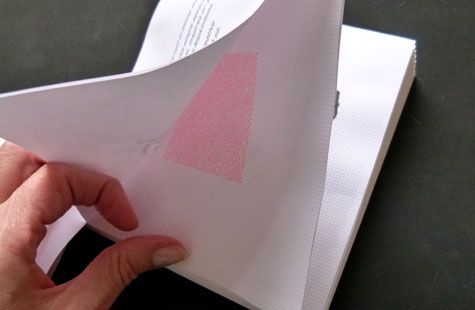
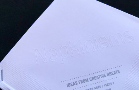
The initial plan was to use actual napkins. As the concept matured, the team realized that napkin look-alikes were the best option.
“From a production standpoint, we realized that if we went too literal on this piece, the actual physical integrity of the book would be compromised and not really give us the fine, finished look that we ended up with,” says Pauptit. “Once we threw out the idea of doing it on actual napkins, then the challenge turned to ‘How can we best imitate a napkin with a fine paper?’ We played around quite a bit with whether we print a pattern on it or we use a linen stock. We settled on a vellum stock and embossed the pattern around the edges.”
“Hans Thiessen, the lead designer, had so much fun putting together all the little details,” says Gamache. “I think the best production highlight for me is the feel of the emboss around the edges that mimics the napkin. Want to know a secret? That tiny pattern is actually a dictionary of toilet paper terms. If you really squint your eyes, you can read things like “TP” and “bum” and “cling on.”
“In the end, Wayward Arts ends up being just an example of great collaboration where the designers do what they do best, we as printers do what we do best, and the paper mills give us their best papers to work with. Together we create something beautiful that we can proudly present to the world,” says Pauptit.
————–
 Cyd Peroni is a Phoenix, Arizona-based writer and owner of Three Figs Villa, an online boutique that creates and sells fine art letterpress prints for writers and wordies. Her favorite quote comes from Mark Twain: “The difference between the right word and the almost right word is like the difference between lightning and a lightning bug.”