 By Aaron Berman
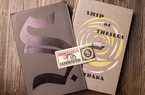
As we prepare ourselves for all the wonderfully intricate print projects destined to come our way during this new year, we conclude our look at one of the most complicated book projects of 2013: S. by JJ Abrams and Doug Dorst.
(Here you’ll find part one.)
When last we left the intrepid team at Melcher Media (and the book’s designer, Paul Kepple of Headcase Design), they had created a 472-page, 6.5-by-9.7-inch hardcover book that features:
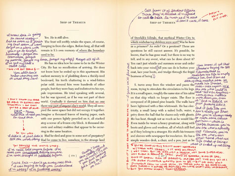
- “Hand-written” remarks throughout the main text (actually multiple InDesign overlays)
- A cover printed on Arlin, an imitation cloth, matched with the printing of a weave pattern that gives the impression of a book printed in the late ‘40s.
But to really make this volume feel like an old book that has been nicked from a library and thoroughly used, the Melcher crew were only getting started.
Verisimilitude is a state of…technology
“JJ and Doug wanted realism, every little detail,” Kepple emphasizes. So they gave them real.
That began with finding a typeface that was authentic to the time period, and continued through “ageing” the paper. Each page was printed with a Photoshop file of aged paper, he explains. “I picked chunks of pages to age in a slightly different way so it didn’t look too routine. And then old books like that, they are darker more at the beginning and the end because more air gets in than in the middle of the book. So the pages on the beginning and the end of the book are a little darker than the middle.” Yes, that’s how much thought went into the details.
And because this is supposed to be a library book, you’ll find all the little touches you would expect, from various faux-rubberstamp date stamps on the inside back cover, to a white Dewey-decimal-system sticker on the spine. It was that last little touch that really put this project over the top for us. It was just so…prosaic.
“I loved [the idea] so much we figured out a way to make it work, because usually I’m the one who says ‘We don’t have any money,’ ” confesses Kurt Andrews, vice president of production and operations at Melcher. Expertly, they changed the cover illustration from a stamp to a blind stamp – making up the difference with clever design printing – freeing up enough money for the sticker.
Ephemera-geddon
Up till now, we’ve limited our discussion to the subtlest little touches that went into the making of S. Now we come to the most attention getting, and rightly so: the ephemera.
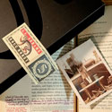
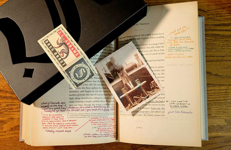
A part of the novel’s storytelling every bit as important as the basic text and the “handwritten” comments, these 20-plus print pieces are the book’s crowning achievement. Each is tucked into its own specific place in the book to add further insight into what is contained between those two particular pages. These items, inserted by hand, include:
- A cardboard spinner-wheel compass
- Handwritten letters
- A filled out greeting card (that itself holds an obituary “torn” from a newspaper)
- A small photograph
- Postcards
- A napkin from a make-believe coffeehouse upon which an intricate map has been drawn.
Indeed, this last item might have been the most difficult for the creative team to pull off. (“You can’t print on both sides,” Andrews confides like a fellow who found out the hard way.)
Even with the ephemera, every little detail was rigorously analyzed. Take a letter written on a university letterhead. Explains Kepple, “When it was on the white and the smooth paper, it just didn’t feel legit as a stationery for a school. Kurt had this other paper he was using for a different piece of ephemera that did feel like it would work, so we just swapped the two stocks.”
Of course stuffing a book full of extra print pieces requires even more thought be given to the cover and binding, Andrews explains. “We had to get in there and make it not look weird. We went through rounds and rounds and rounds of dummies to try to get the spine half round, and make it so it doesn’t fall apart with all that stuff inside there.”
To keep everything exactly where it should be, the team came up with one final touch – an exotic-looking, perforated sticker that traps the book inside its slipcase until the reader opens it. This required coming up with a perforation strong enough not to tear during shipping, but loose enough to allow readers to free the book easily from the slipcase without mangling the sticker. And even that had a philosophy behind it, says editor Lauren Nathan.
The authors “really wanted the case and the book to be two separate objects, so in the end they didn’t want there to be an adhesive under the middle of the sticker where it touches the spine because they didn’t want the two things to be interacting.”
Taken as a whole, all of these intricate aspects have their intended effect: they greatly enhance the feeling of mystery and paranoia present in the story itself. The result: The reader ends up questioning the thoughts behind absolutely everything in the book…even the scent of its pages, which lies somewhere between mimeograph and photocopy. Or is that simply another illusion?
“I wish I could tell you we put some special scent on it,” laments Andrews, and means it.
“It’s so much fun because people keep asking us that,” says Nathan. “It shows that they’re really immersed in the experience.”
……
 A former writer and editor for USA Today, Aaron Berman is the editor of PaperSpecs, and covered the newspaper industry for the Newspaper Association of America’s monthly magazine, Presstime.
He is the author of the new book Soap! The Unauthorized Inside Story of the Sitcom that Broke all the Rules, and The Gilmore Girls Companion. Who knew?